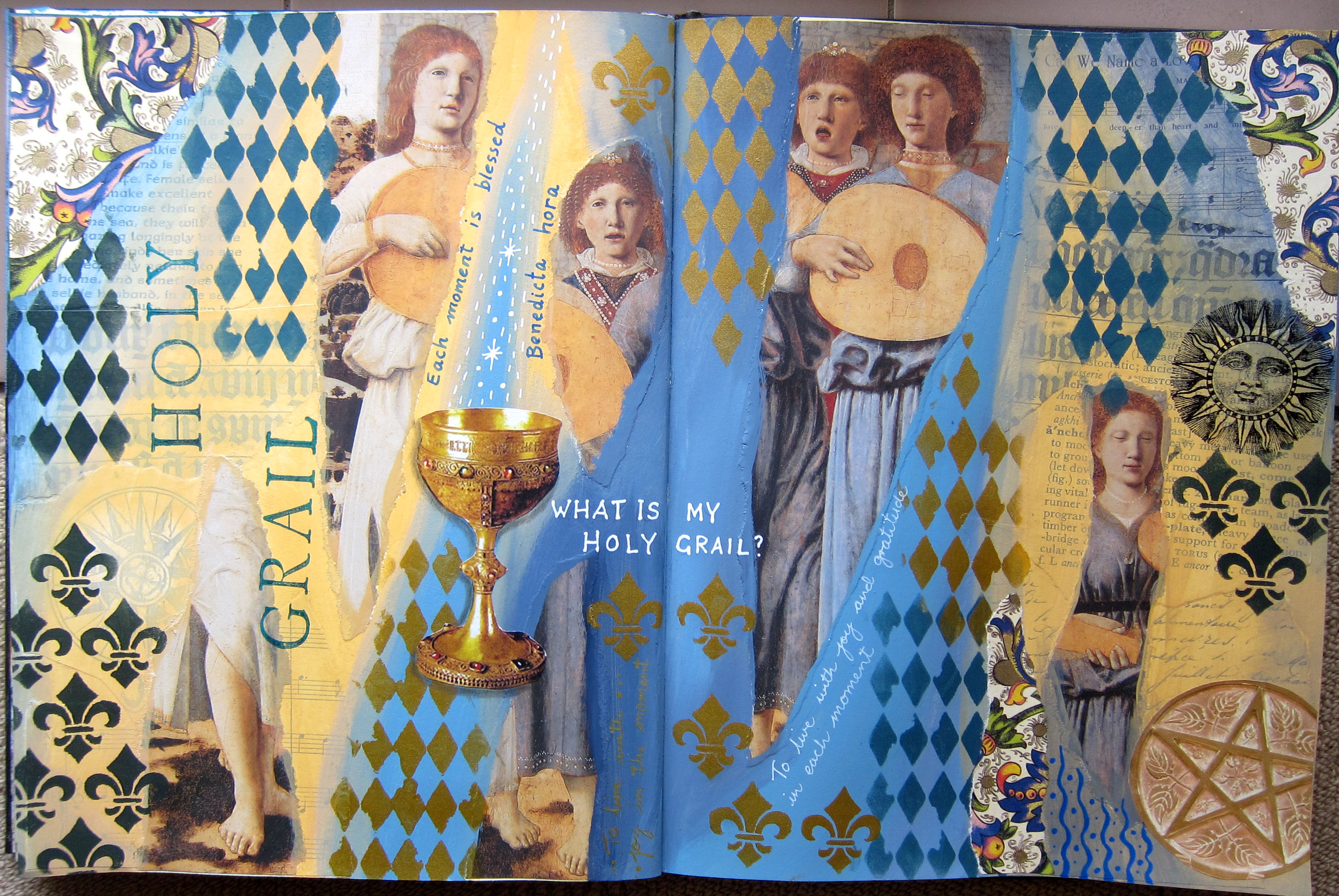
Last month I enrolled in an online art journaling course with Kelly Kilmer, in which we choose an artist for inspiration and use some aspects of their work in our journal. This could be by collaging some pieces of their paintings, copying some of their shapes or design elements, using their colour palettes….or all of these methods. Kelly inspired us by showing how she had made beautiful art journals inspired by Georgia O’Keefe and Frida Kahlo.
I chose Brett Whiteley as my artist because 1. He is Australian 2. I love his paintings of Sydney harbour which are special to me as Sydney was my home town until I was 26. 3. I think he was an incredible artist.
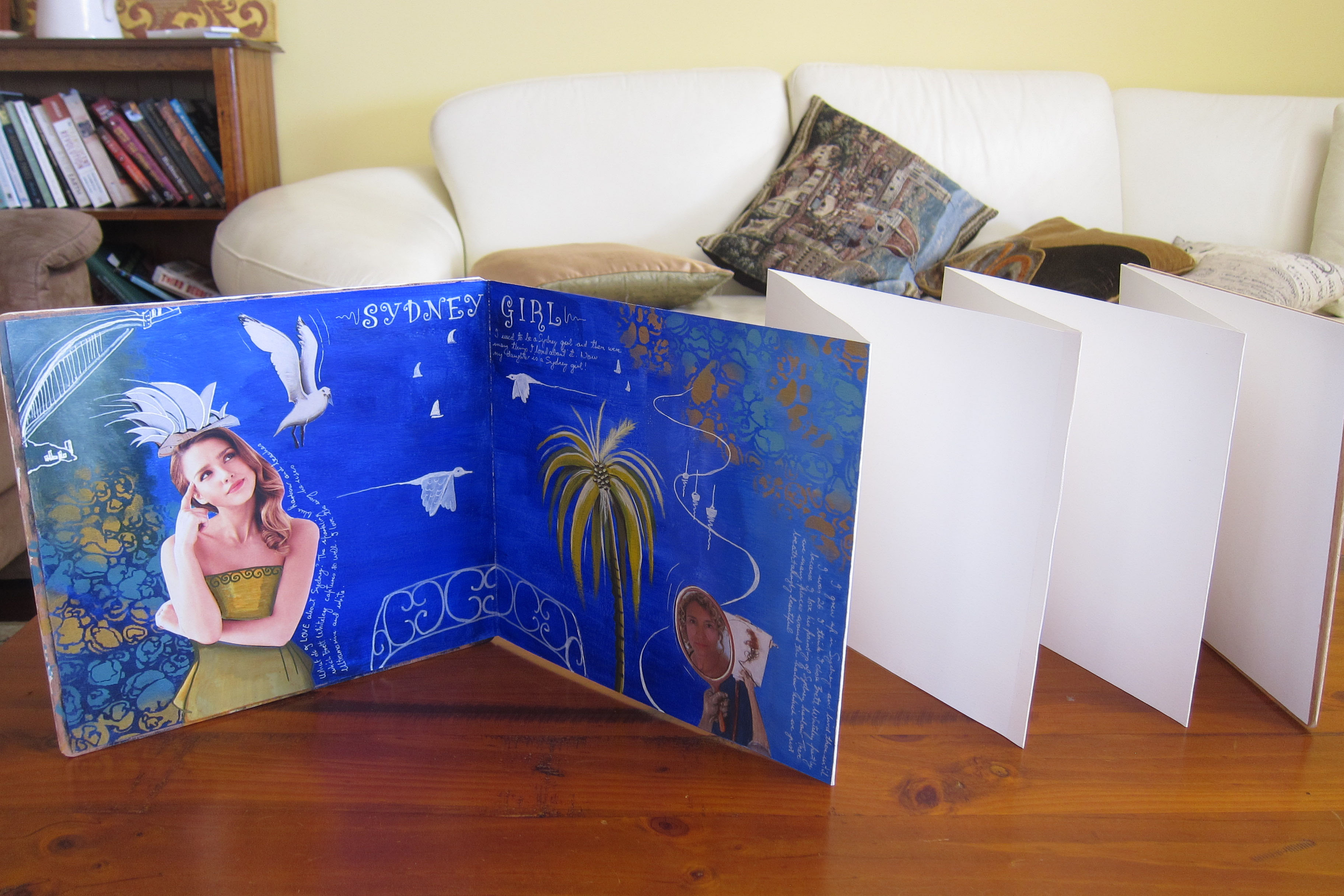
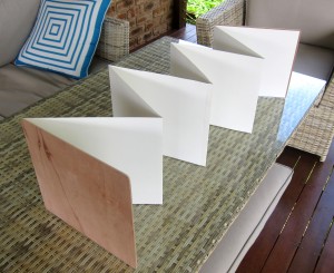
We were supposed to make an art journal from scratch using stitching and bookmaking techniques but I knew that would be time consuming and difficult so basically I decided I couldn’t be bothered. Instead I cut some 300gsm hot pressed (ie smooth) watercolour paper into 2 strips and make a concertina (accordion) journal…easy peasy! I coated the whole thing with gesso both sides, then decided it needed 2 stiff ends, so my dear husband offered to cut and sand 2 pieces of wood for me which i glued on either end. It looked and felt fantastic and I couldn’t wait to get started in it.
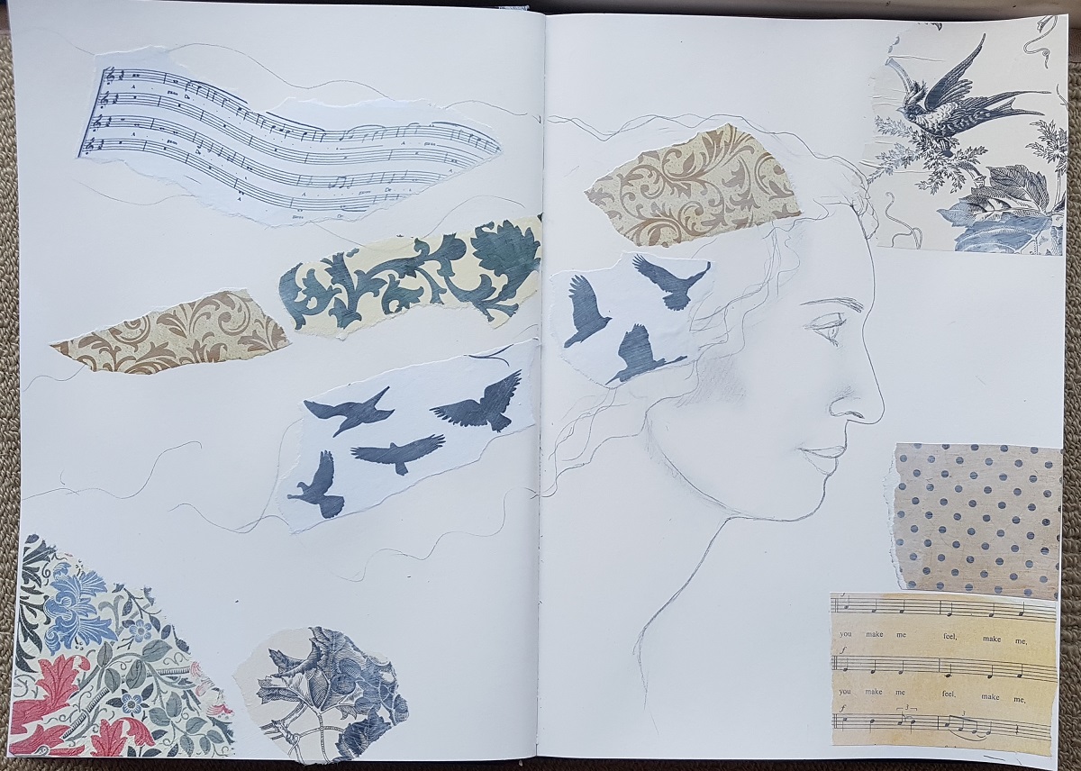
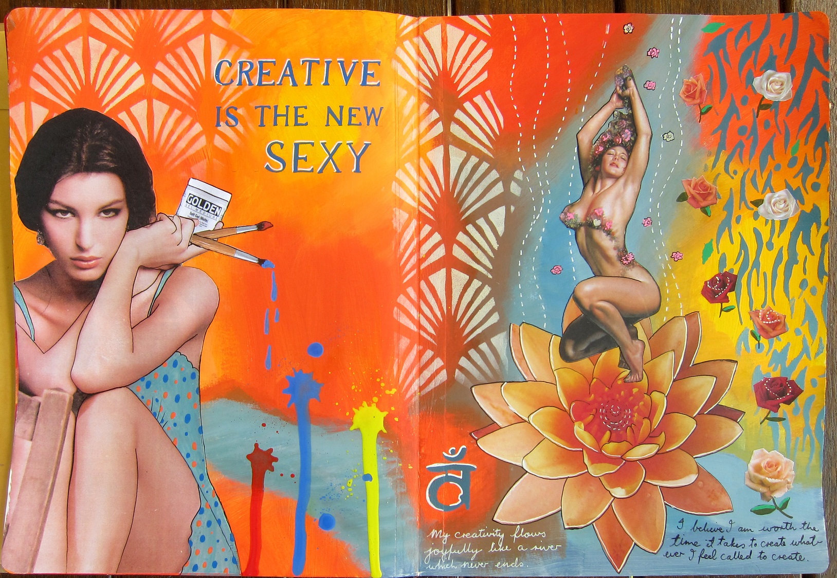
 The first decision I made was that I would mostly stick to the colours that Brett Whiteley used in his paintings. I read that he LOVED ultramarine blue so I started with a double page spread that was a homage to his Sydney harbour paintings. The second decision was that I would include a focal image of a woman cut from a magazine like Kelly Kilmer does on most of her pages. This figure would represent me, or some aspect of me perhaps. The 3rd decision was that I would make the page, then ask it what it had to tell me, or what it was about as I got near to finishing it, much like i do with making SoulCollage cards. That would help me to decide what to write on the page.
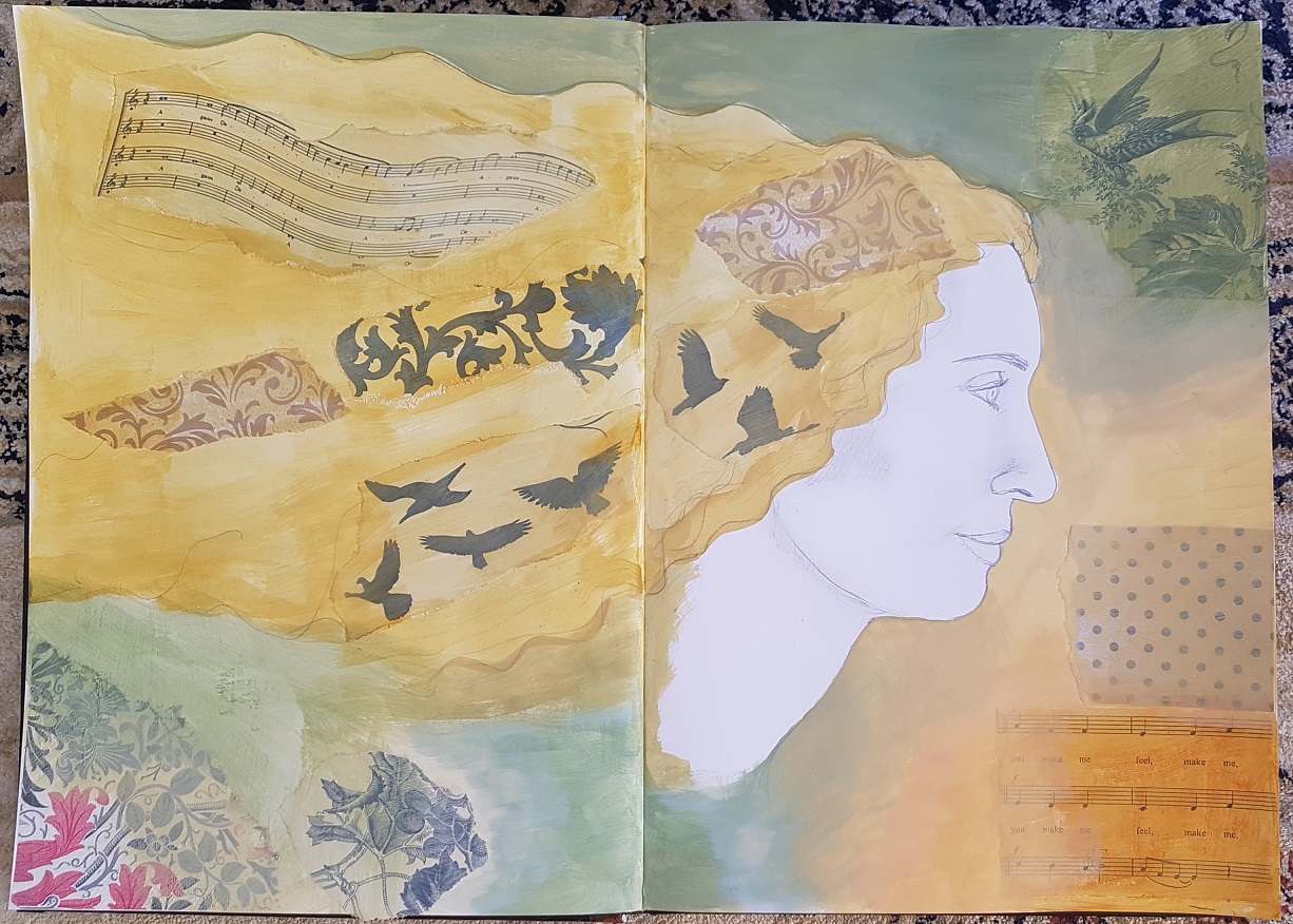
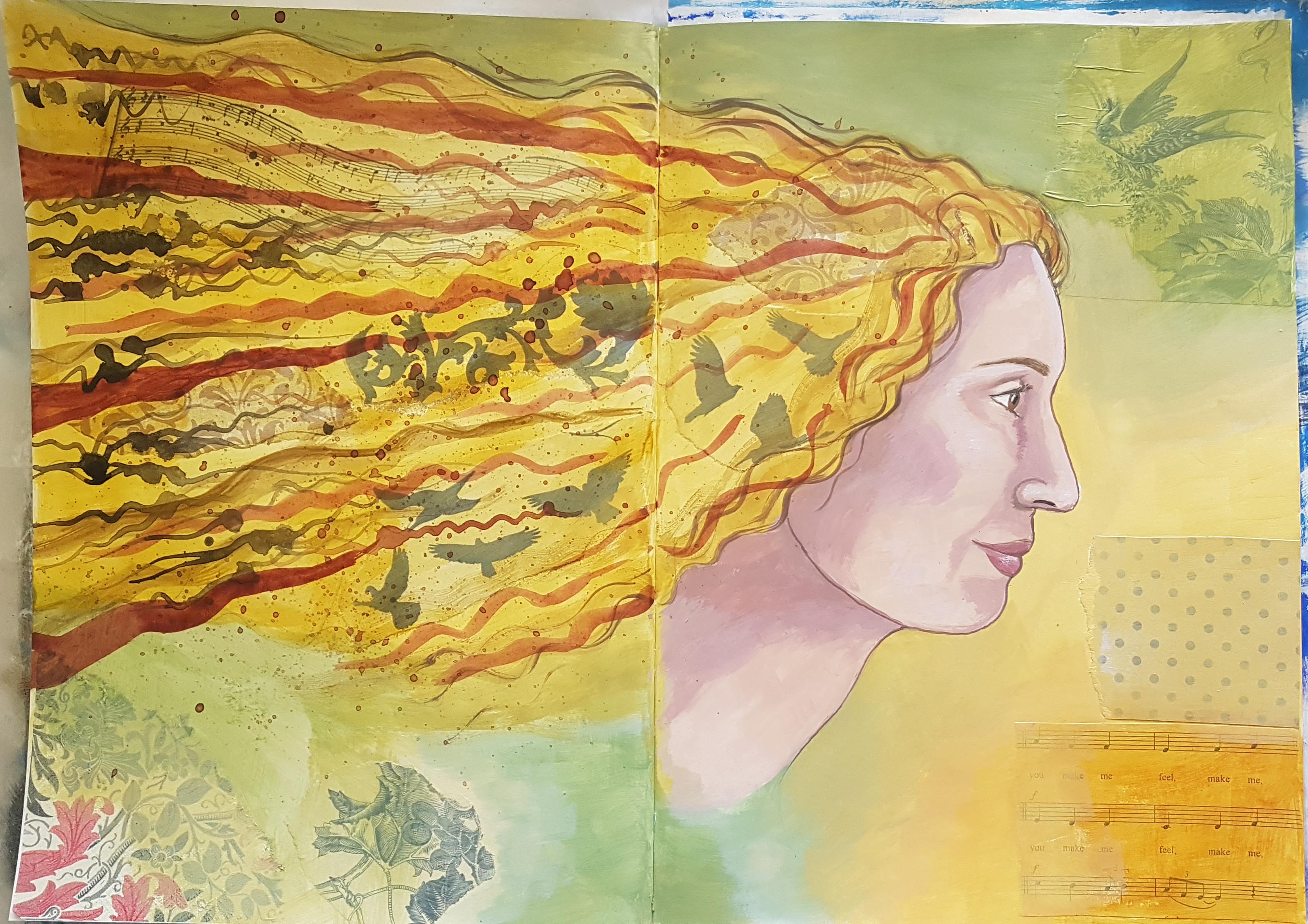
 I thought I might use stencils on some pages, but not all and that I would sometimes try to actually paint some things myself rather than just rely on collage.
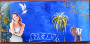
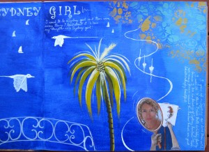
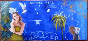
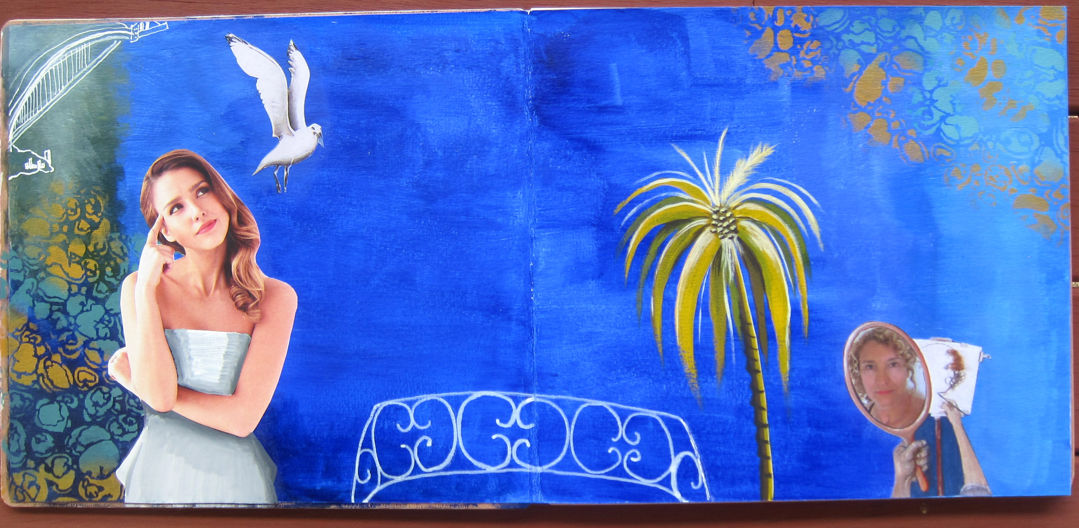
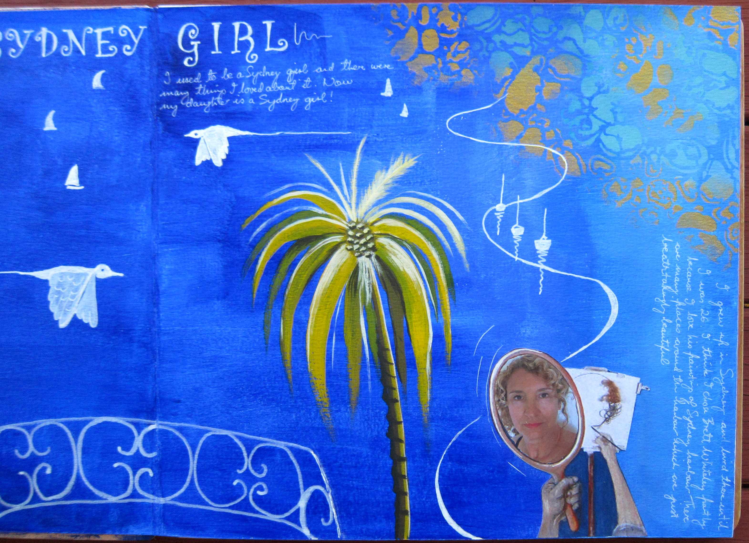
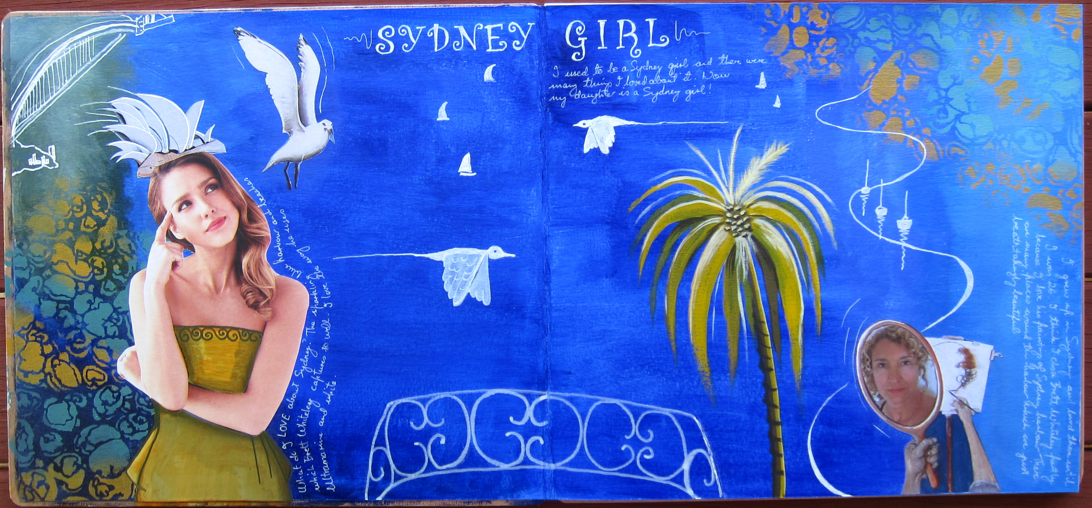
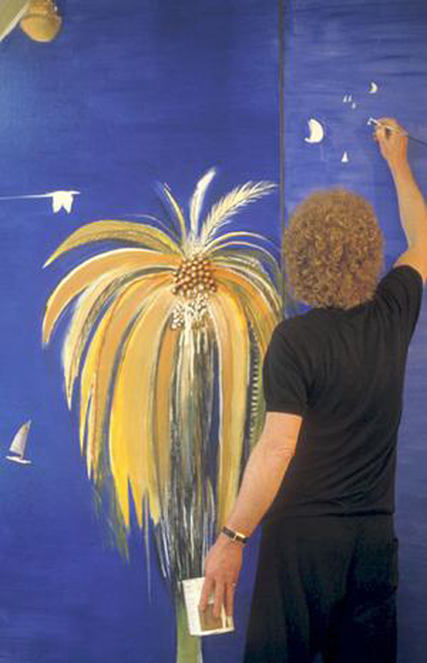
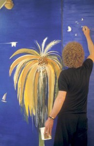
 I started with a good coat of ultramarine paint and copied the balcony of wrought iron from Whiteley’s painting called “the Balcony” with a white Posca pen. I used his self portrait in the mirror but replaced his face with a photo of my face. We both have curly blond hair so actually it doesn’t look very different!! Then I wanted to have a go at actually painting something in his style so I copied a yellow palm tree from one of his paintings and I was pretty proud of how it turned out. I also copied the way he drew/painted the Sydney harbour bridge in one corner.
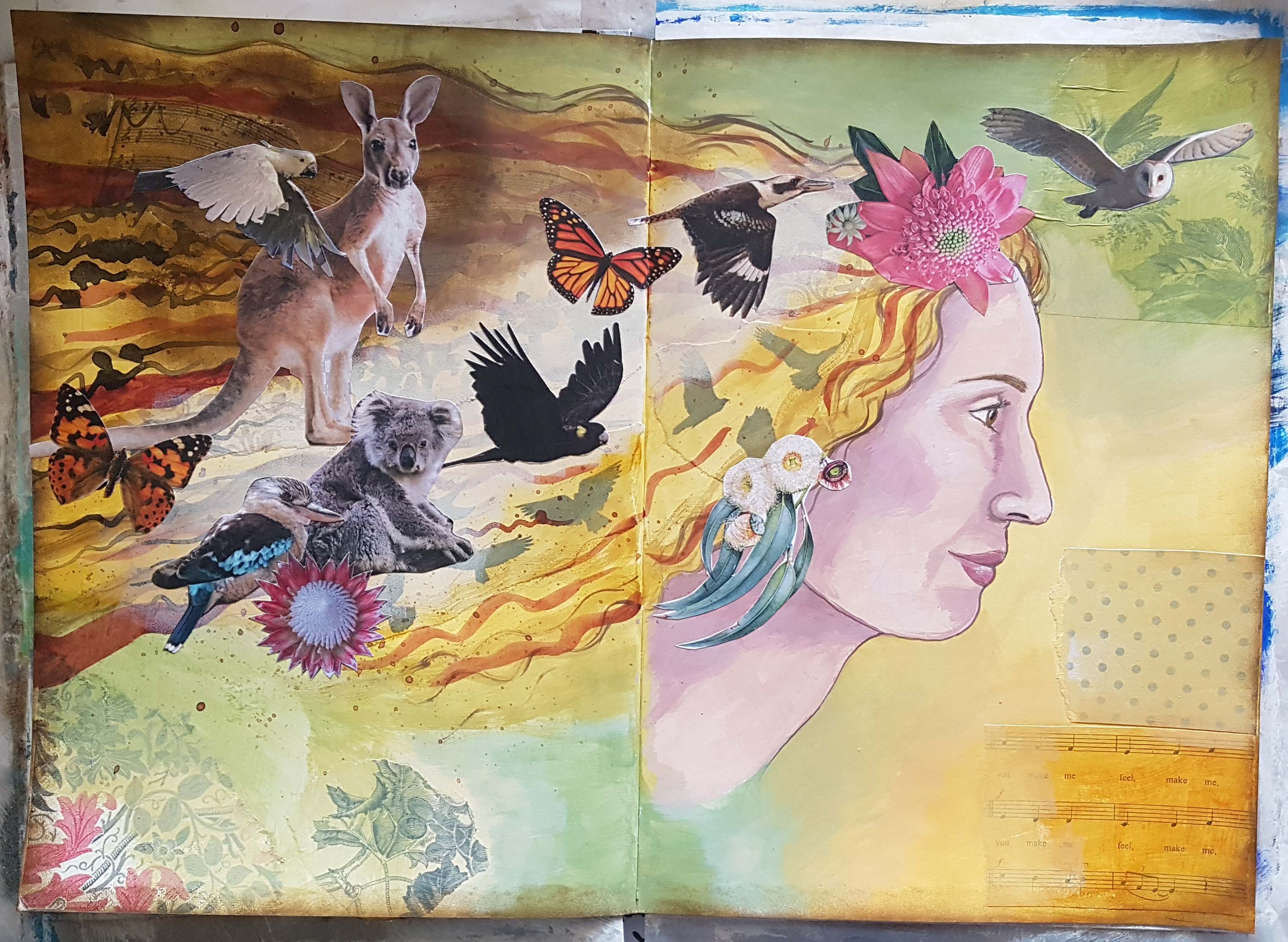
The seagull is cut from one of his paintings and so is the opera house which i turned into a hat for the woman. She is thinking about what she loves about Sydney harbour, and the writing I ended up doing is about my relationship to Sydney and what i loved about it. I finished off the page with some Whiteley-esque flying birds, some little white boats and the sort of swirl shape he uses a lot. I forgot to mention that I used a Stencil girl stencil called “Rock Pools” on either side in shades of turquoise and gold. Sydney has lots of fabulous rock pools that I loved as a child. All in all I’m quite pleased with my first page.
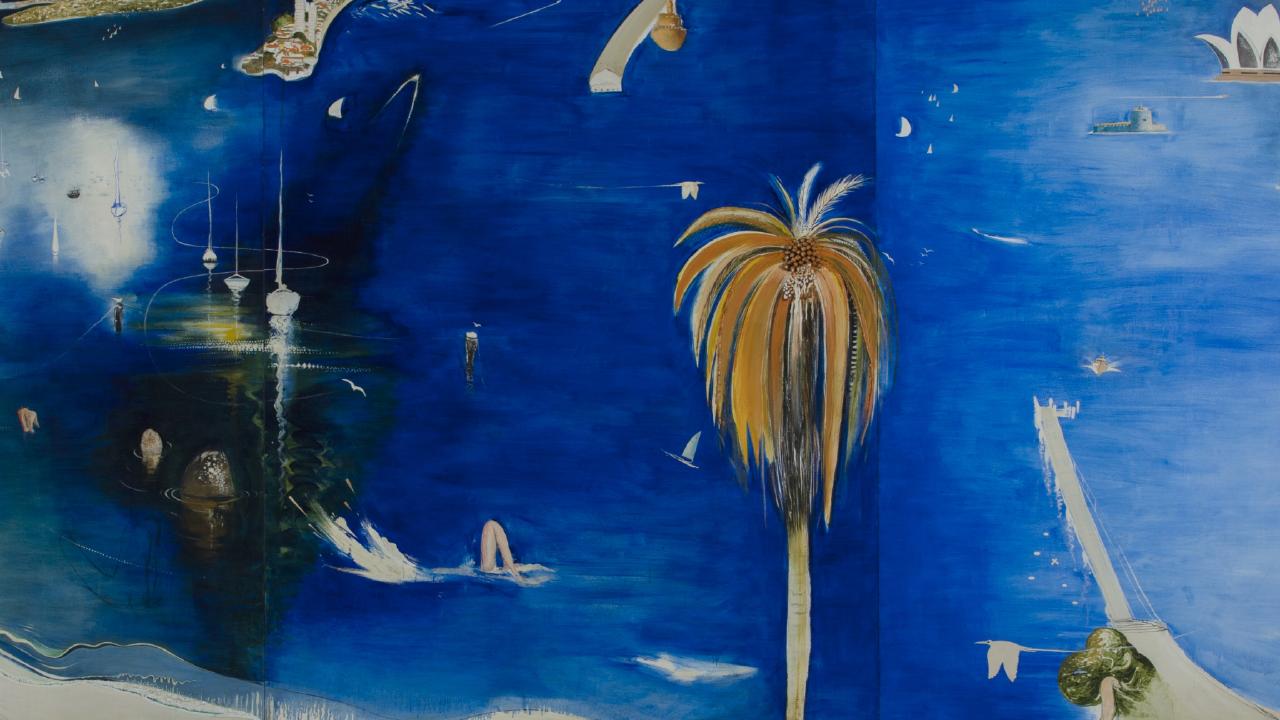
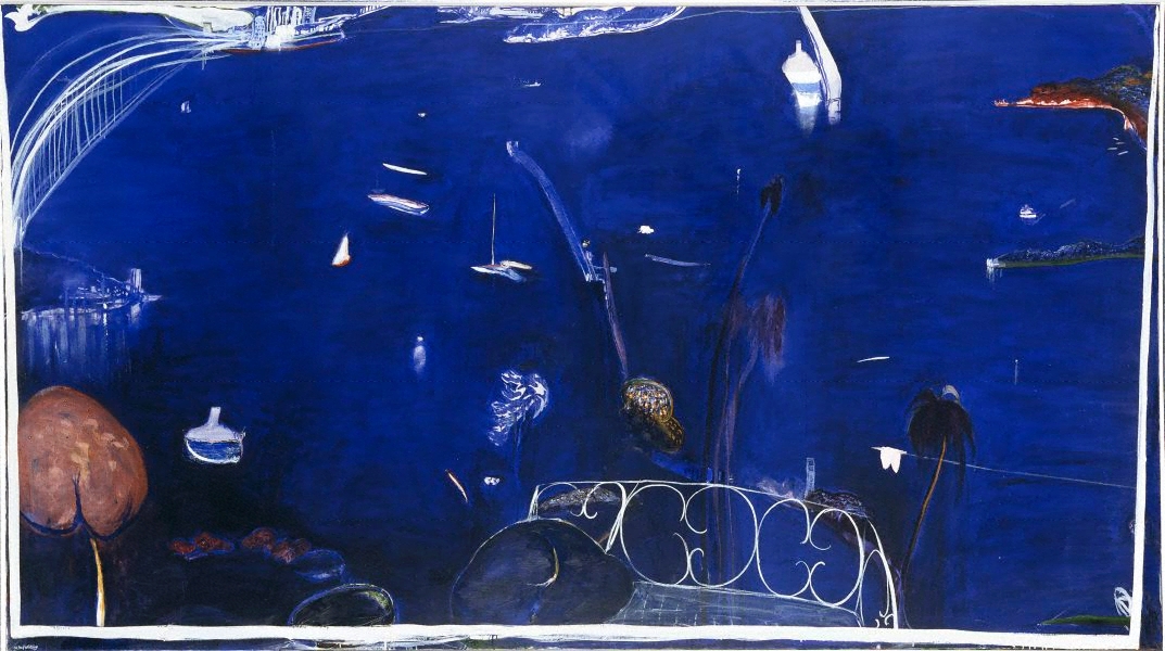
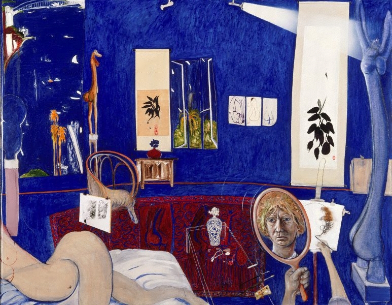
Here are the Whiteley paintings I was inspired by: 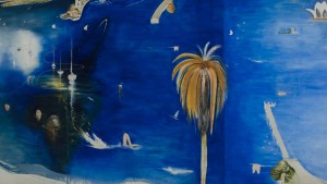


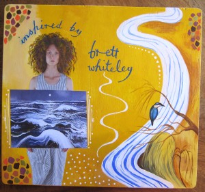
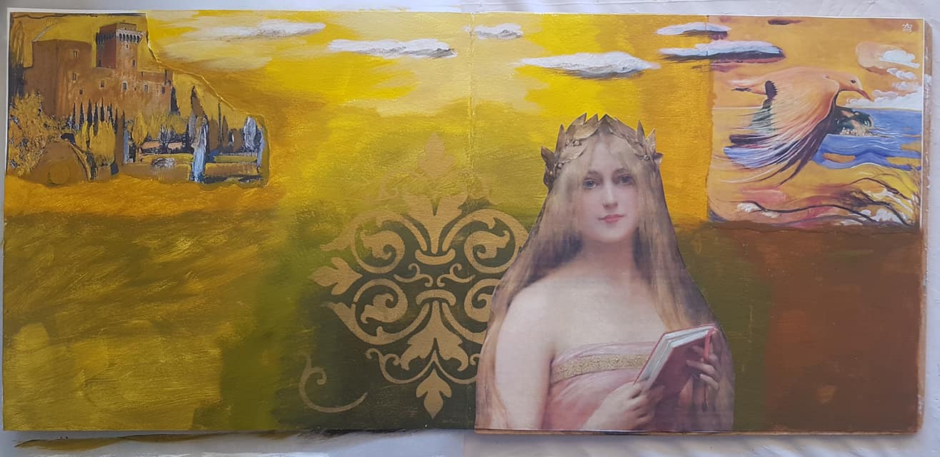
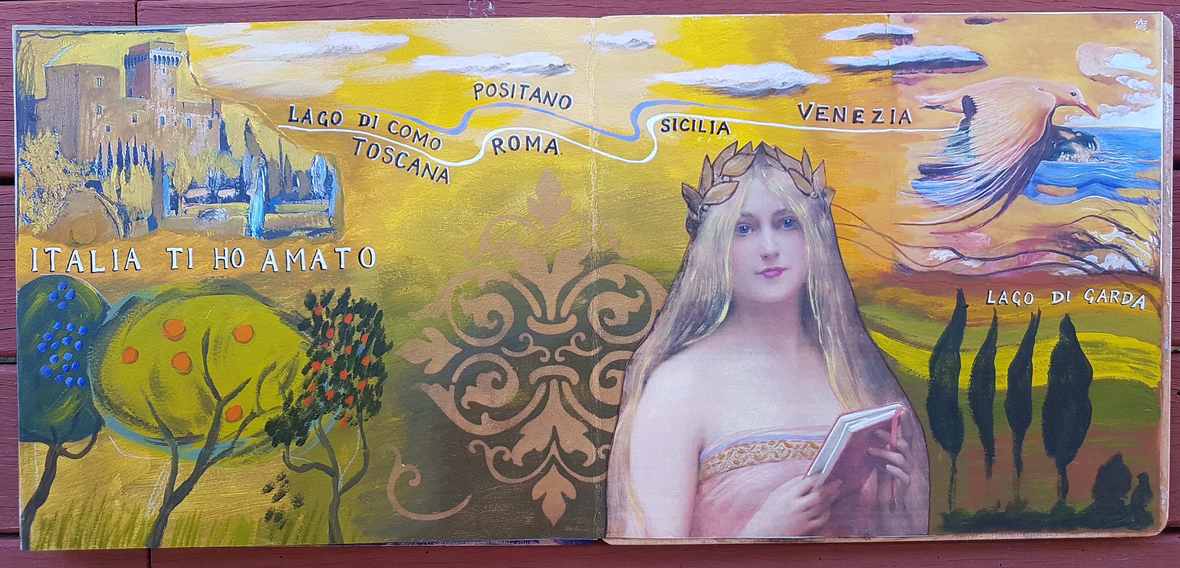
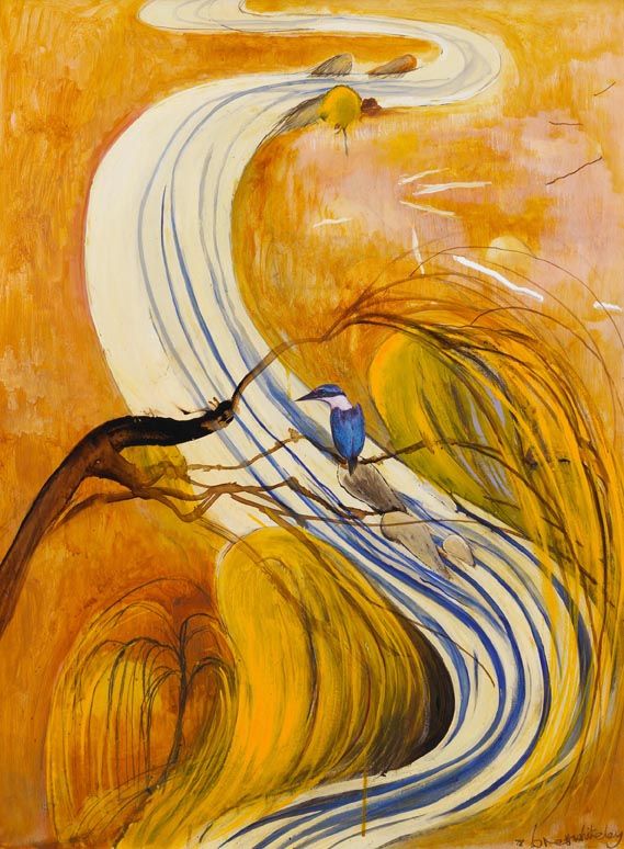
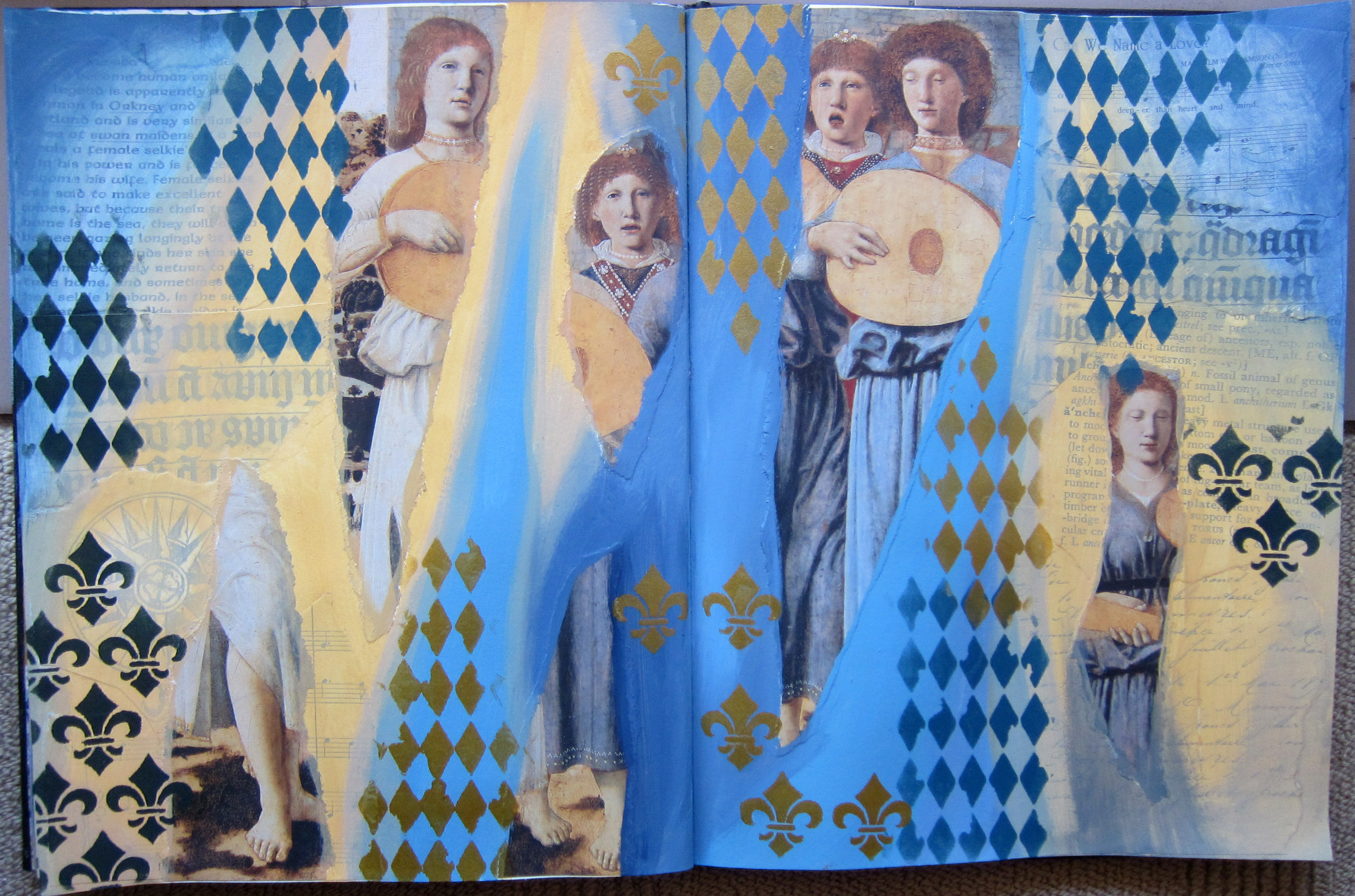
Next I painted the wooden cover with 2 coats of gesso, then some yellow and yellow ochre tones. I used a woman with curly Whiteley ish hair and she is holding a section of one of my favourite of his ocean paintings, “Thebes Revenge”. Then i bravely painted a reversed version of his painting called “Study for kingfisher” down the right hand side. here is the original:
 I can see the value of copying paintings by master painters, I already feel that I have learnt quite a lot copying Brett’s work.
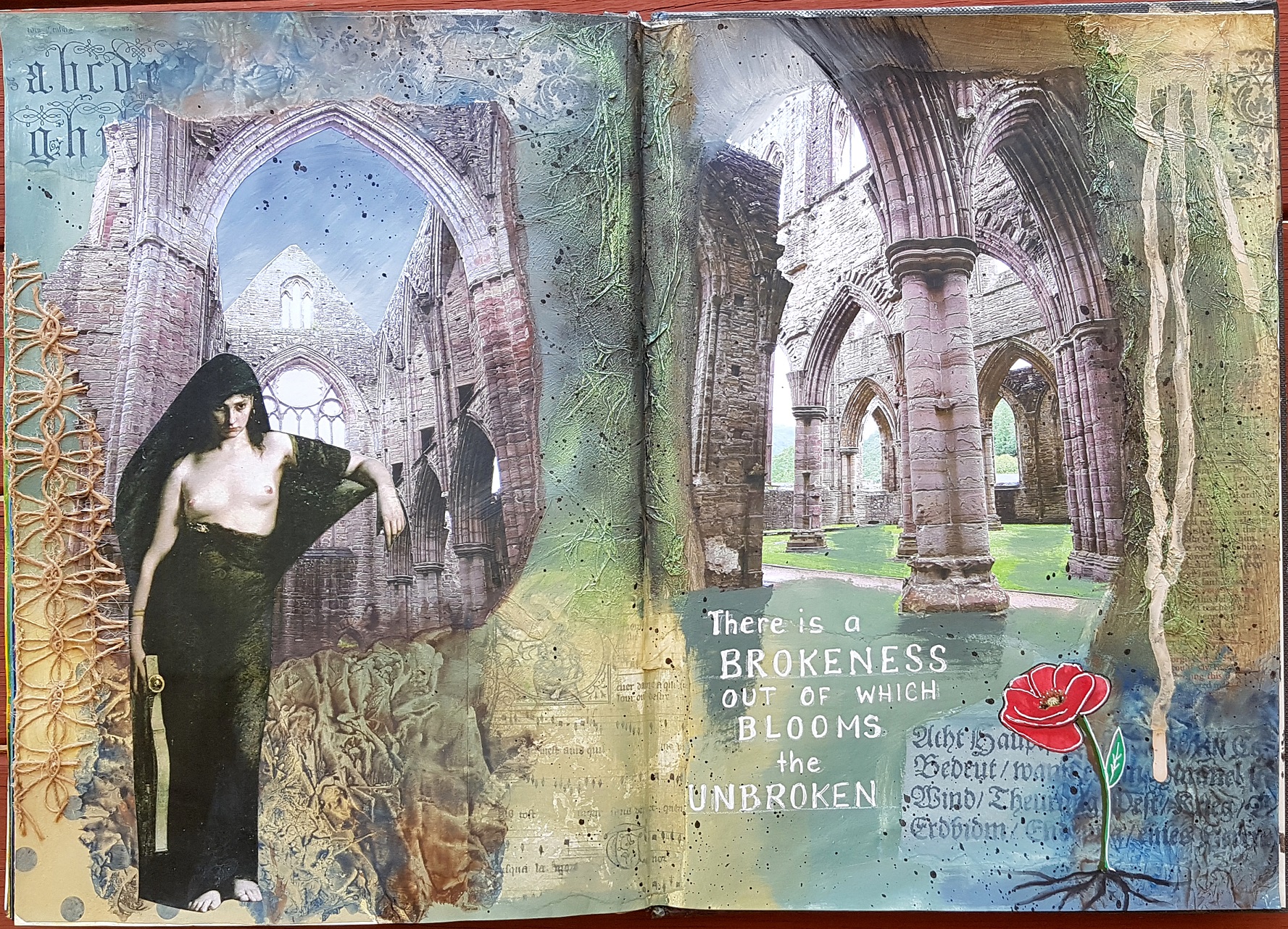
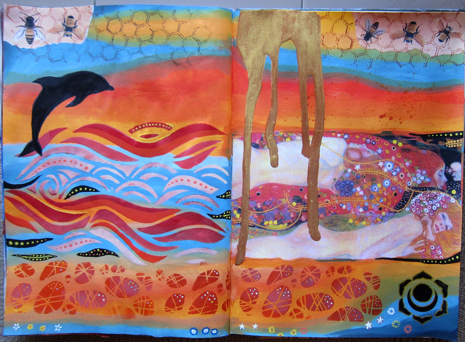
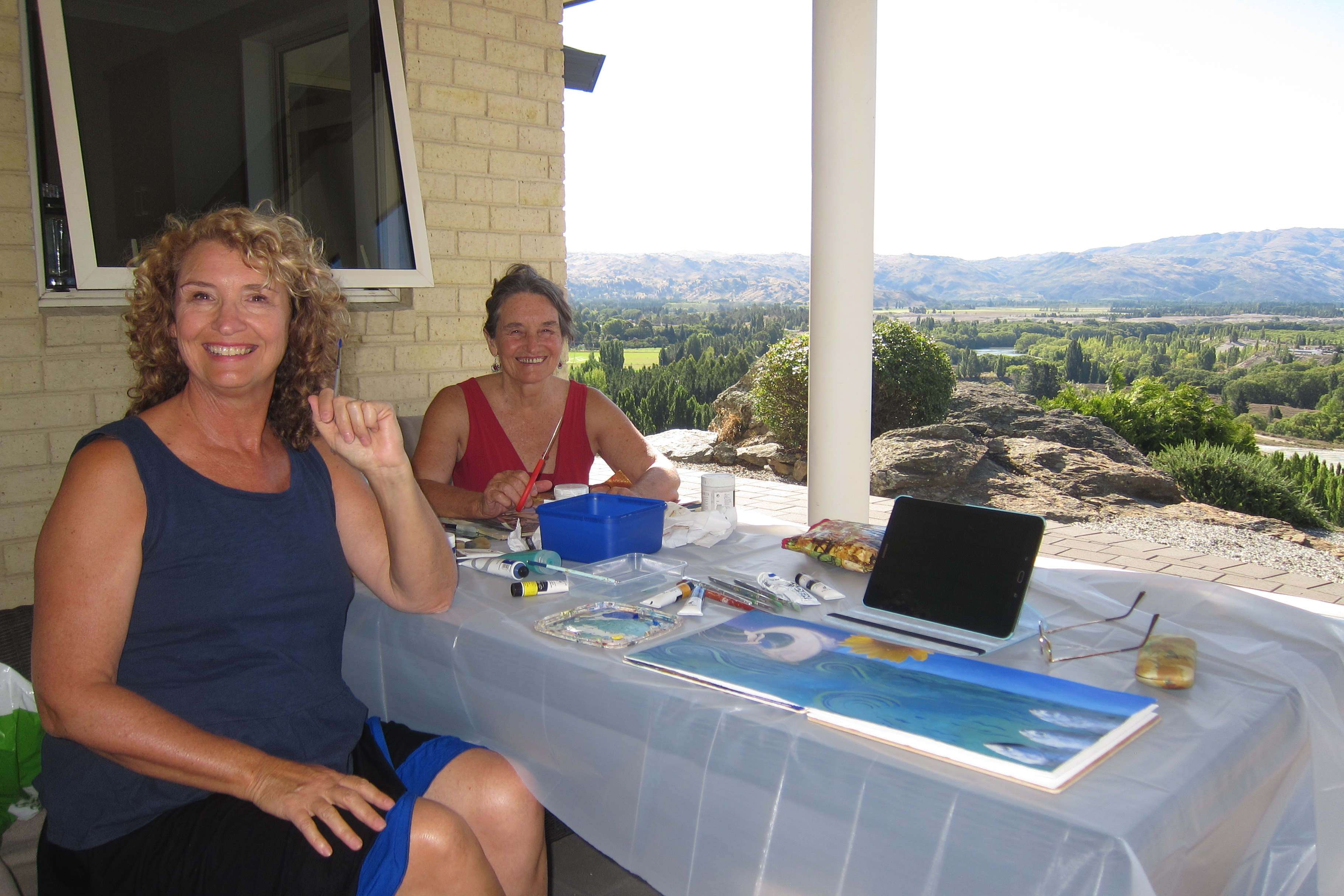
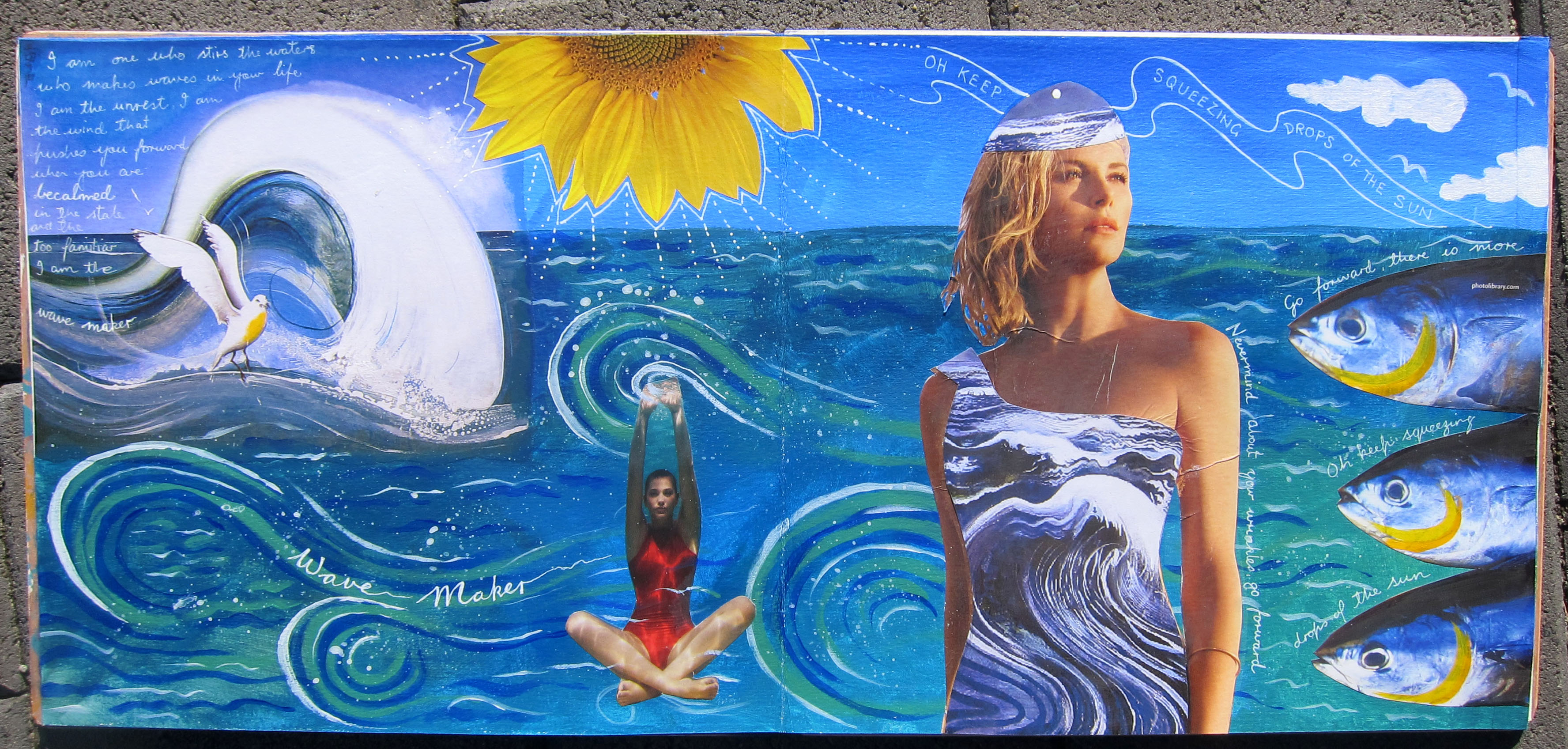
Now I am on holidays in New Zealand and spent some time yesterday doing some art journaling with my sister. we have a wonderful view from our house exchange place in Alexandra. I have been working on another Brett Whiteley spread. 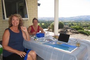 This is also inspired by his ocean paintings. I collaged his wave and seagull painting on the top left of my double page and then extrapolated from there across the page in blue and green paint. I collaged some of “Thebes revenge” painting over the dress of the woman, and also gave her a hat from it, she looks like a kind of ocean goddess emerging. She actually turned out a bit wrinkled when i glued her down, but I decided that was Ok, I’m turning out a bit wrinkly too as the years go on!! The other figure sitting on the bottom of the sea with her arms raised told me she is making waves.
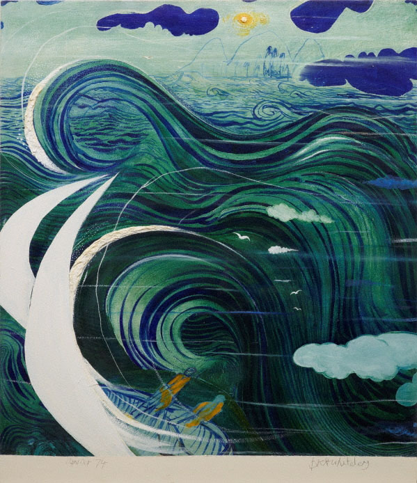
I had the sunflower and the 3 fishes images in my stash and they made their way onto the page too. The Yellow in the sunflower needed balancing so I added some yellow to the fishes gills. I copied the wave forms from this painting of Whiteley’s called “Stanner’s dream”:
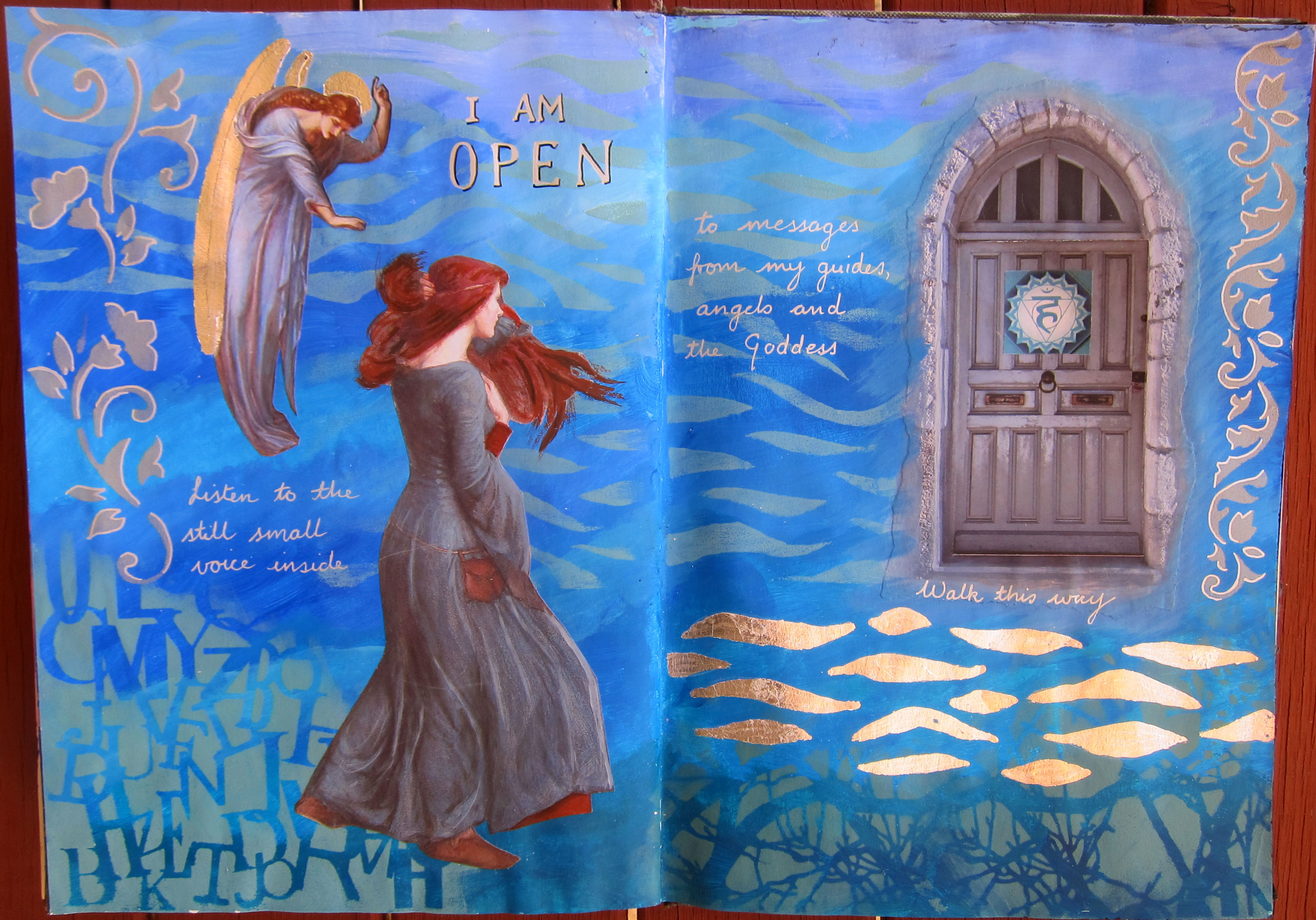
 This is what i wrote on the page “I am one who stirs the waters, who makes waves in your life. I am the unrest. I am the wind that pushes you forward when you are becalmed in the stale and the too familiar. I am the WAVE MAKER”
And the fish also wanted to speak. They said “Go forward, there is more! Oh keep squeezing drops of the sun” (they were quoting Hafiz here of course).
 “Thebes Revenge” by Brett Whiteley
This has been a long post, thank you for visiting my blog.
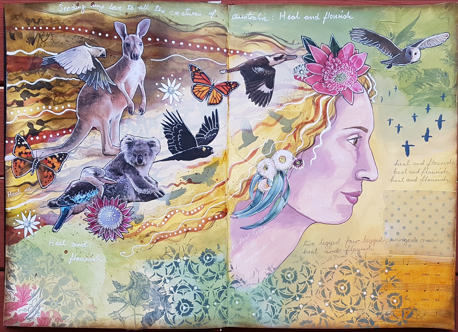 Heal and Flourish.