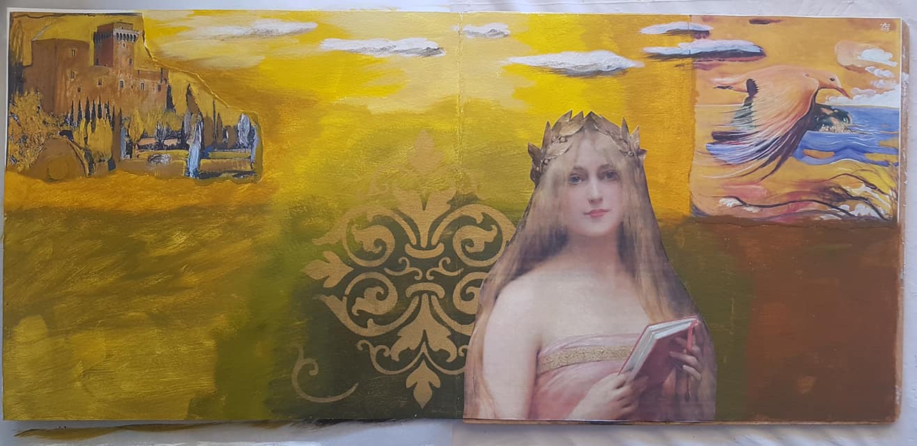
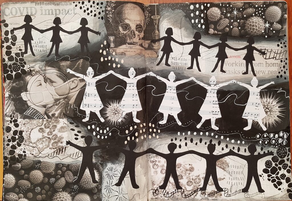
I’ve signed up for wanderlust 2020, an online art journaling course, because I want to be pushed to try some new things in my art. So far we’ve had 2 weekly classes and I have actually completed an art journal page for both of them, so I’m quite pleased with myself. For week 2 we we encouraged to paint a portrait of an ancestor, either real or imagined, copying from a photo or internet image. I didn’t have any good photos of grandmothers so I decided to paint my daughter as an imaginary Scottish ancestor. I have Scots ancestors on my father’s side, but my daughter has them on both sides, (the Mackays from the island of Raasay on her father’s side, and the Frasers and MacDonalds from Skye on my side)….plus, she’s beautiful!
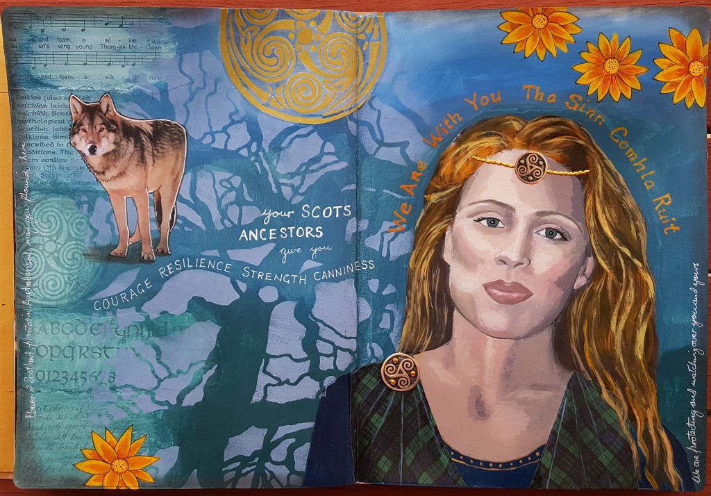
I imagined her as a kind of Celtic warrior queen. I draped her in the Mackay tartan and added a wolf as a power animal companion (there were wolves in Scotland until the 17th century) because she is a strong person and a sheep or rabbit just didn’t feel appropriate!I googled Scottish flowers and painted those orange Gazanias as a contrast to the blue/green background.
In this class we had to do a tonal underpainting first in black and white, then put colour over it. It was all quite challenging, I haven’t ever tried to paint a portrait in acrylics before. I was going to trace the main outline with carbon paper but decided to just print a desaturated photo, glue it down and paint it with clear gesso and then paint over it. At least then I’d have the proportions correct. My tonal underpainting I did with brown and white: 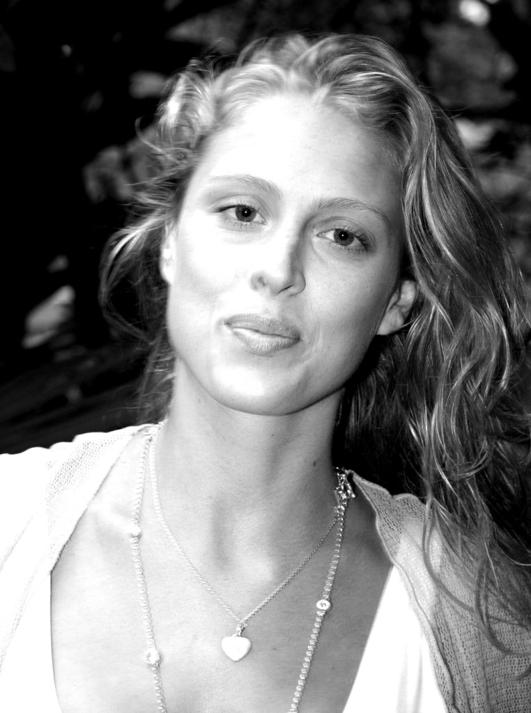 Photo of my daughter, desaturated.
 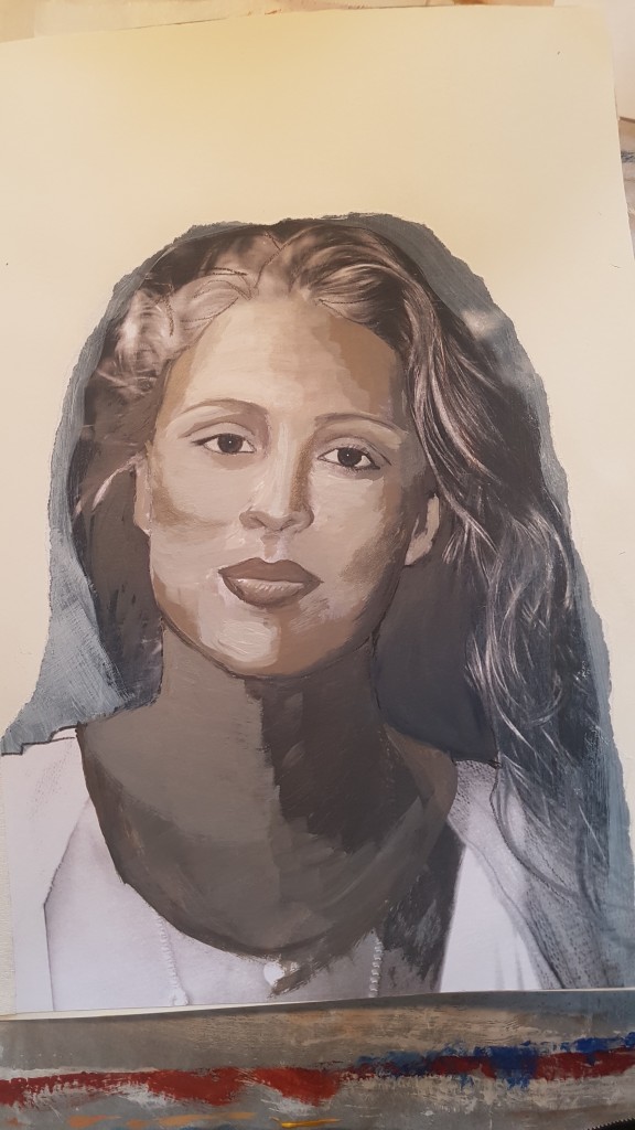 Tonal Underpainting, Van Dyke brown, white and Paynes grey. Neck is far too dark!!
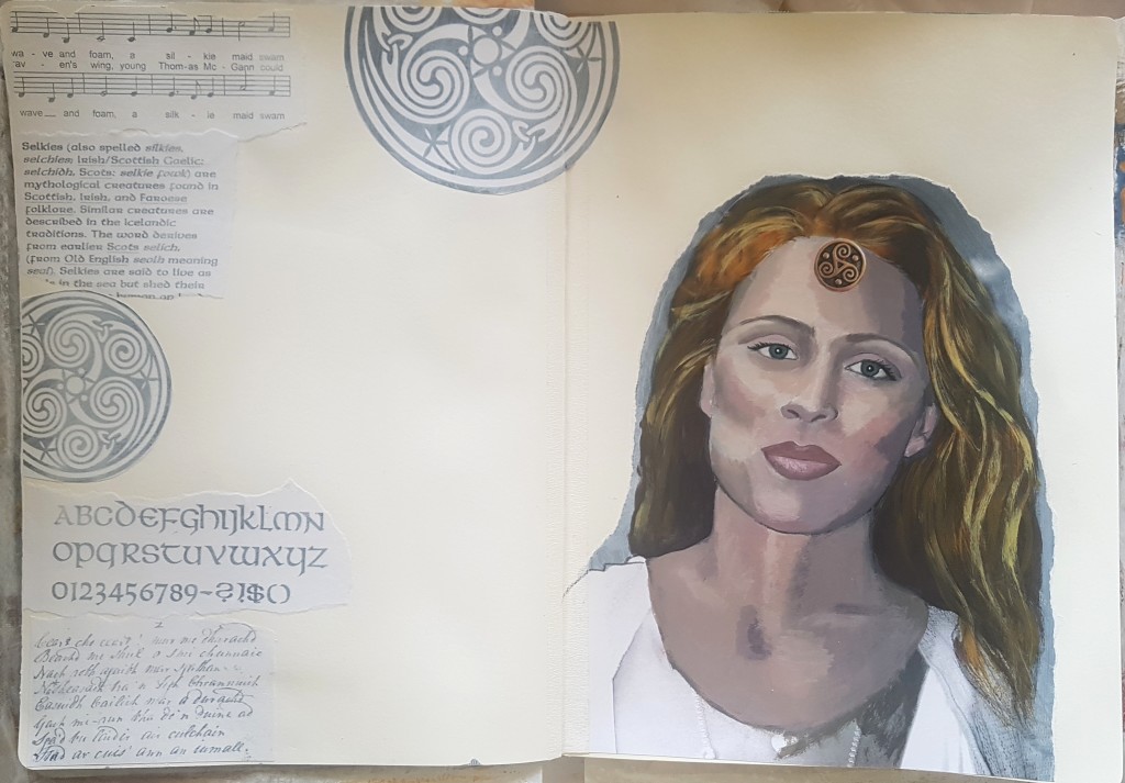 Next I painted over it with colour, skin tones (this was very challenging!), plus I added some appropriate ephemera undercollage on the left page and gessoed over it with a mix of clear and white gesso.
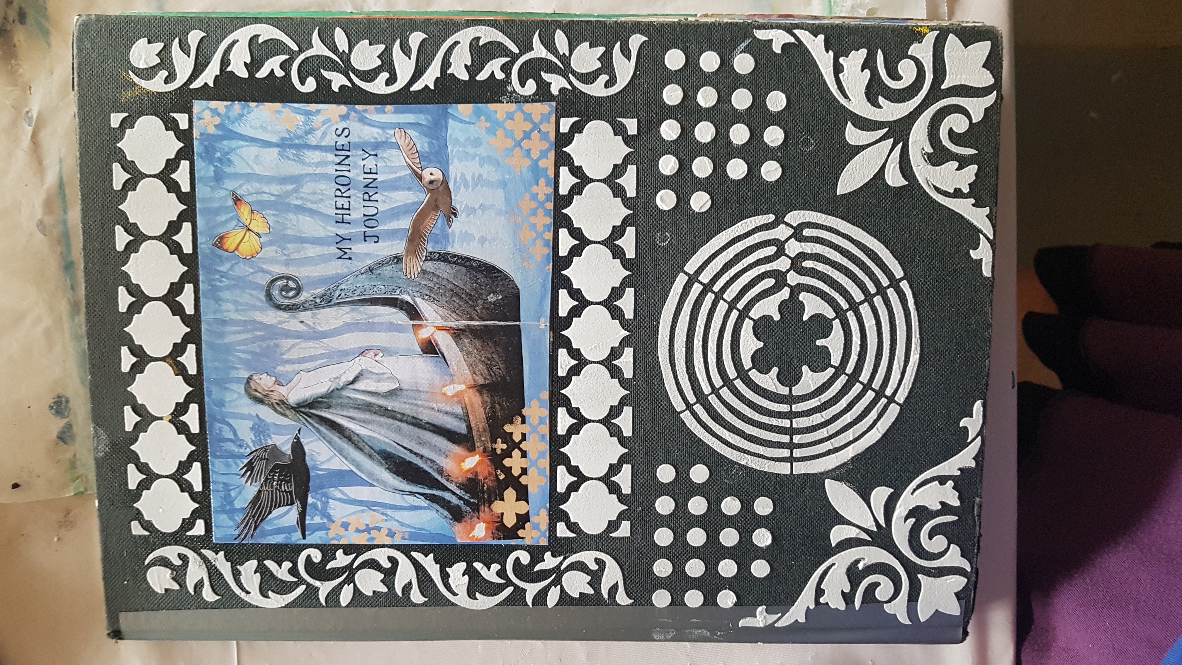
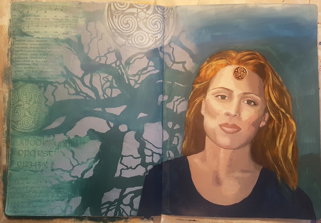 I painted the background with some blues and greens (all mixed with a bit of Paynes grey and Raw Umber, I didn’t want bright colours) and added some stencilling (a beloved Stencil girl gnarly tree stencil)
 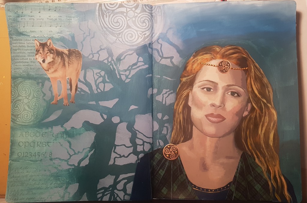 Next I added the wolf, the tartan and jewellery embellishments and I painted the celtic shield at the top with gold. To finish I painted the flowers, then did some writing.
Google translate once again came in handy….Tha Sinn Comhla Ruit means “We are with you” in Scots Gaelic. I wanted to convey the idea that she (and perhaps, I ) have received gifts of strength, canniness (love that word!) and resilience from our Scots ancestors, and also that somehow they are watching over us, protecting and assisting us.
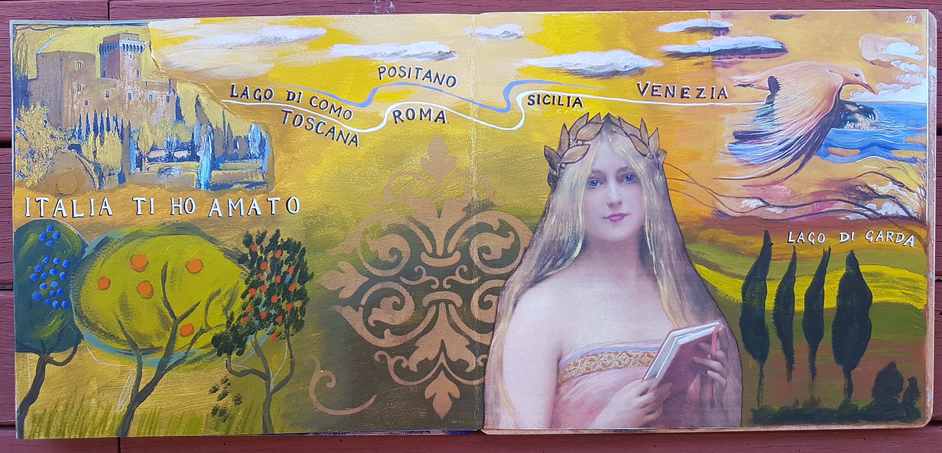
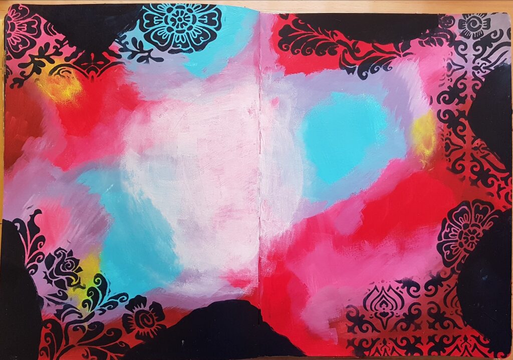
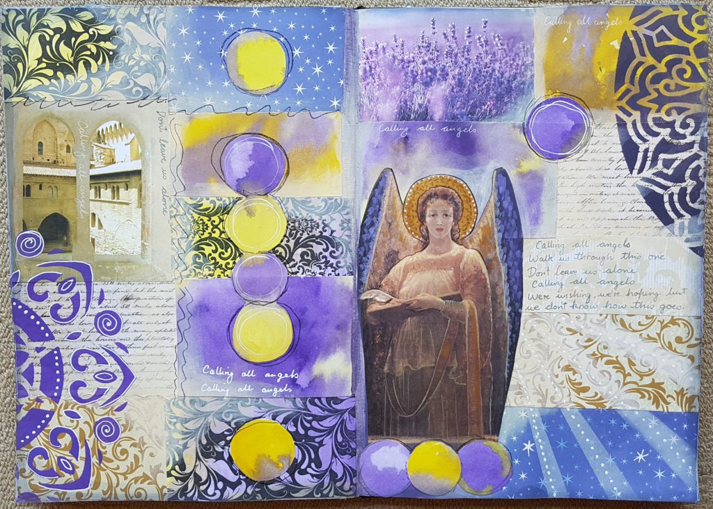
For the first weeks lesson we focused on creating an art journal page about our 3 major relationships, using scraped on paint, ephemera and patterned papers and choosing images to symbolise those relationships. Here is my finished page: 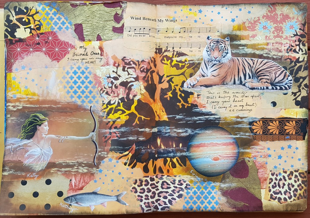 I used an image of Artemis to represent my daughter, planet Jupiter for my son (he’s a Sagittarius) a tiger for my husband (Year of the Tiger) and a fish for my Piscean sister. Tying it all together was a bit of a challenge. Here’s how it looked a bit earlier:
 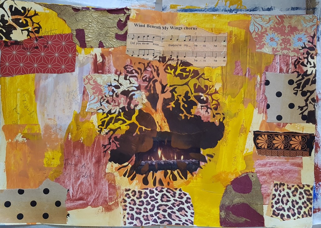 We were directed to use a stencil in the centre in a dark colour.
I pretty much followed Kasia’s instructions for most of it, and added a few ideas of my own. For example I did a bit of sponging in a dark colour before I glued down the Tiger and Jupiter (so they would stand out better) and then painted some floaty clouds to tie it all together. I used the words of the poet e.e.cummings to convey my feelings.
I like the page, It’s a bit different to what I usually do, and that is why I signed up for the course, to try a few different things.
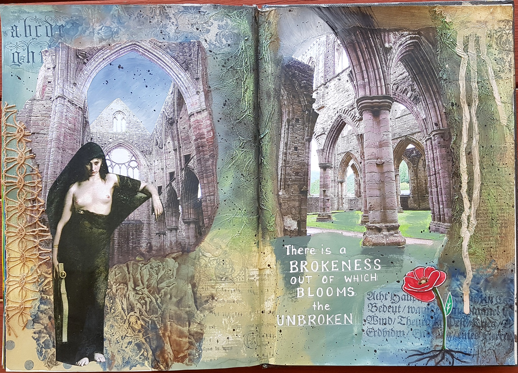
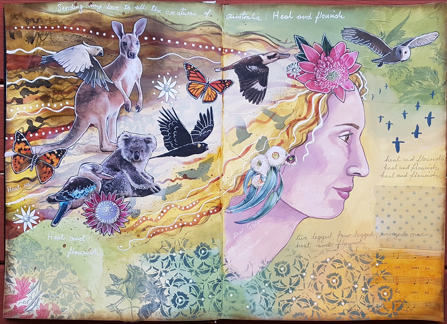 Heal and Flourish.
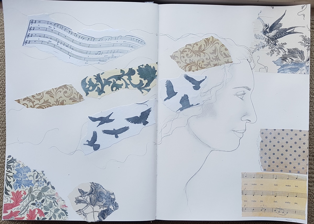
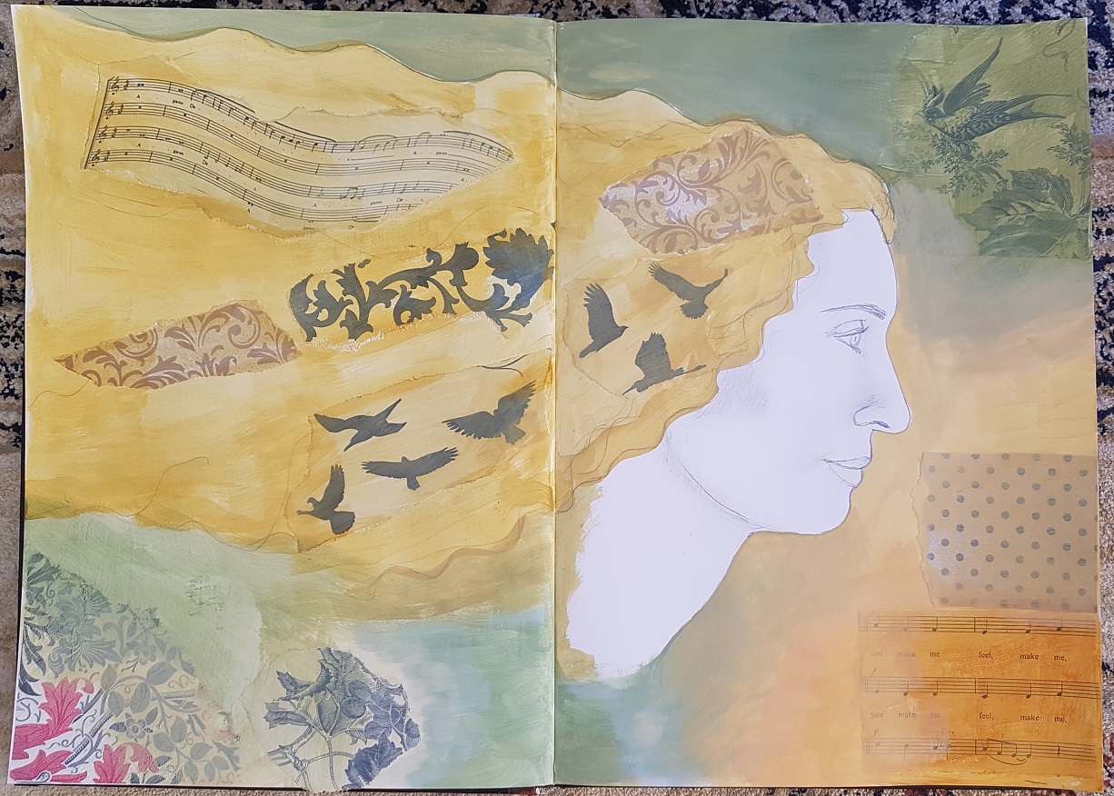
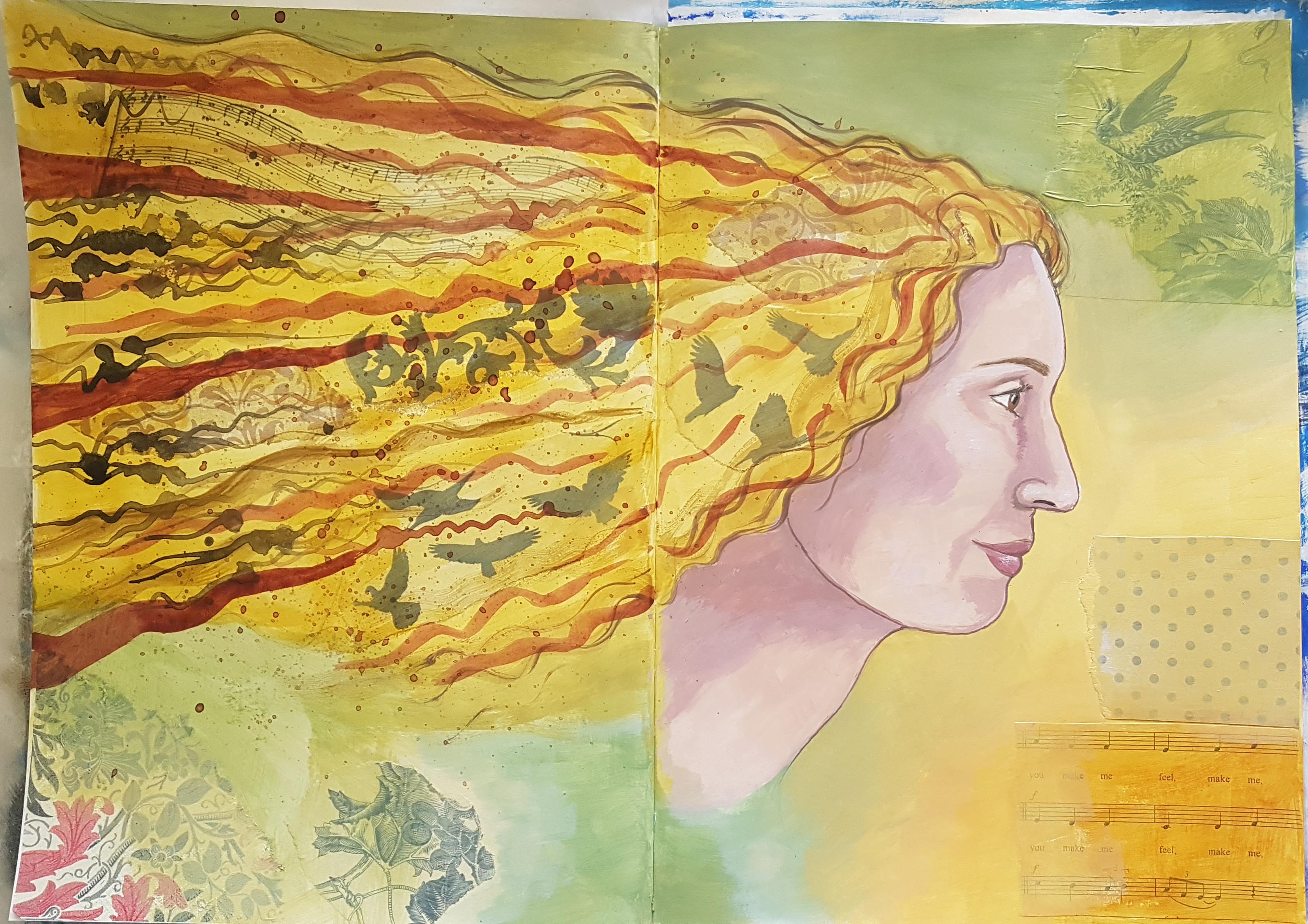
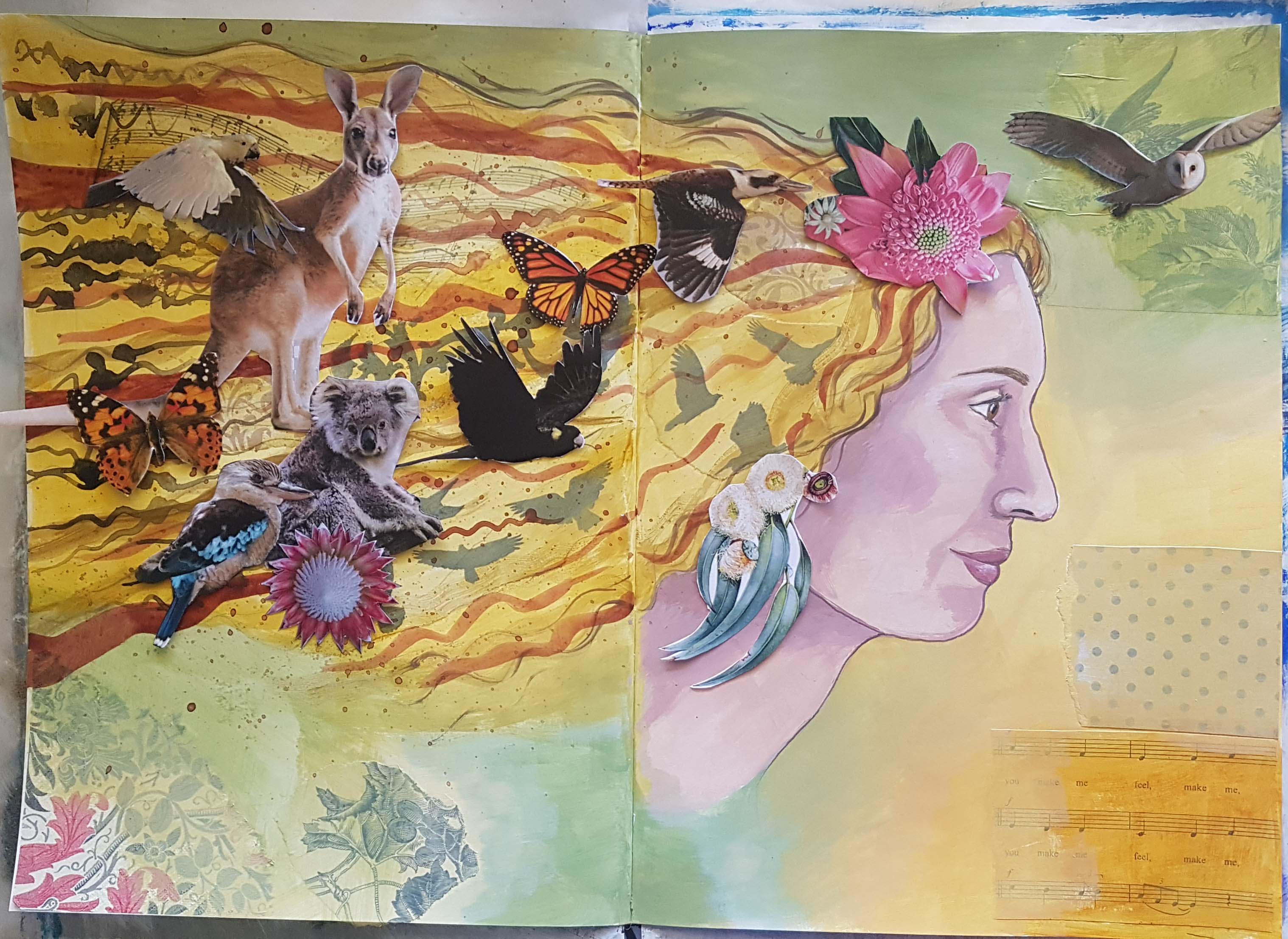

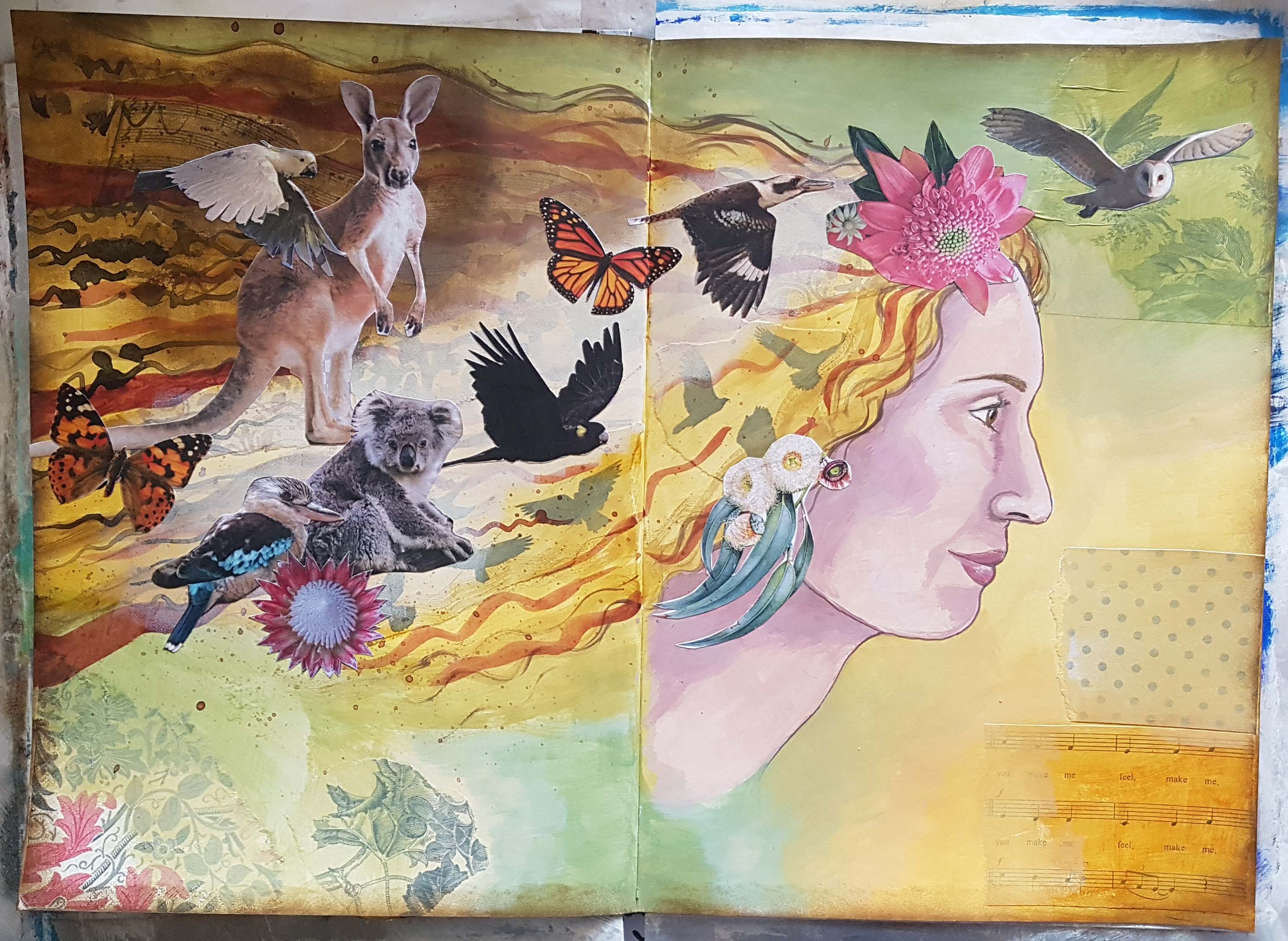
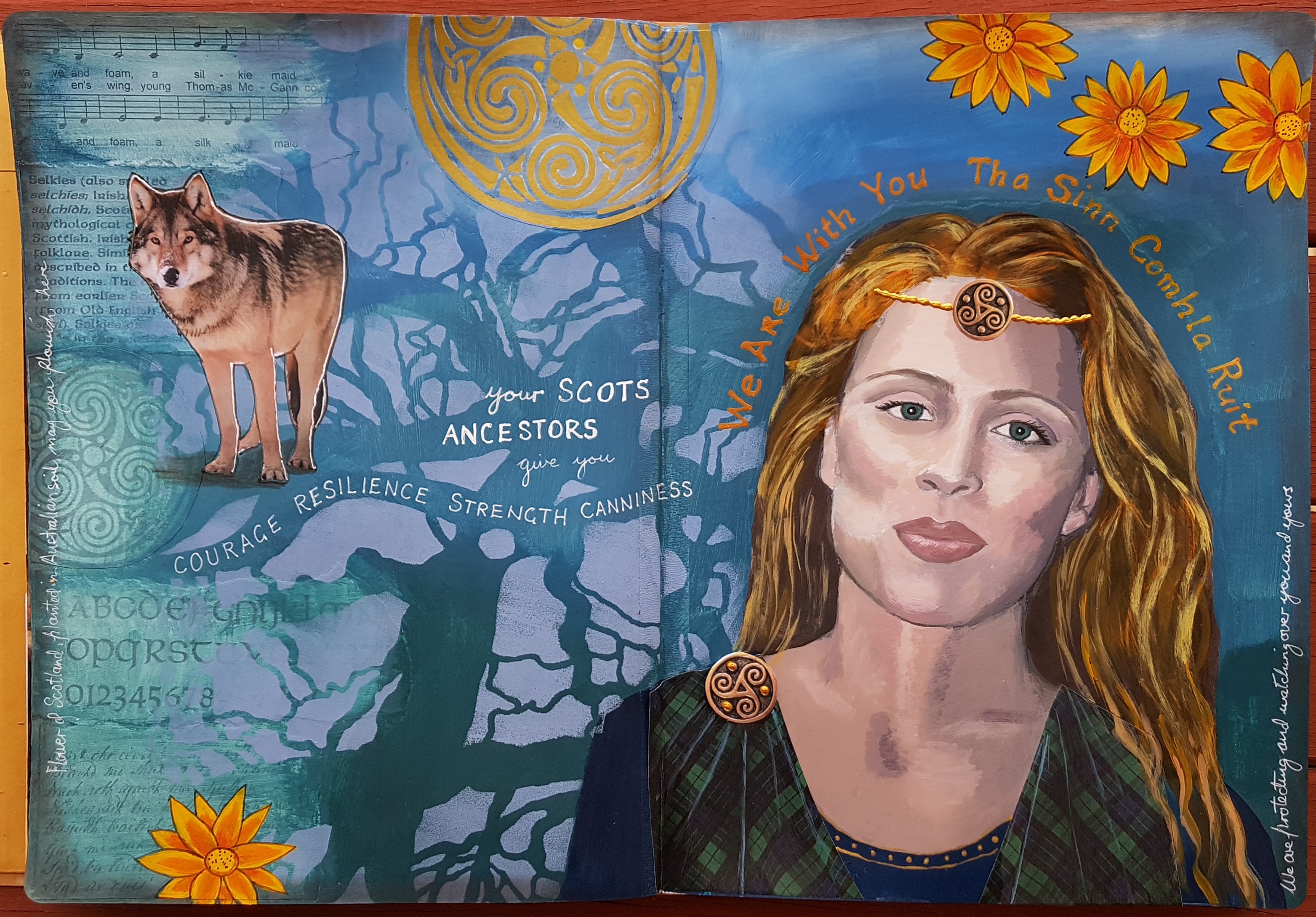
 Photo of my daughter, desaturated.
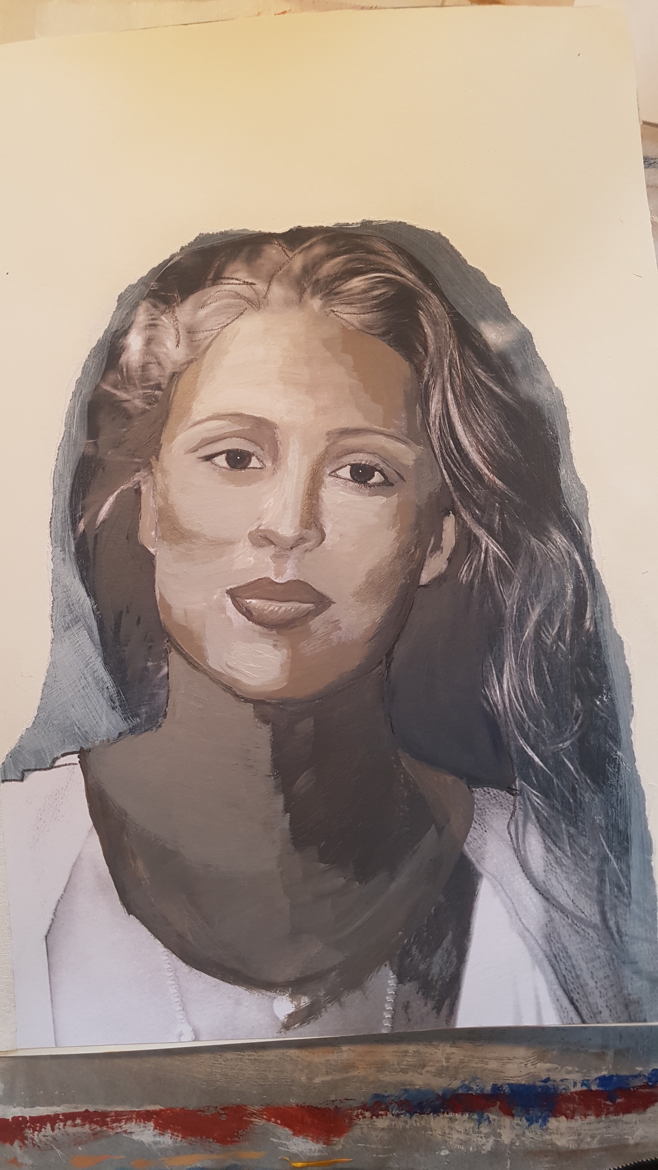 Tonal Underpainting, Van Dyke brown, white and Paynes grey. Neck is far too dark!!
 Next I painted over it with colour, skin tones (this was very challenging!), plus I added some appropriate ephemera undercollage on the left page and gessoed over it with a mix of clear and white gesso.
 I painted the background with some blues and greens (all mixed with a bit of Paynes grey and Raw Umber, I didn’t want bright colours) and added some stencilling (a beloved Stencil girl gnarly tree stencil)
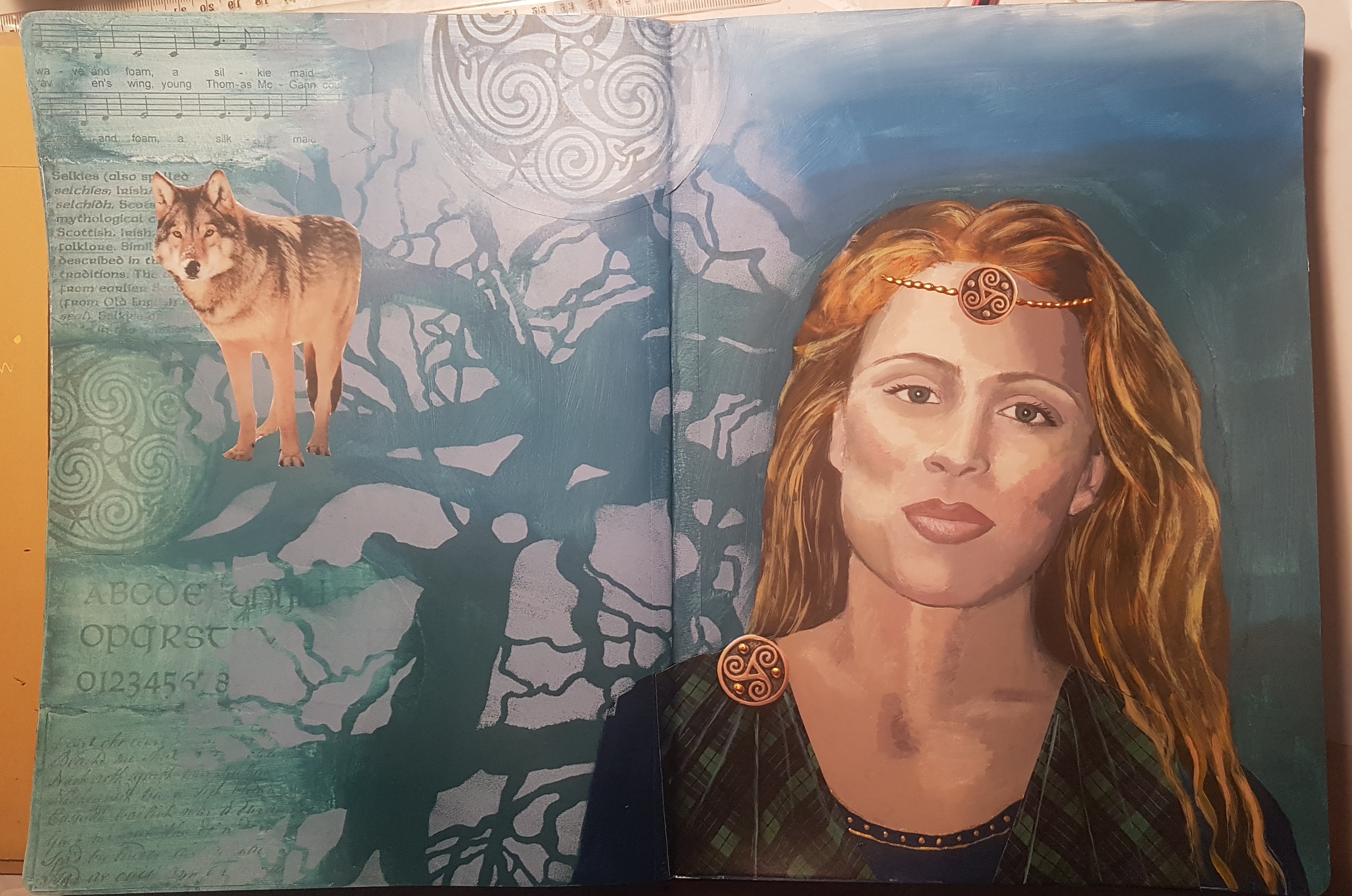 Next I added the wolf, the tartan and jewellery embellishments and I painted the celtic shield at the top with gold. To finish I painted the flowers, then did some writing.
 We were directed to use a stencil in the centre in a dark colour.