I’ve made a short video about my classes in Brunswick Heads featuring some of my lovely students and some of my art journal pages .
I’ve made a short video about my classes in Brunswick Heads featuring some of my lovely students and some of my art journal pages .
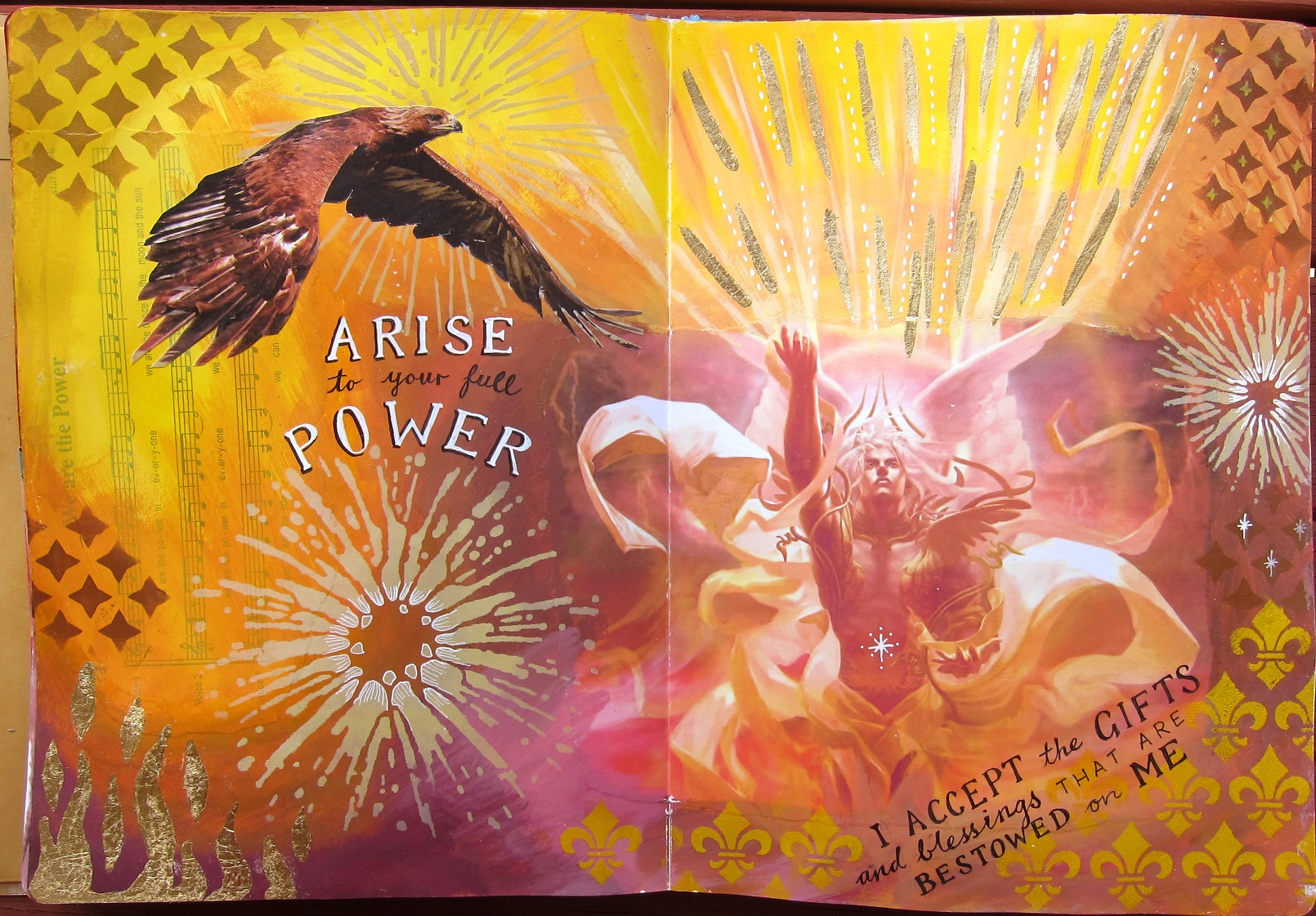
Earlier this year I taught a series of art journaling classes on the 7 chakras. We focused on one chakra per class, exploring the colours and themes of each chakra on a journal spread. I created some art journal pages on the chakras myself before each class, to provide some ideas and inspiration. Here are some of my chakra pages.

 1st Chakra pages: colour red
2nd Chakra: colour orange

Third chakra: Yellow
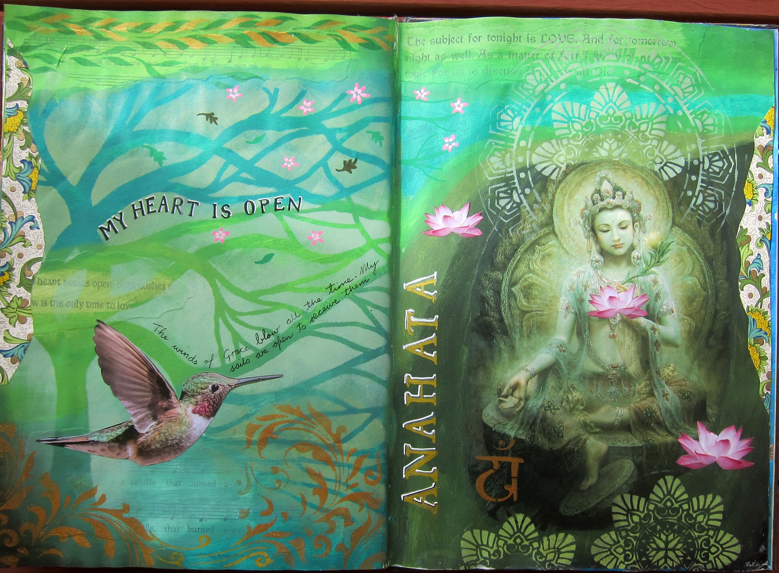
4th chakra: heart
Colours green and pink
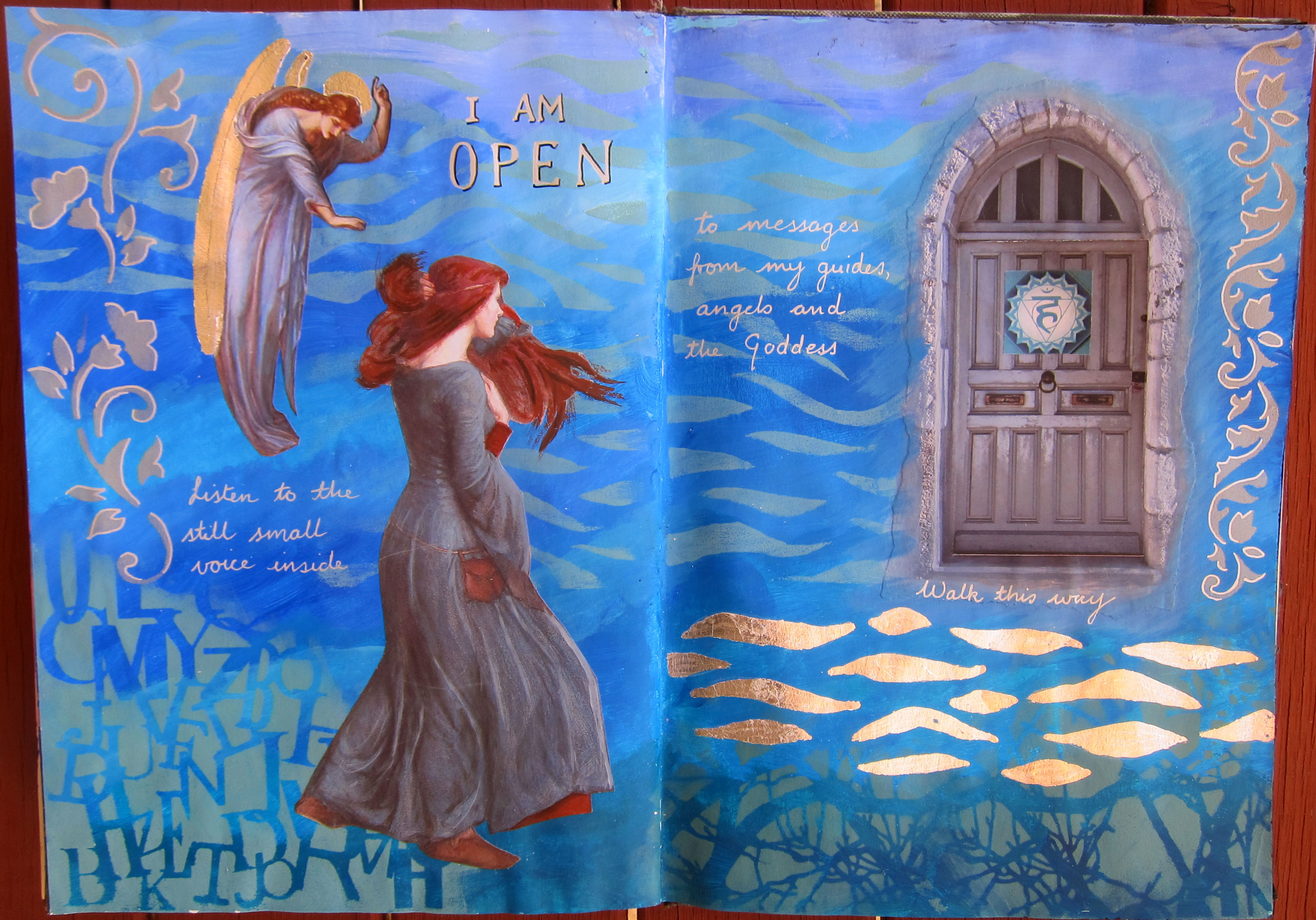

5th Chakra: Blue
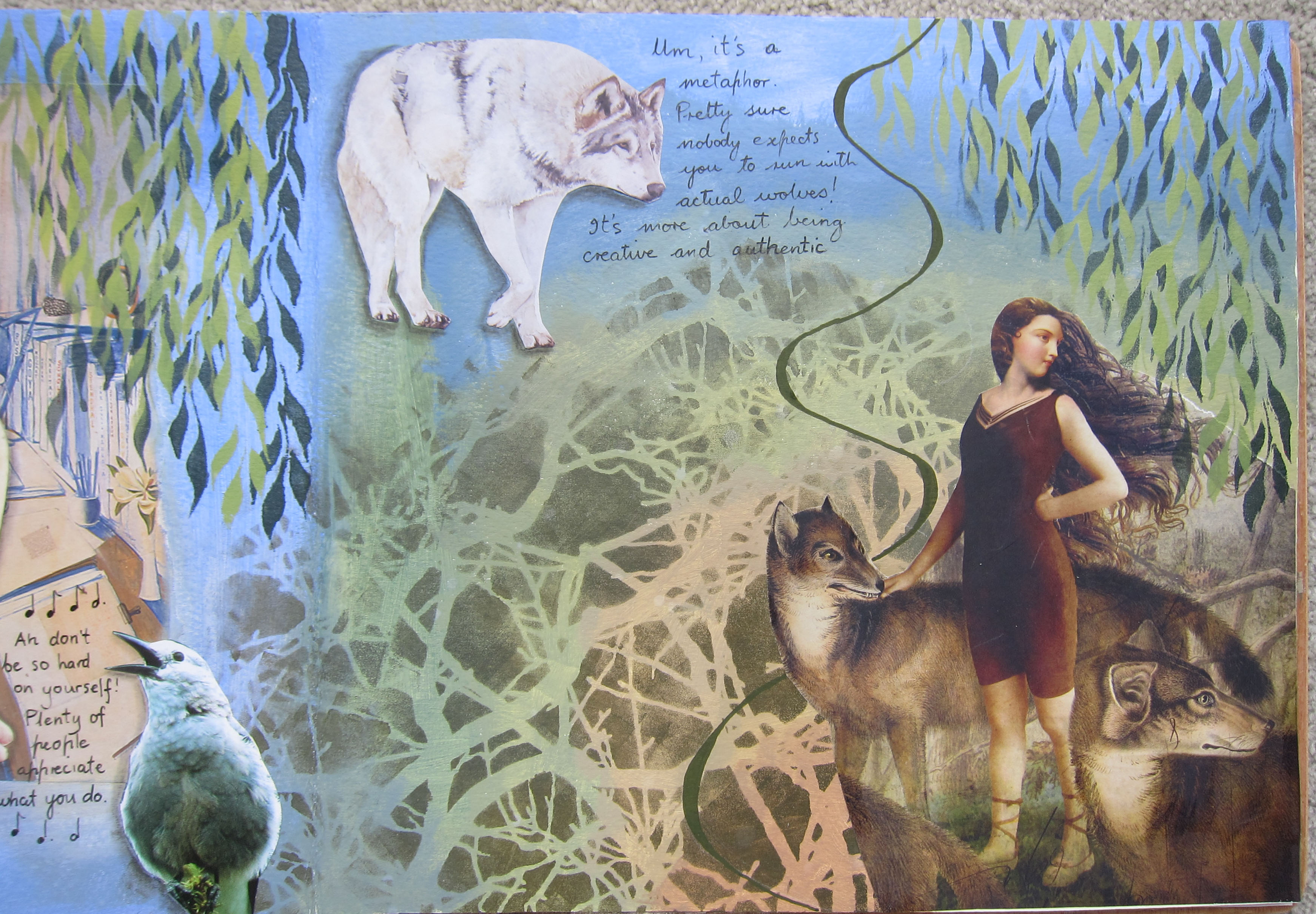
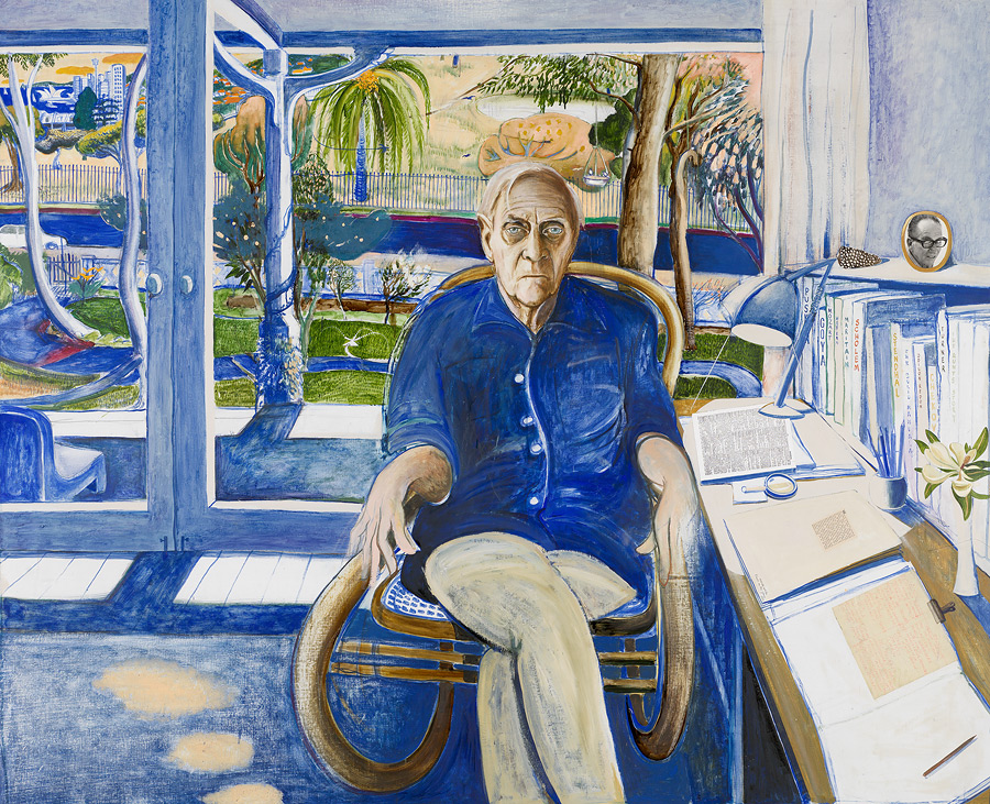
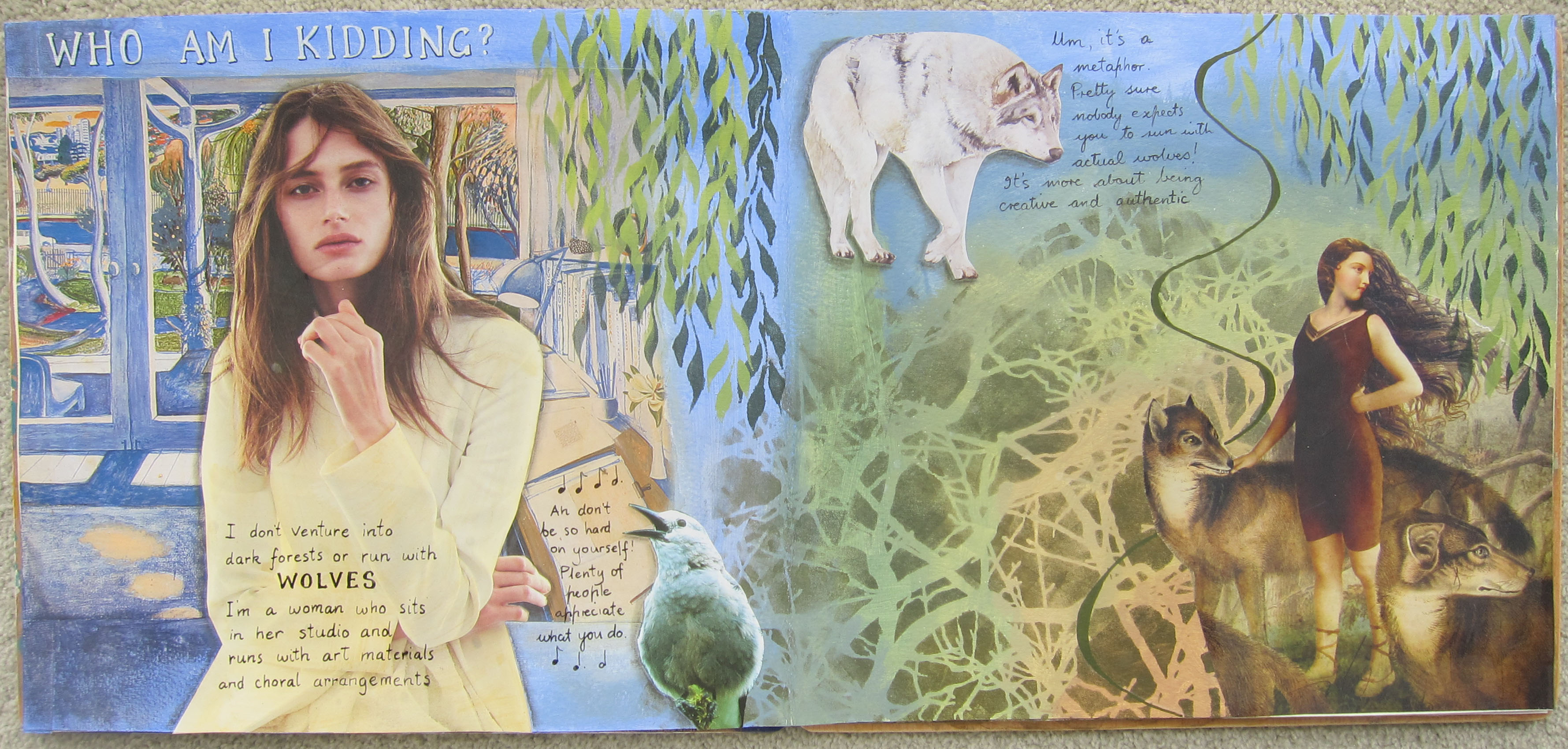 Another page in my” Inspired by Brett Whiteley” journal for the online course with Kelly Kilmer. For this page I started with Whiteley’s painting of Patrick White sitting in his office or studio. My idea was to cut out Patrick White, replace him with the woman and stick him on the right hand side of the page separately. He looked a bit grumpy though so in the end I didn’t use him. I had some images from a Womankind magazine article about Women who run with the Wolves, one of my favourite books, and one I draw on quite a lot for stories and quotes in my Heroine’s journey course. After I stuck down the image with the wolves the meaning of the page started to become apparent, ie am I a bit of a fraud quoting from this book when I am not particularly “wild” and spend a lot of time in my studio, not out on the wild!?
I extended the image of the painting of the studio with ultramarine paint mixed with white and on the other page I mixed Ultramarine with yellow, yellow ochre and a smidgen of burnt sienna to get various shades of browns and greens, soft foresty colours like the ones in the lovely woman with wolves painting (which was painted by Catrin Welz-Stein). Then I used a new stencil from Stencil Girl, (that i was dying to use) of the branches. The right page was looking very mystic forest but the left page was too blue and stark white so i washed over the studio and the woman’s outfit with transparent yellow ochre paint to tie it in with the right hand page. A wolf and a bird found their way on to the page and they both had something to say to me! I added a Whiteley style swirl (in Olive green posca pen) and some writing and the page was finished pretty fast. You can probably read the writing if you click on the images to enlarge them. Thank you for visiting my blog.

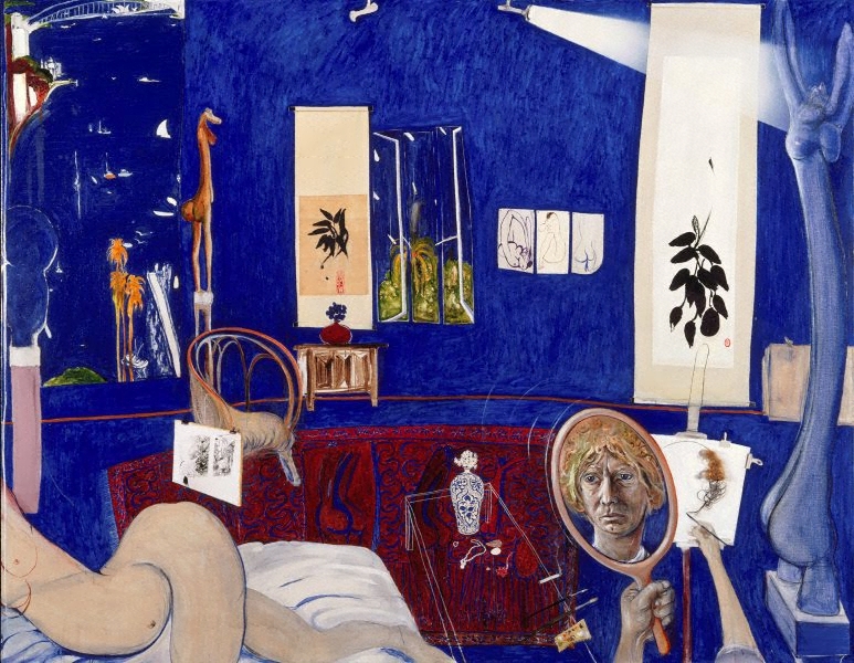
I will also include here the Whiteley portrait of Patrick White. You can see I used the background.
Last month I enrolled in an online art journaling course with Kelly Kilmer, in which we choose an artist for inspiration and use some aspects of their work in our journal. This could be by collaging some pieces of their paintings, copying some of their shapes or design elements, using their colour palettes….or all of these methods. Kelly inspired us by showing how she had made beautiful art journals inspired by Georgia O’Keefe and Frida Kahlo.
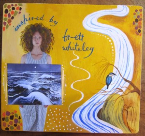
I chose Brett Whiteley as my artist because 1. He is Australian 2. I love his paintings of Sydney harbour which are special to me as Sydney was my home town until I was 26. 3. I think he was an incredible artist.
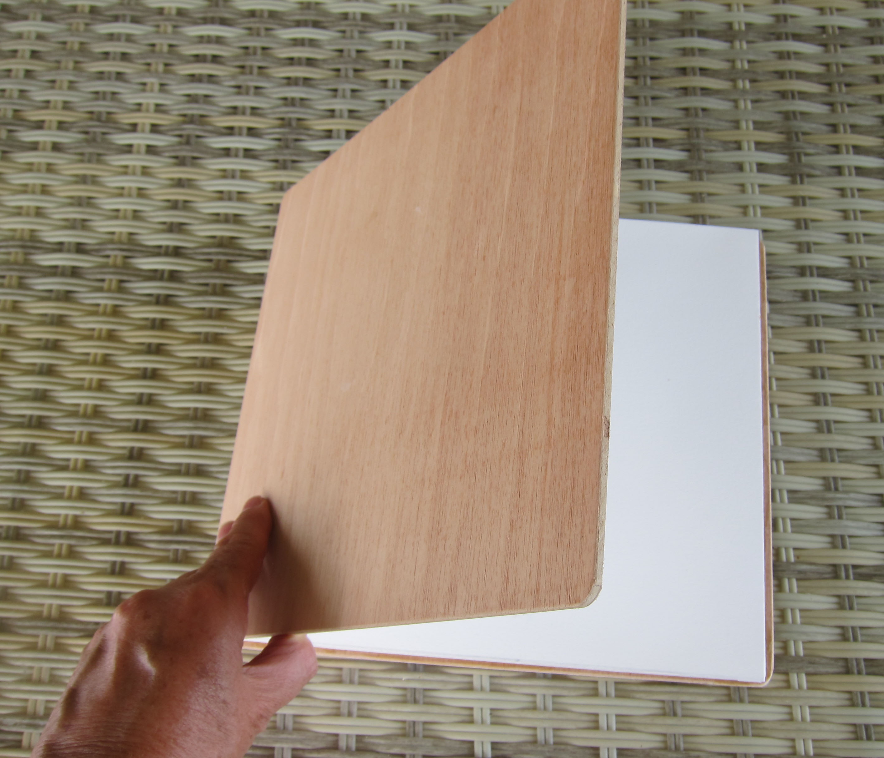
We were supposed to make an art journal from scratch using stitching and bookmaking techniques but I knew that would be time consuming and difficult so basically I decided I couldn’t be bothered. Instead I cut some 300gsm hot pressed (ie smooth) watercolour paper into 2 strips and make a concertina (accordion) journal…easy peasy! I coated the whole thing with gesso both sides, then decided it needed 2 stiff ends, so my dear husband offered to cut and sand 2 pieces of wood for me which i glued on either end. It looked and felt fantastic and I couldn’t wait to get started in it.
 The first decision I made was that I would mostly stick to the colours that Brett Whiteley used in his paintings. I read that he LOVED ultramarine blue so I started with a double page spread that was a homage to his Sydney harbour paintings. The second decision was that I would include a focal image of a woman cut from a magazine like Kelly Kilmer does on most of her pages. This figure would represent me, or some aspect of me perhaps. The 3rd decision was that I would make the page, then ask it what it had to tell me, or what it was about as I got near to finishing it, much like i do with making SoulCollage cards. That would help me to decide what to write on the page.
 I thought I might use stencils on some pages, but not all and that I would sometimes try to actually paint some things myself rather than just rely on collage.
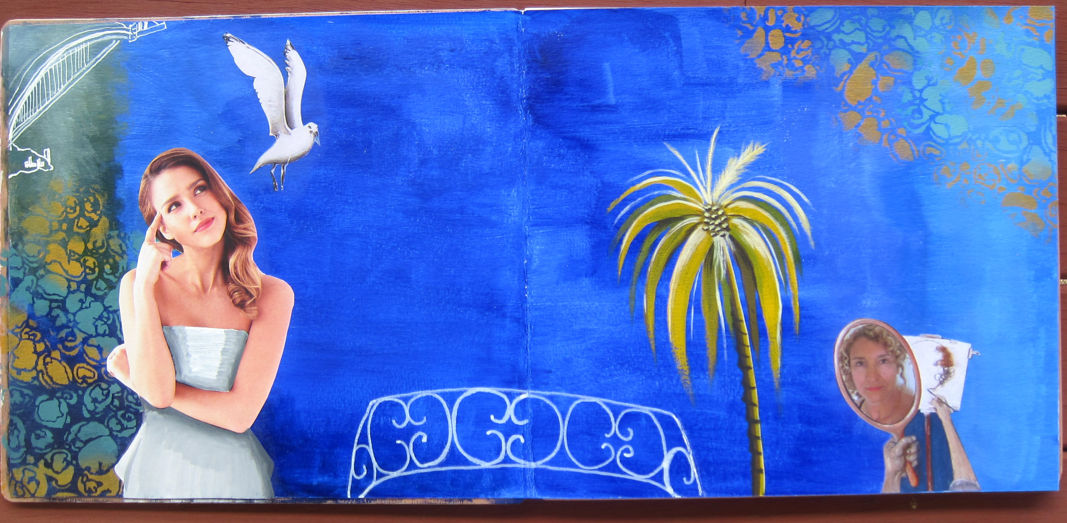
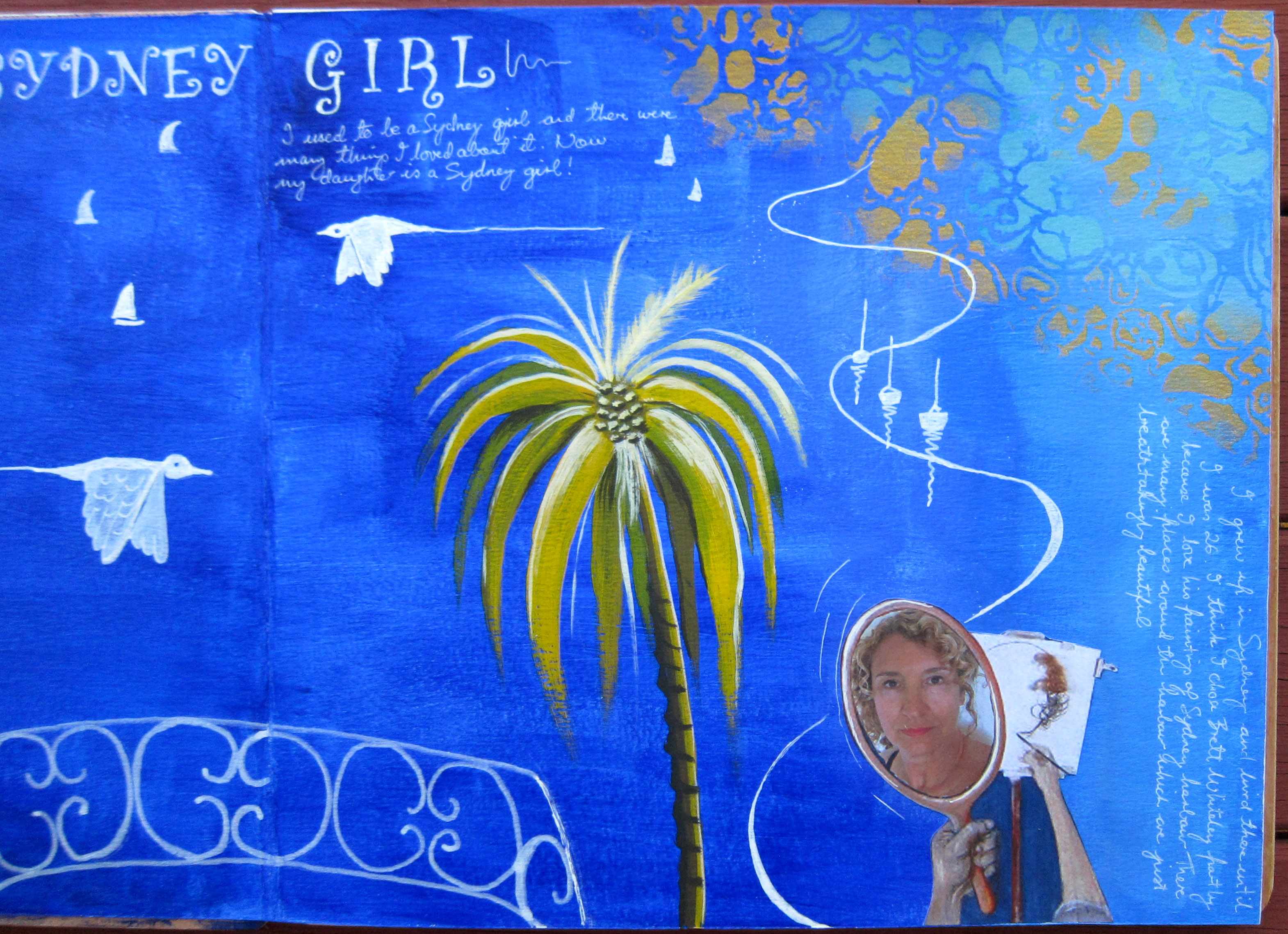
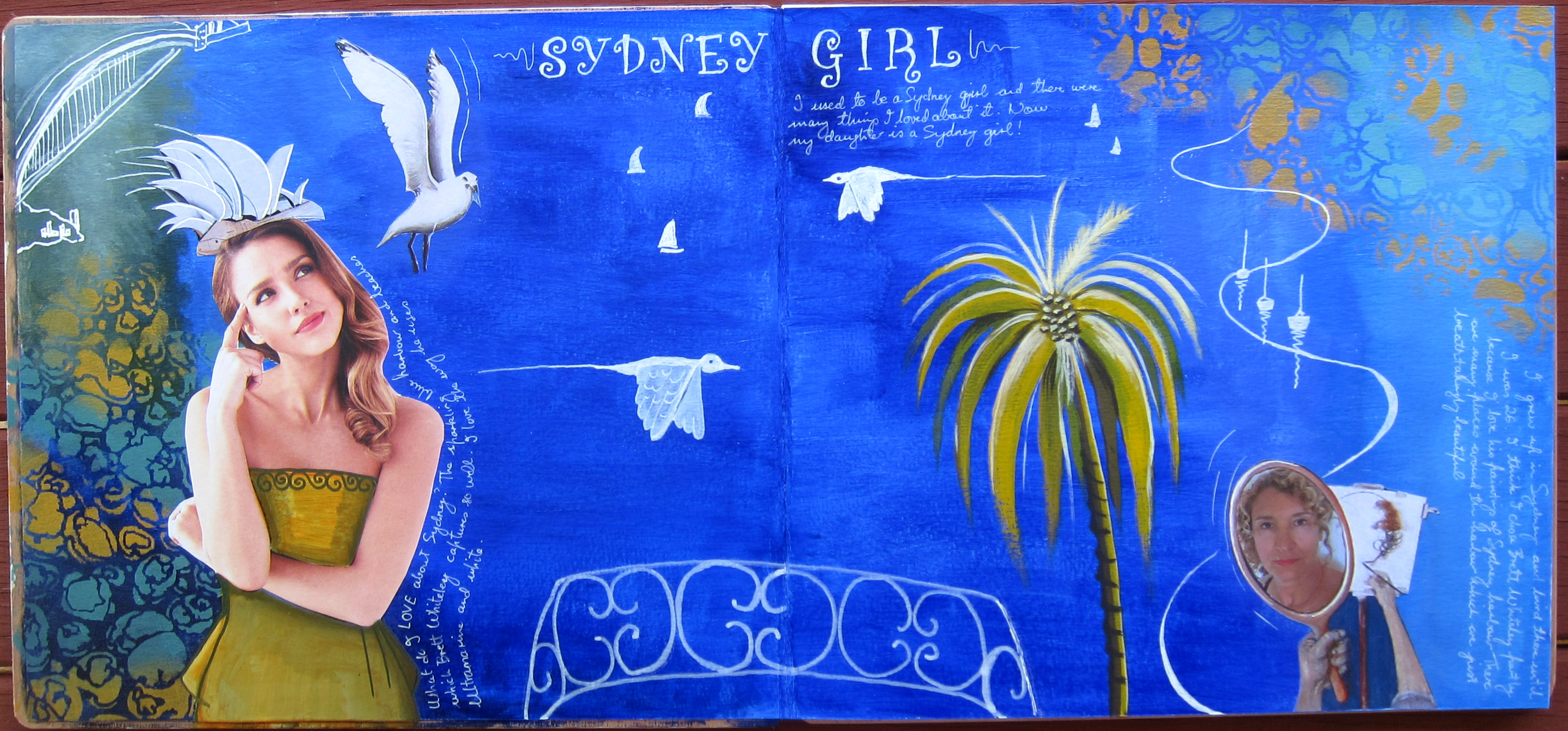
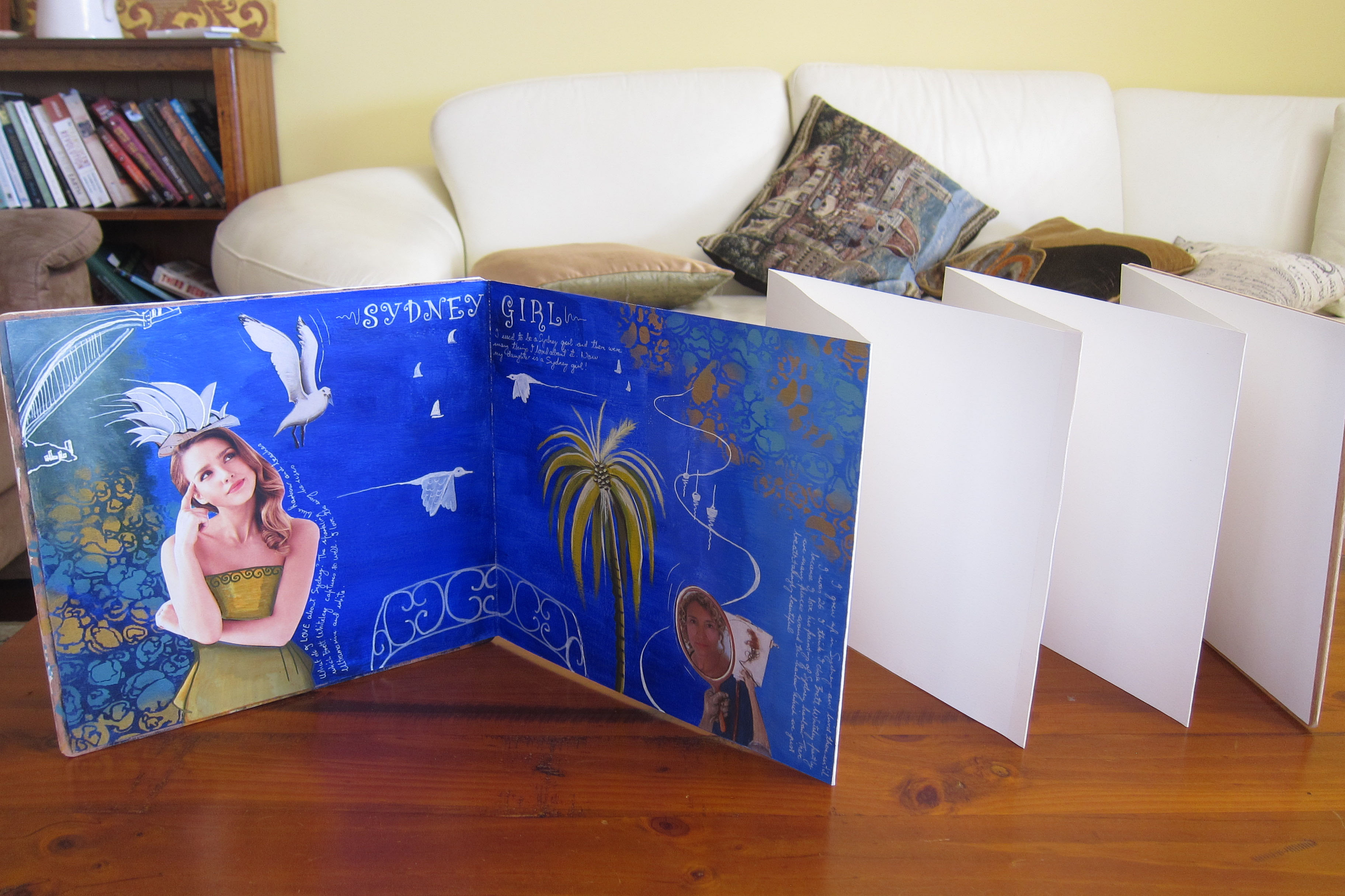 I started with a good coat of ultramarine paint and copied the balcony of wrought iron from Whiteley’s painting called “the Balcony” with a white Posca pen. I used his self portrait in the mirror but replaced his face with a photo of my face. We both have curly blond hair so actually it doesn’t look very different!! Then I wanted to have a go at actually painting something in his style so I copied a yellow palm tree from one of his paintings and I was pretty proud of how it turned out. I also copied the way he drew/painted the Sydney harbour bridge in one corner.
The seagull is cut from one of his paintings and so is the opera house which i turned into a hat for the woman. She is thinking about what she loves about Sydney harbour, and the writing I ended up doing is about my relationship to Sydney and what i loved about it. I finished off the page with some Whiteley-esque flying birds, some little white boats and the sort of swirl shape he uses a lot. I forgot to mention that I used a Stencil girl stencil called “Rock Pools” on either side in shades of turquoise and gold. Sydney has lots of fabulous rock pools that I loved as a child. All in all I’m quite pleased with my first page.
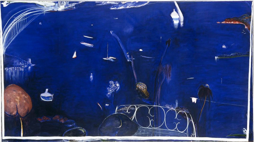
Here are the Whiteley paintings I was inspired by: 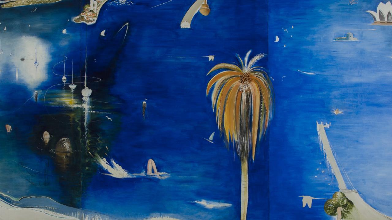
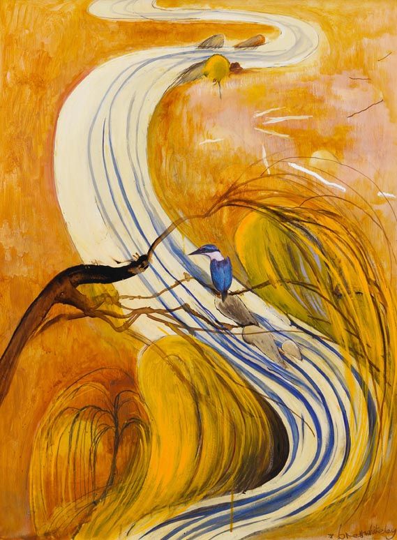
Next I painted the wooden cover with 2 coats of gesso, then some yellow and yellow ochre tones. I used a woman with curly Whiteley ish hair and she is holding a section of one of my favourite of his ocean paintings, “Thebes Revenge”. Then i bravely painted a reversed version of his painting called “Study for kingfisher” down the right hand side. here is the original:
 I can see the value of copying paintings by master painters, I already feel that I have learnt quite a lot copying Brett’s work.
Now I am on holidays in New Zealand and spent some time yesterday doing some art journaling with my sister. we have a wonderful view from our house exchange place in Alexandra. I have been working on another Brett Whiteley spread. 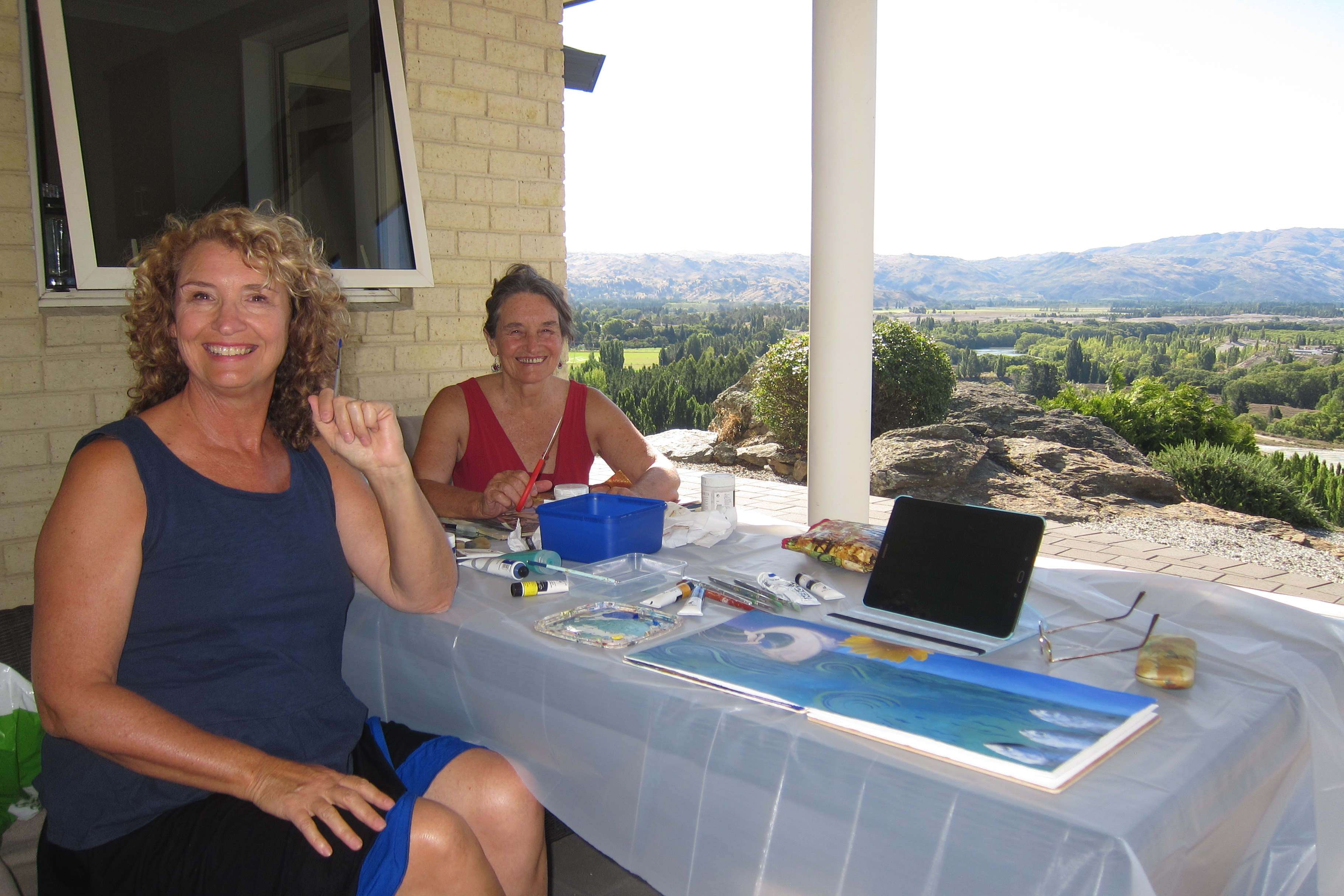 This is also inspired by his ocean paintings. I collaged his wave and seagull painting on the top left of my double page and then extrapolated from there across the page in blue and green paint. I collaged some of “Thebes revenge” painting over the dress of the woman, and also gave her a hat from it, she looks like a kind of ocean goddess emerging. She actually turned out a bit wrinkled when i glued her down, but I decided that was Ok, I’m turning out a bit wrinkly too as the years go on!! The other figure sitting on the bottom of the sea with her arms raised told me she is making waves.
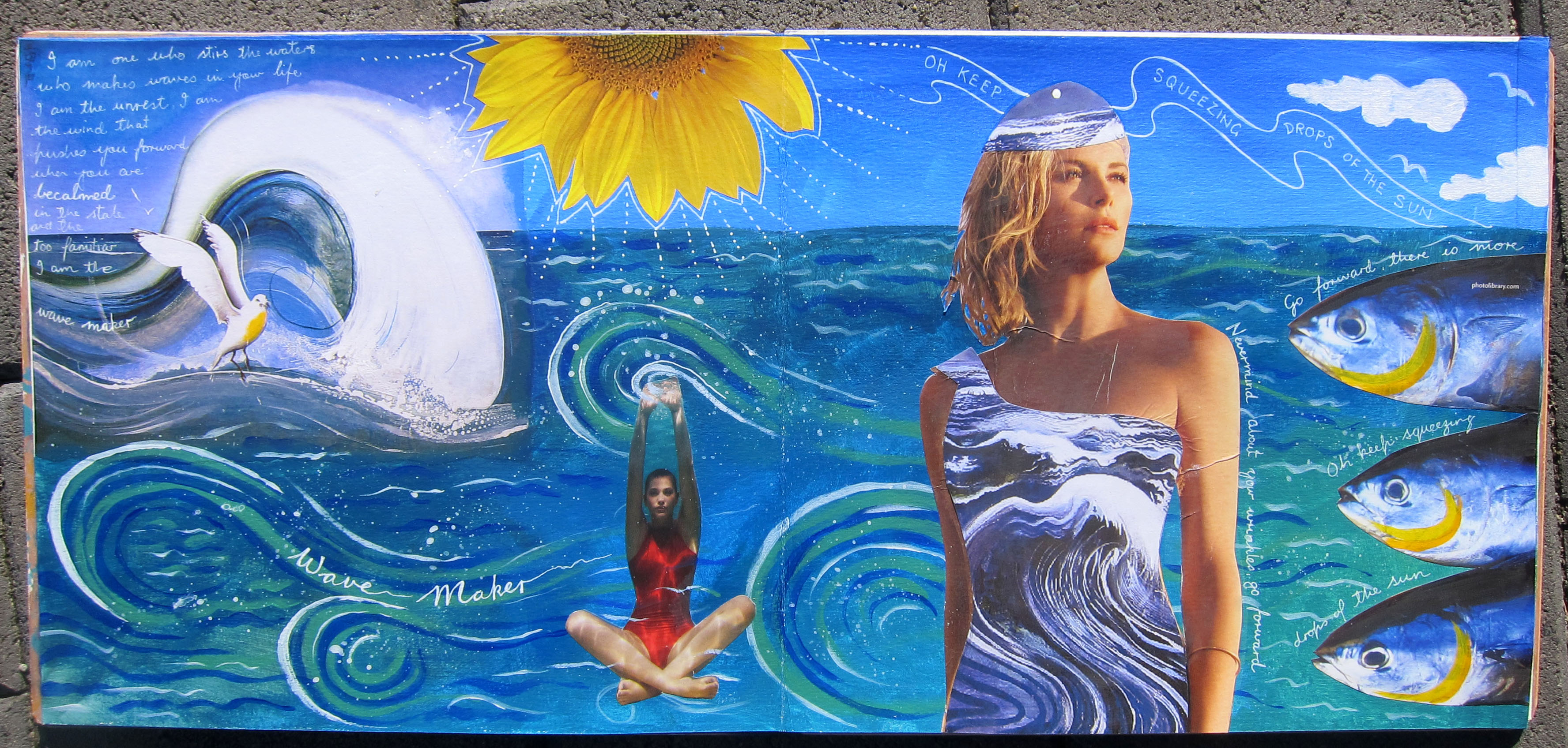
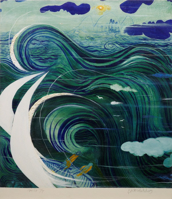
I had the sunflower and the 3 fishes images in my stash and they made their way onto the page too. The Yellow in the sunflower needed balancing so I added some yellow to the fishes gills. I copied the wave forms from this painting of Whiteley’s called “Stanner’s dream”:
 This is what i wrote on the page “I am one who stirs the waters, who makes waves in your life. I am the unrest. I am the wind that pushes you forward when you are becalmed in the stale and the too familiar. I am the WAVE MAKER”
And the fish also wanted to speak. They said “Go forward, there is more! Oh keep squeezing drops of the sun” (they were quoting Hafiz here of course).
 “Thebes Revenge” by Brett Whiteley
This has been a long post, thank you for visiting my blog.
 Just finished a new art journal spread and this time I remembered to take some photos along the way.
Step one: gesso and collage elements
 Step 2: Paint : cobalt blue mixed with raw umber, paynes grey, yellow ochre and of course all mixed with some white.
 Step 3: Stencilling with 3 different colours, 2 stencils, I’m loving that medieval look as usual. I love the colours too. Still don’t have a clue what to make this page about.
 Step 4: More collage. I happened to have an image of a grail like cup or chalice lying on my desk. I also added a pentacle and some italian patterned paper. As I was gluing down these images the words “What is your Holy grail?” popped into my head. Good question, I thought. If I was searching for a Holy grail in my life, what would that be??
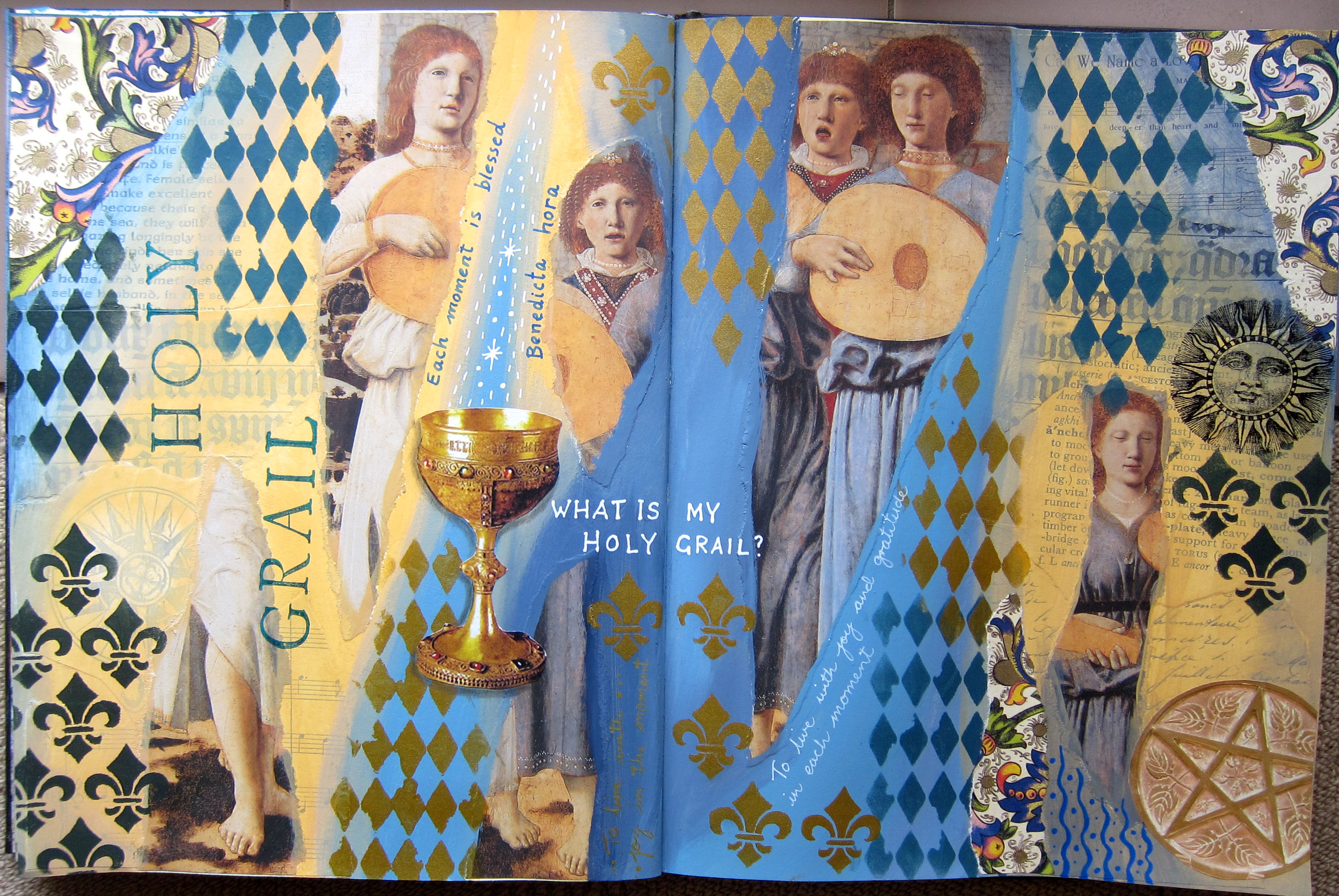 Step 5: Finishing touches. Stamped the words “holy grail”, and did some writing . I think my Holy grail would be learning to live with joy and gratitude IN EACH PRESENT MOMENT. I wish I could do that more often!
What about you? What is your Holy Grail?
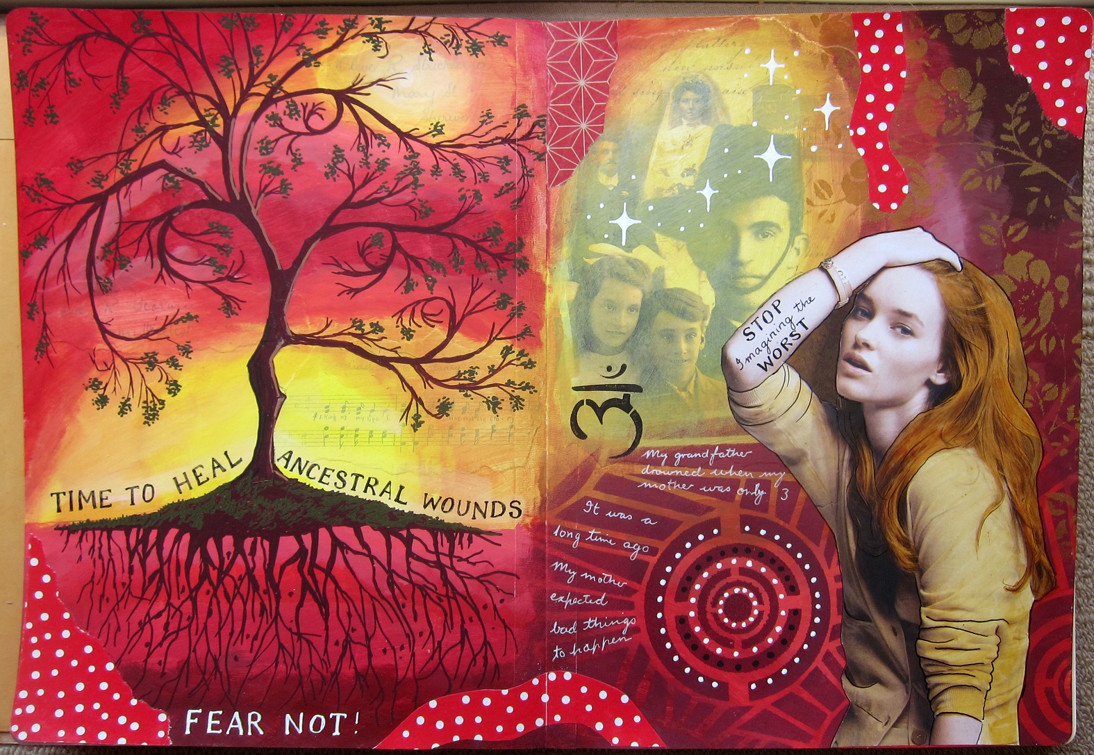
 My life and my mind have been very busy lately with arranging songs for choirs and organising several upcoming Heroine’s Journey classes. I didn’t realise that’s what this page would turn out to be about when I started it. I wanted to experiment a bit more with painting over magazine images, so i started with this image of the woman with hat…it was a black and white image and her coat appeared to be all black. First I swirled some yellow and purple together on the background, adding white to blend the colours together. Next I stuck down the woman and painted over her with clear gesso. I was wondering what colour to use for her clothes and was contemplating taking the purple and veering either towards blue or pink. I went with the pink/purple. I also had a few new stencils that I’d never used and wanted to try out. Once I’d used the stencils it started to become apparent that the page was about my business with all the creative projects I have going lately. Mostly I enjoy to have lots of creative things going, but occasionally it becomes a bit much, especially when I have deadlines (like with the choir arrangements) and a lot of organisation, as with the heroine’s journey classes, ordering art materials etc. The parrot joined the page and told me to stop squawking and complaining because I asked for a colourful life (I have a SoulCollage card called “Colourful life”)
It is fun painting over magazine images but its also easy to stuff up the face, so I’m always very careful there. Sometimes I just leave the face and don’t do much to it at all, but in this case since she was black and white, I wanted to colour her face, so I had to totally paint it. I’m quite pleased with how it tuned out, but I needed a REALLy fine brush!
I’m still wondering whether to write some larger words on the page, I’ve nearly always done that. But I notice increasingly people (on Facebook groups like “A Stand for Art Journaling”) don’t seem to be writing much on their pages, especially large words/headings. What do you think?
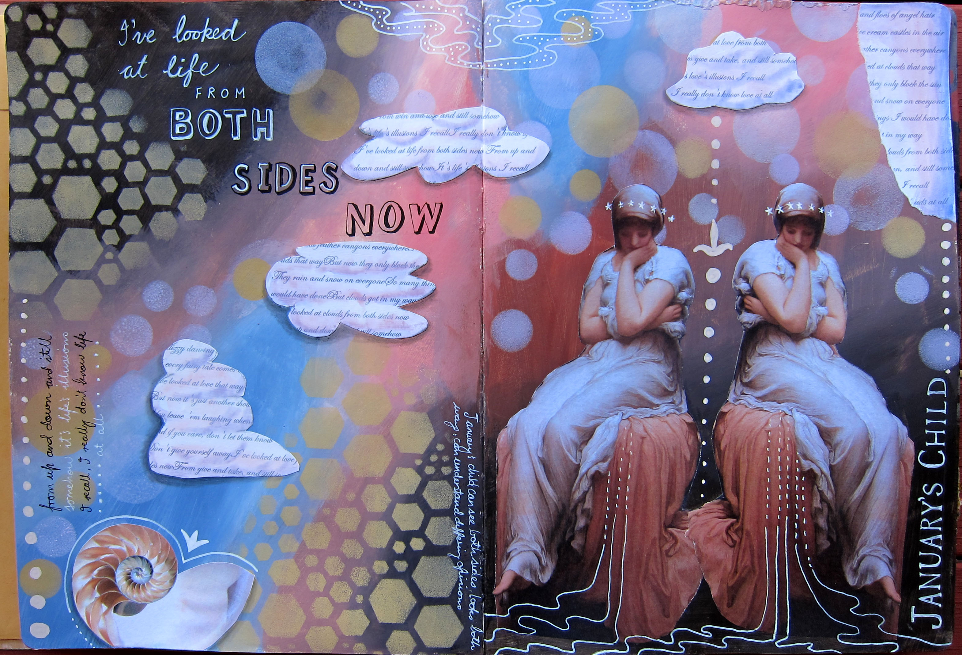
I was born in January, my birthday is coming up in one week’s time and this art journal spread turned out to be about January and also the song ‘Both Sides Now”. 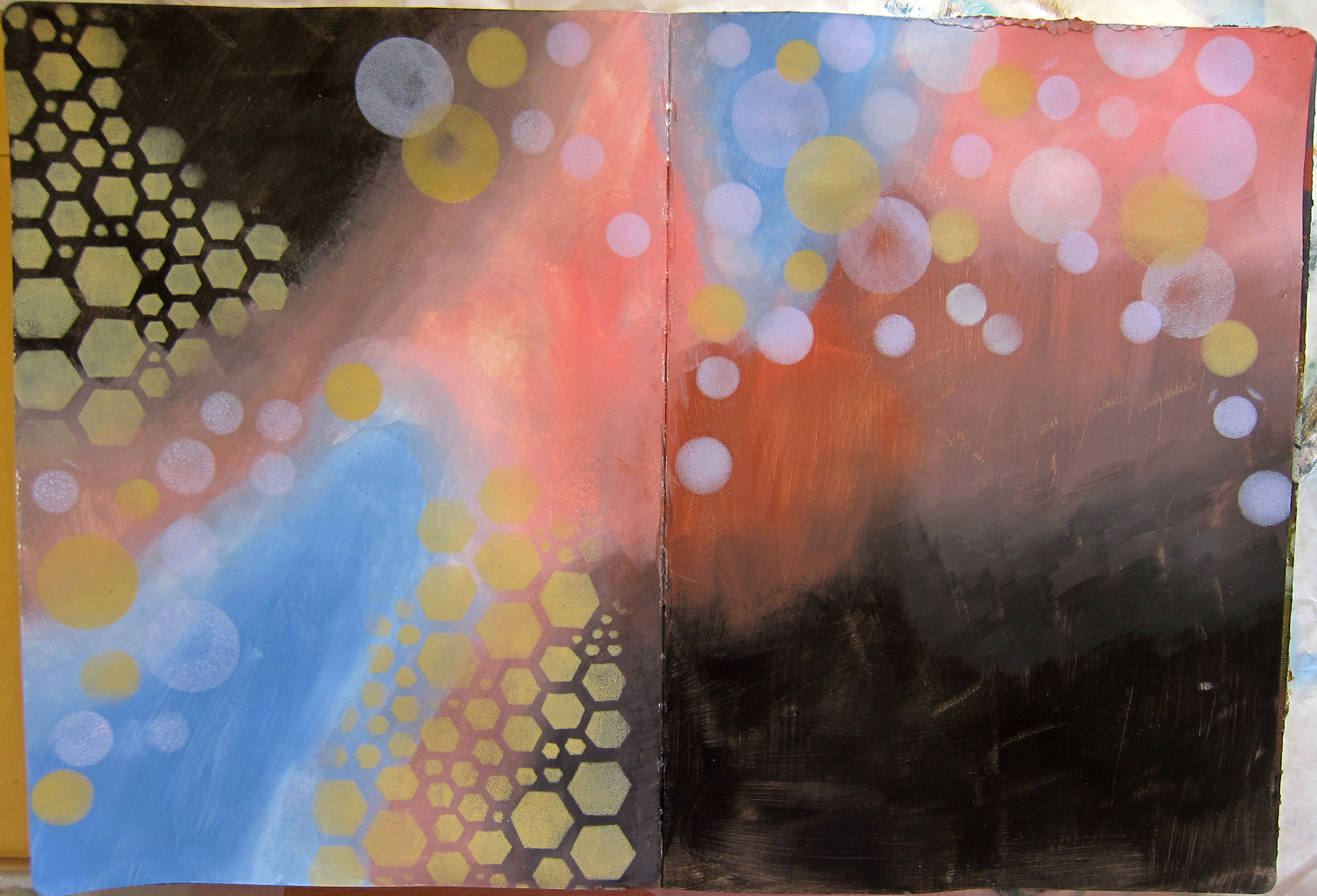
I had this image I wanted to use sometime of the woman looking thoughtful…it’s a 19th century painting by Frederick Leighton called Solitude. I sort of chose colours for the background that I thought would tone in with the image, I didn’t want really bright colours as the painting is quite muted. I used a stencil I had cut a while back with a circle punch and tried to make it look like those lights or orbs that you sometimes get in photographs (some people I know think that they are actually photos of spirit beings but being a Capricorn I’m a bit skeptical!)
Anyway I duplicated the painting and flipped it on photoshop, because Janus, the ancient God for whom January is named, has 2 heads, looking in 2 directions. As I worked on the spread the words of Joni Mitchell’s famous song “Both Sides Now” came into my head, so I printed out the words in a script font, painted and cut them out to roughly look like clouds (“I’ve looked at clouds from both sides now…”) The significance for me of this page is that I have always felt that I am someone who is able to see both sides of a situation or argument. Sometimes this means that I don’t have very strong opinions and can be a bit of a fence sitter. On a more positive note though, it gives me the ability to empathise. I don’t know whether this has anything at all to do with being born in January, but you never know!
Happy birthday to me. Blessings to all of you art journalers out there, thanks for visiting.
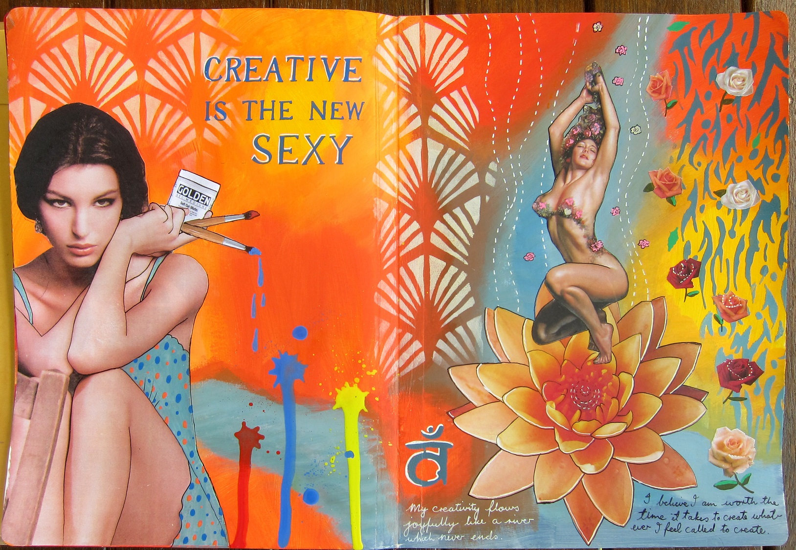
So it turns out that of all the 21 Secrets “Make a Mess Magic” spreads that I did, I love the purple and yellow combination the most. Here is my finished spread, which I called “The Goddess of Paradox”. As with all my blog posts, click on the image to see a larger version. I’ve been scrolling the net lately for paintings which are out of copyright and it just so happens that I adore old paintings anyway, especially 19th century paintings with women or goddesses 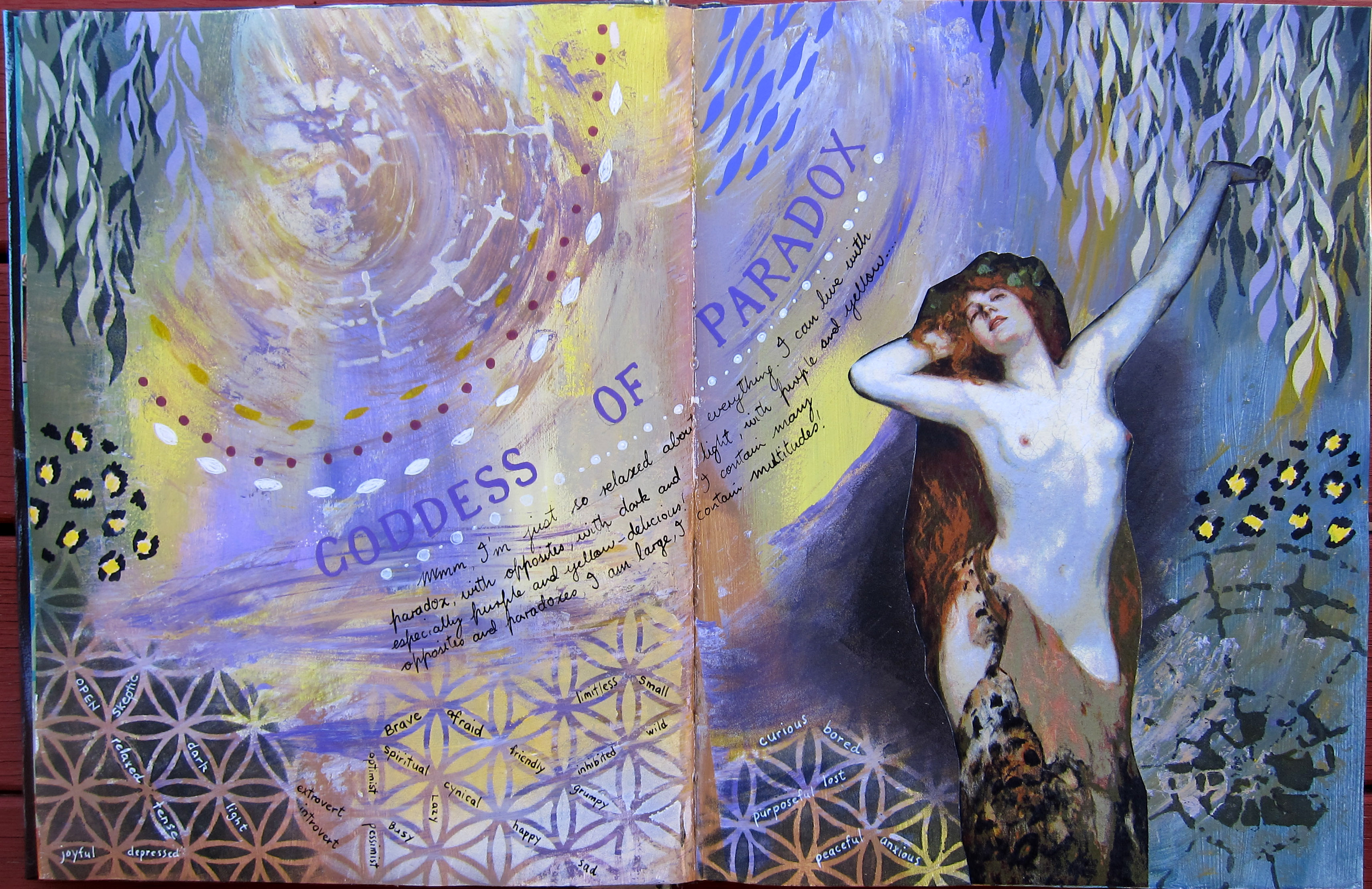 in them! This one spoke to me about how relaxed she feels about living with Paradox (she does look relaxed doesn’t she!!?) and about how she contains multitudes and many opposing contradictory characteristics, and she’s fine with that. And so am I.
I include here my process: first I made a mess using purple and yellow paint. Not only some interesting shades of brown but also some olive greens emerged, who knew?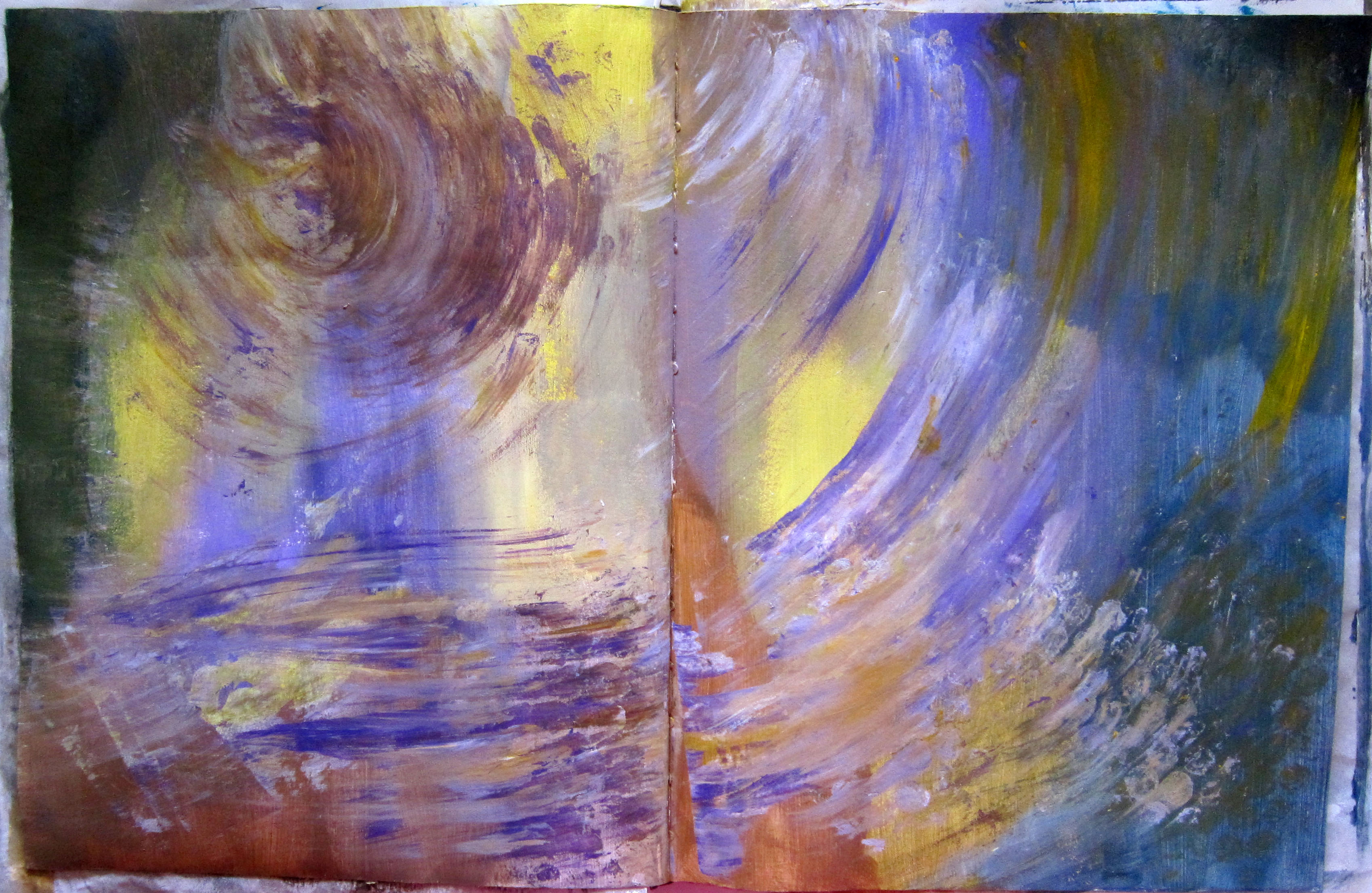
Then I did some stencilling in a dark olive green and a very light yellowy white. I started to love the page at this point. I searched my images of paintings and found this wonderful woman who had some pale purple tones on her body and i knew she was perfect. I sponged a darker area underneath where I was going to stick her, so she would stand out and also tone in better to the background.
 Finally I dialogued with her to find out what she wanted to tell me, just as I do in SoulCollage, and with most of my art journal spreads.
She said she is the Goddess of paradox and she got me thinking about how I have many opposite characteristic as part of me, so i wrote some of these in tiny letters amongst the Flower of Life stencilling across the bottom of the page. I guess we all contain multitudes, I suspect you do too! Thanks for visiting my blog, here’s a bit of Walt Whitman to finish: “Do I contradict myself?
Very well then I contradict myself,
(I am large, I contain multitudes.)”

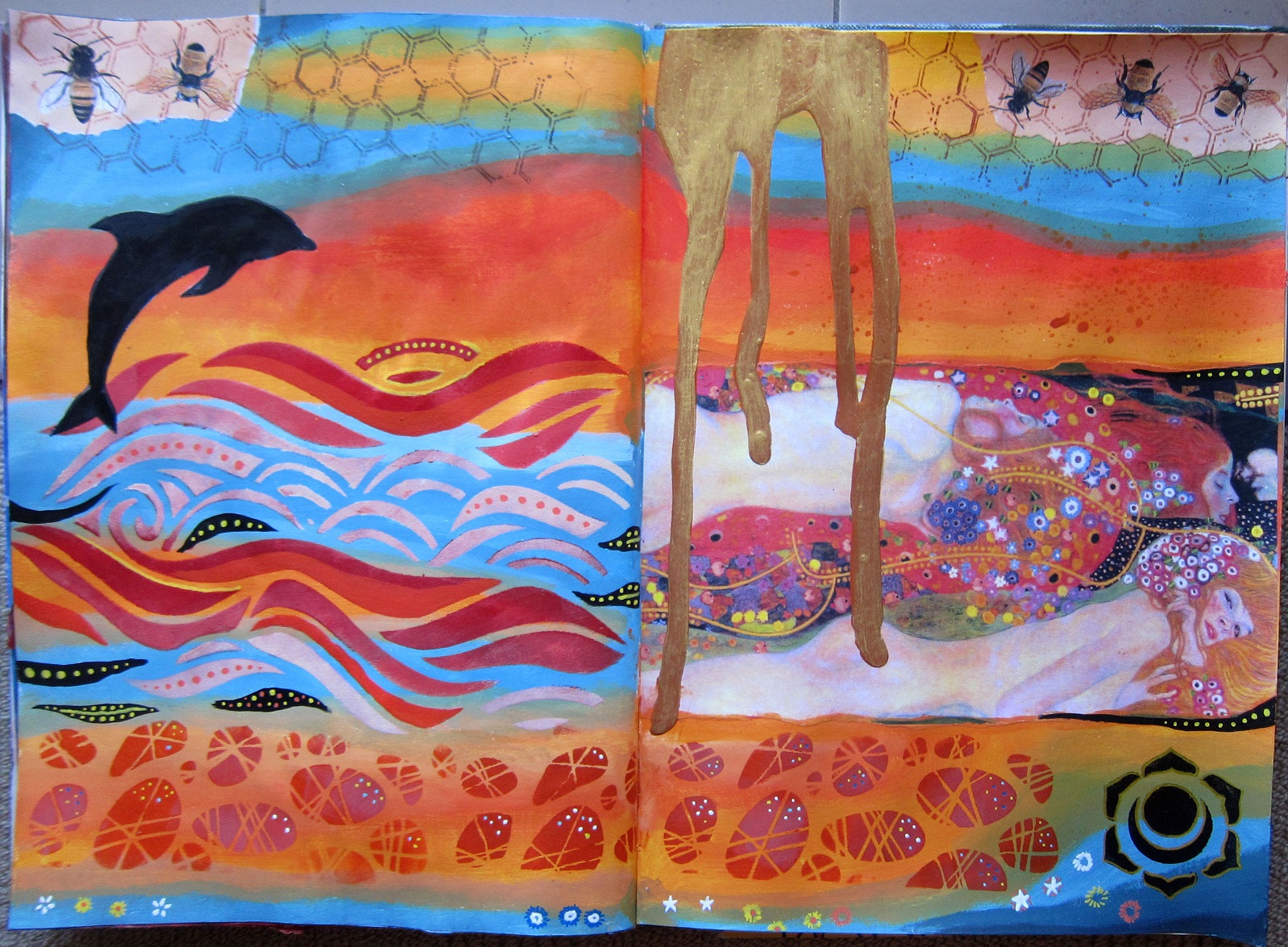
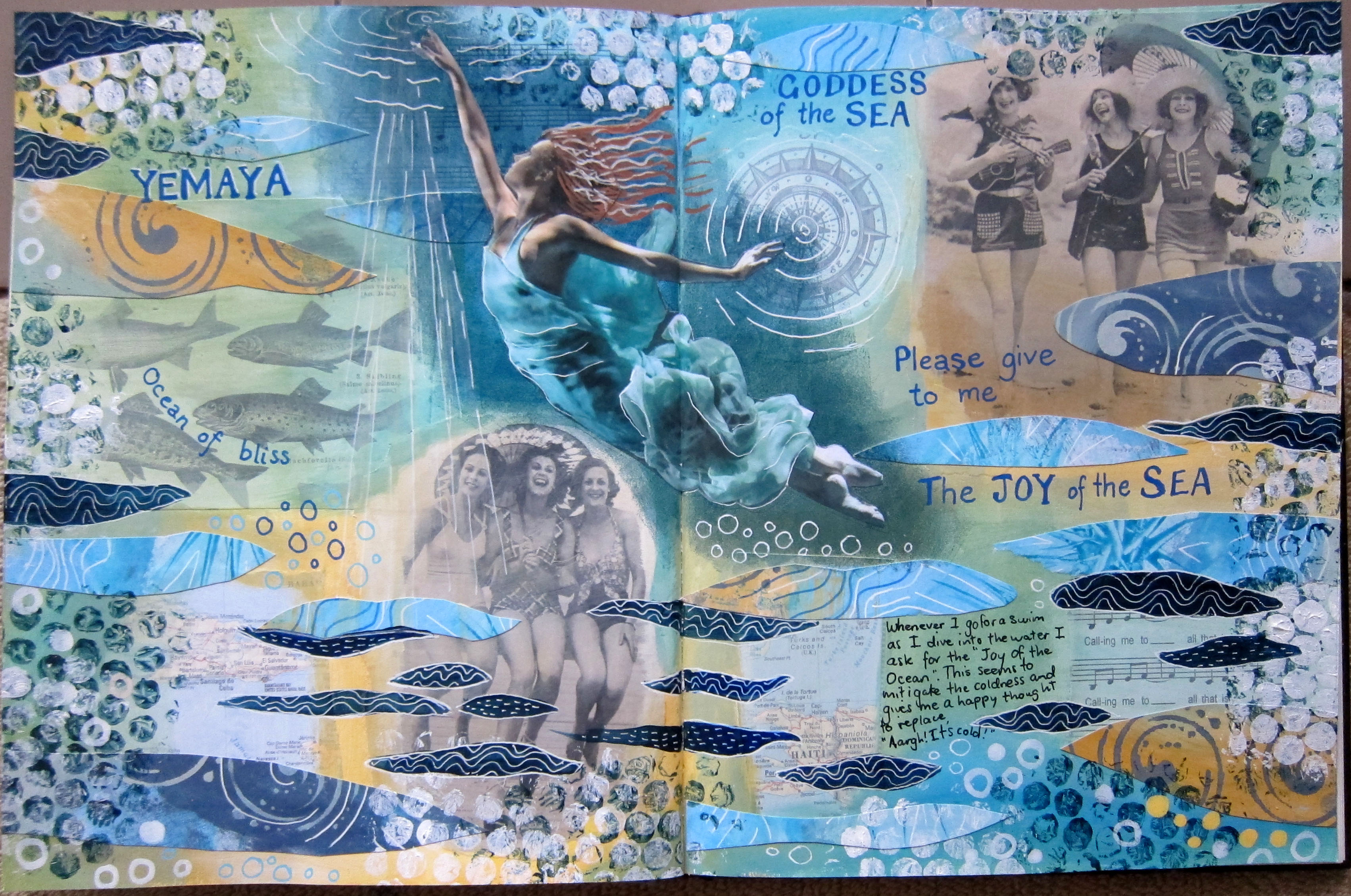 A few minutes drive from where I live the Brunswick River joins the sea at Brunswick Heads, and throughout summer and autumn I like to swim everyday in the river, at high tide if possible. Sometimes in spring and early summer it’s cold getting in, so I have a little ritual that I do. As I dive in I ask for the “Joy of the Ocean” to be mine, and I imagine the joy that all the sea creatures, especially dolphins and fish must have as they glide and leap about in the sea, and that I am receiving all that joy into my body. Somehow this stops me feeling so cold. Slightly. I imagine that I am asking this of the Goddess of the Sea. Anyway, this spread turned out to be about that.
I’ve bought several 21 Secrets online art journaling courses now. As I think I’ve mentioned, some of the classes are inspiring and others not so much. I bought the Spring 2015 class largely because Roxanne Coble was one of the teachers. I made this page after I watched her videos. I know it’s not really very like her work, but well, my own thing started happening, so I just went with it. I decorated a separate page of watercolour paper with stencils and paint and gel pens, using the same colour scheme as my spread, and cut this paper up to use as collage. Roxanne was working in an old altered book which had some black and white photos in it. As I was just working on a blank page in my Strathmore art journal and not an altered book, I collaged down some old photos and other images before I started painting. I was loving my colour scheme, and even though i tried really hard to paint in some black areas , as Roxanne is fond of doing, I just couldn’t bring myself to do it in the end. That dark Prussian blue was the darkest i wanted to use. I sponged an area of Prussian blue on which to glue my focal image of the underwater ballet dancer, so that she would stand out against the background. Here is the collaged page before I started adding paint: thank you for visiting my blog.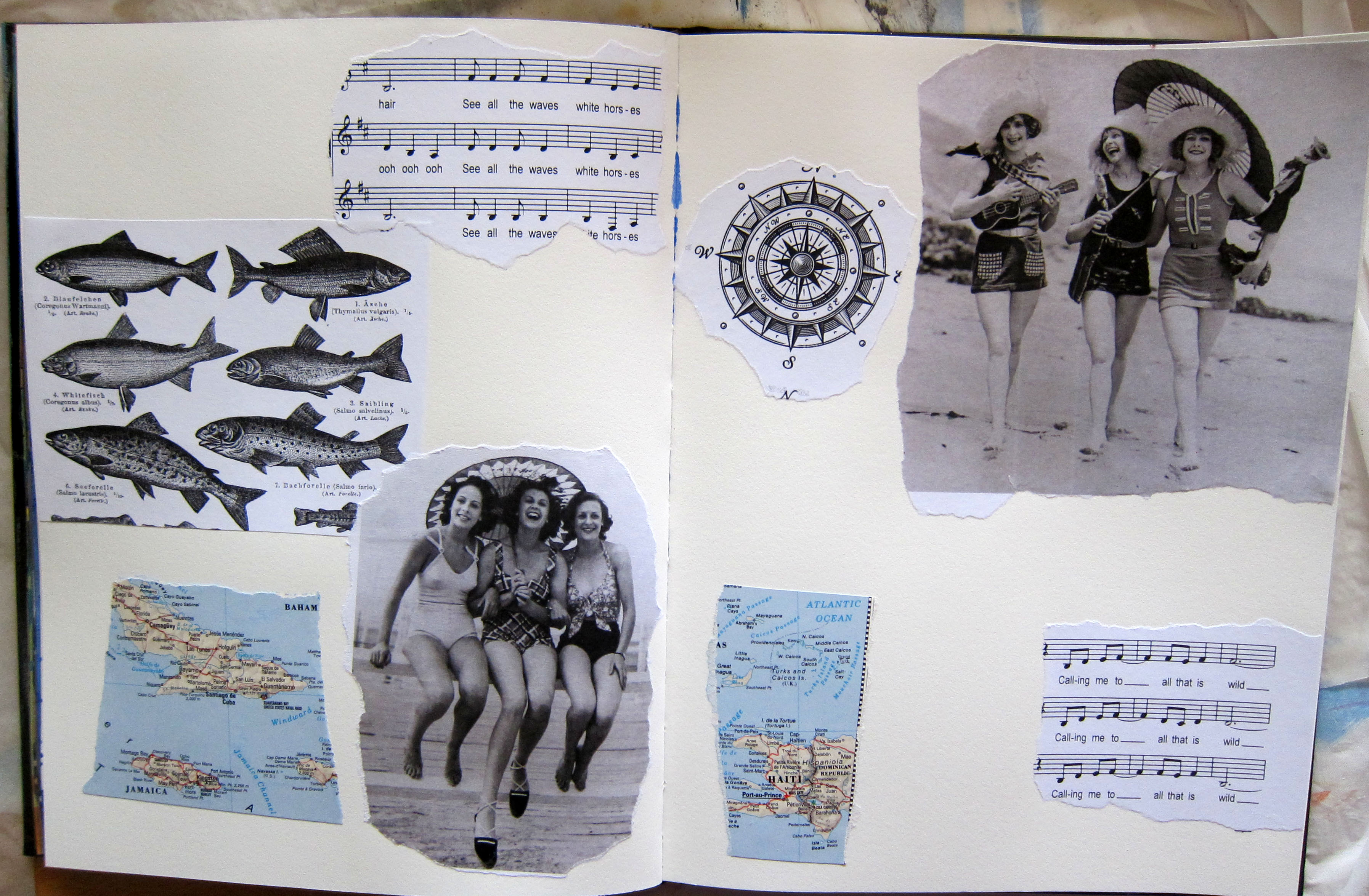
I’ve been doing the 21 secrets Color Color Color (or, as we say in this country, Colour, colour colour) online course. The class that has grabbed me the most is the one by Hali Karla called Make a mess magic. Hali invites you to make a mess, applying paint in different ways with no idea where it is going, and then invites you to make Magic from it somehow. She suggests using 2 complementary colours and exploring the different colours of brown/neutral/grey that is made by mixing them together. In her demo she used Blue and orange but suggested we could also use red and green or purple and yellow. I decided to make 3 different pages so I could try all 3 combinations.
Here is my red and green attempt. Which I HATED because the red bits looked like blood and gore. I can see that red paint used straight can pretty much look like you’ve smeared blood across your page. Or perhaps I’m being a bit sensitive?
 Anyway, I stared at it for a long time, I even smeared some gold paint on it hoping to redeem it. Eventually I decided that most of the red had to go, so I used the fern and plant masks that I had cut earlier in the year and masked around them with 2 shades of green, a dark and a light. The red was only poking through in small quantities , which was a vast improvement!
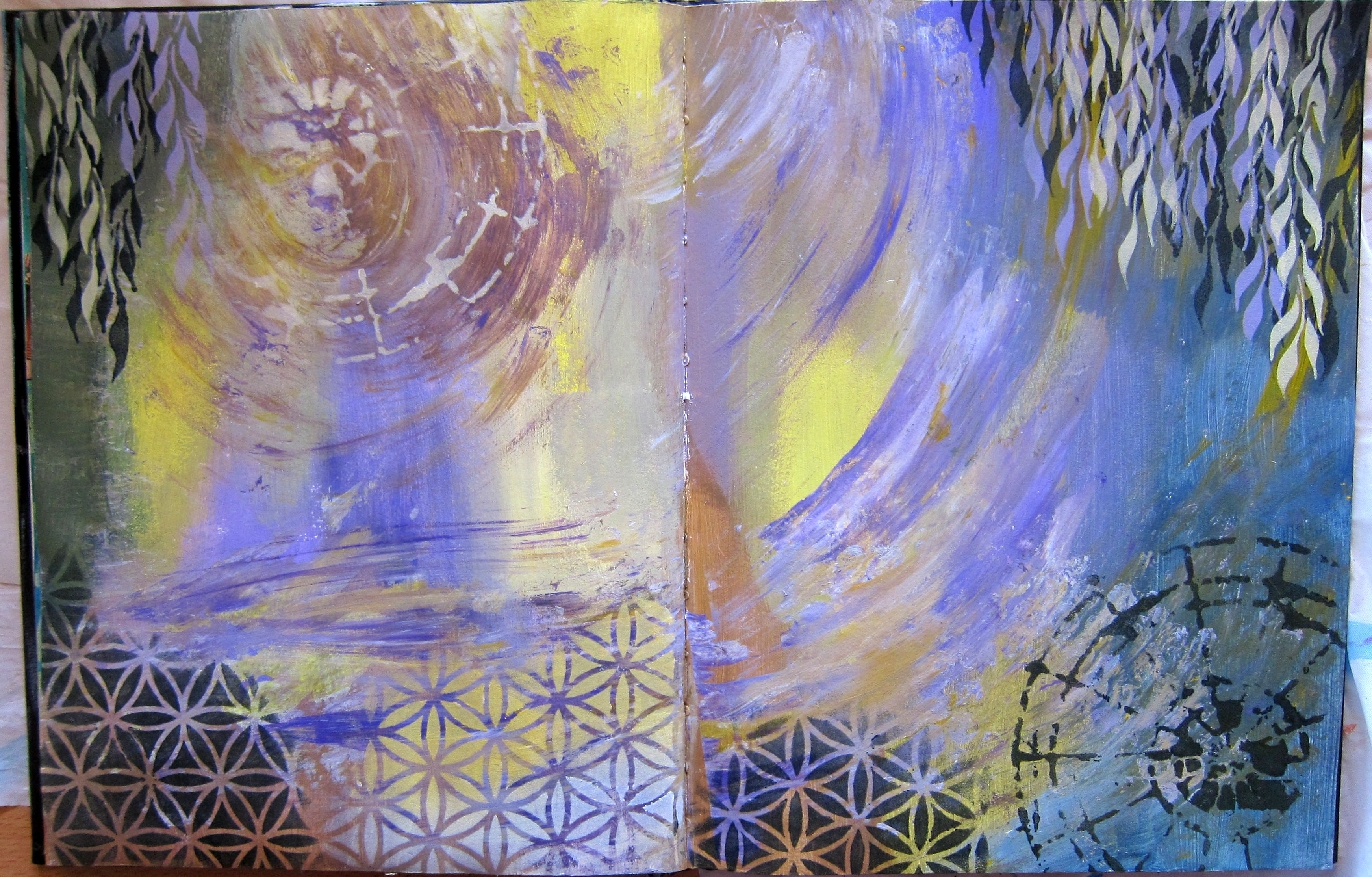
 It made for quite a colourful busy background though and so I thought it needed something in black and white to stand out. Black and white, hmmm…? I know, magpies! If you don’t live in Australia you may not be familiar with magpies, but they are everywhere here. Everytime I go out for a walk I see lots of them, usually staring intently at me, sometimes swooping down to scare you away if they have babies in the trees (in springtime). They are very cheeky birds who will swoop in to steal your food if they can. My mother loved them and used to go out everyday holding out food and calling “maggie, maggie, maggie”.
 They showed up quite well on this background, but I did have to paint a little bit of watered down white paint behind them to tone down the background. After I outlined them with some white and black pens, I asked them what they wanted to tell me. I thought it might be something timeless and enlightening, since they are quite magical birds, a bit similar to ravens, and they have an intelligent look in their eyes. But they started singing an old silly song from 1981 by Joe Dolce, “Shaddap a Your Face”. In case you don’t remember the song, I include the lyrics of the chorus here for your edification, it was sung with an italian accent. :
Mama used to say all-a time.What’s-a matter you? Hey! Gotta no respect.
What-a you t’ink you do? Why you look-a so sad?
It’s-a not so bad, it’s-a nice-a place.Ah, shaddap-a you face! I’ll include the Youtube clip below.
So my birds said to me: “what’s a matter you? Why you look so sad? it’s a not so bad! it’s a nice place!” Fortunately they didn’t go so far as to say “Shaddup a you face” but I could tell they were thinking it!
It seems a bit silly, but actually, this is quite a deep and timeless message for me. I have been feeling a bit …well, not exactly sad, but a bit FLAT and lacking in joy at times, which considering my life is actually wonderful and I live in the best and most beautiful place IN THE WORLD (and I’ve travelled a lot in the last 6 years which has only confirmed this opinion!) with a husband who is wonderful and supportive, my flatness is inexplicable and disappointing. So I need to hear the magpies’ message! What IS the matter with me? Why do I look so sad?? it’s a not so bad! It’s a nice-a place! So I’ll just Shaddap-a my face now. Thanks for visiting my blog!