School days

I belong to a creative writing group which meets fortnightly. For the last session of last year we randomly chose the name of someone else from the group and wrote a piece for them.

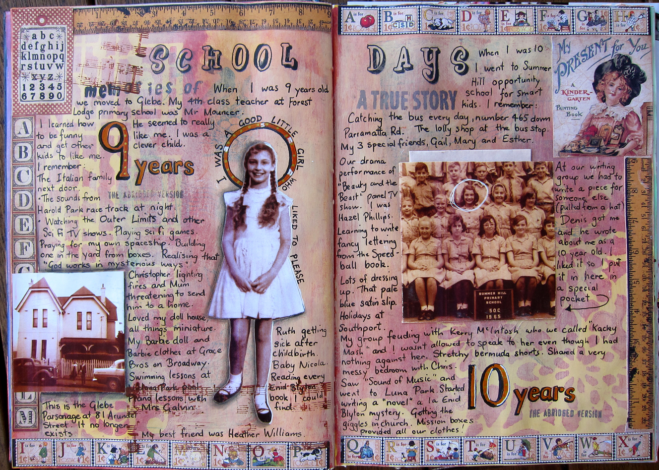
Denis got my name and wrote a lovely little piece about me in which he imagined what I must have been like at age 10. I was touched, and it also got me thinking about what I was like at that age. So I created these pages based around my memories of when I was nine and ten years old. I had some not very good black and white photos (we’re talking mid sixties here) which I photoshopped so they looked sepia because I love that sepia vintage look. I’m telling you this so you don’t think I’m older than I am!!! Anyway I had recently bought my first book of scrapbooking papers which had a School days theme, so I used bits of these papers and took my colour scheme from them. First I painted the whole page a creamy colour, than did some stenciling over it with a brownish red. It looked too bright so I gessoed over it with a cream tinted gesso to tone it all down. This was better, so then I collaged down some photos. I had a go at creating a pocket from my year 5 school photo and I folded Denis’ piece of writing and popped it into the pocket. I had quite a few memories I wanted to write, so I didn’t bother with doing fancy writing, just did my normal hand printing.

I have an unformed plan in my mind now to make a whole journal of memories of my life, perhaps starting even with my parents life before I was born. Two of my sisters have been writing some memoirs, but I suspect I don’t write as well as they do, I’m probably more visual. So perhaps a Visual memoir might be a good thing for me to attempt. It could become quite a big project I suppose. Maybe I’ll use an old book for the purpose, will keep you posted!

An art journaling month

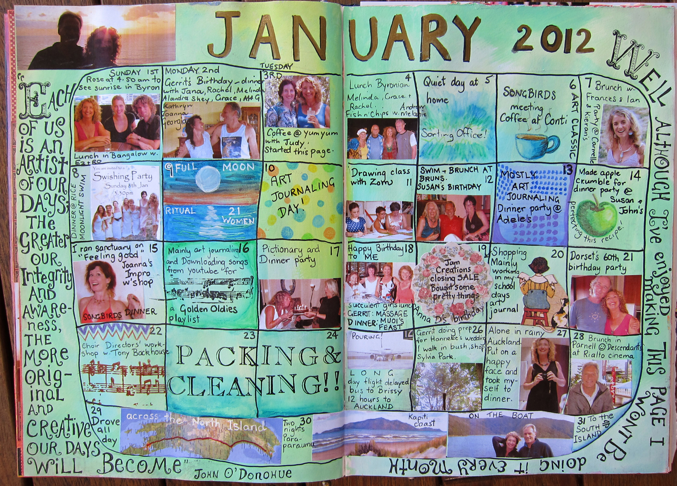
My first attempt at a calendar page! I had seen some other art journalers that did a calendar page and was inspired to begin one on 1st January. I really enjoyed this process and I LOVE looking back at it now and remembering all the events,  but it was a big commitment at the time. I decided to use photos for some of the days, but not all. I was after a variety of different ideas and media. Apart from printing out little photos to fit each day’s unique shape (thank God for photoshop and a laser printer) I used acrylic paint, inktense pencils, prismacolour pencils and stamps.

I started carrying my camera around with me everywhere, keeping in mind that I might want to get a picture for this calendar. This changed my consciousness in a way…it’s hard to explain but my life seemed to take on a new significance because everything was potential fodder for this calendar page. Each event and each day somehow became more important, and I even seemed more important, which was quite a nice feeling. So I will definitely do it again sometime, not next month because we’ll be going away for 2 weeks (away from my computer and printer!!) but maybe in May.

One thing I noticed was that because the photos had to be fairly small,  they looked much better if they were close ups. January 1st was the last day of my son Eirinn’s 2 week Christmas visit before he went back to Holland. I probably won’t see him now until April NEXT year (sigh!) so I love that there is a photo of him (with his partner Rowena) at the beginning of this calendar.

I almost immediately regretted writing the John O’Donohue quote down the left hand side because the calendar actually looked much nicer without it. The writing around the edges makes it all too busy and detracts from the calendar in my opinion. We live and learn!

Faery Gifts

I’m a SoulCollage facilitator (see www.soulcollage.com ) and have on occasions run a workshop in which I have used a guided meditation that I wrote based on the Sleeping Beauty story. In a nutshell, the participants visualise themselves as a baby and there are 12 faeries invited to their christening. Each faery comes forward with a special gift for them, for example, that they will be artistic, kind hearted, athletic etc and as they “hear” each gift they write it down (a bit tricky when you are in a light trance, but not impossible!). Just when the last faery is about to step forward the 13th faery (who was not invited) appears in a puff of smoke, and she is NOT HAPPY. So she gives the  baby an “obstacle” something that will hold them back from achieving their best purposes in life. When she disappears, cackling, the twelfth faery steps forward and says that although she cannot undo the 13th faery’s “obstacle” she can give the baby a gift which will help him/her to overcome it. The participants will afterwards go on to make some SoulCollage cards based on some of these gifts.

So this double page is based on that guided meditation. That is a photo of me as a baby, and I have written the gifts that I believe I was given at birth. The obstacle I was given is being too FEARFUL, and the ameliorating gift from the 12th faery is the gift of a “courageous heart”, because Love is always stronger than fear.

A cautionary note: Because I used pastels on this page (on the stage curtains at the top) I sprayed the page with fixative which caused some of the stamps and writing to run (at bottom of page) EVEN THOUGH they were waterproof pens. The writing at the bottom right ran so badly that I ended up printing the words out  (“For love is always stronger than fear”) and sticking them over the top. Turned out OK anyway!

A Travel Page

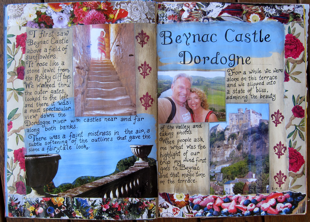
The prompt was simply to write about a place we had been, and as we had returned relatively recently from our big European trip I wrote about one of the most special moments of our holiday, ie our visit to Beynac castle on the Dordogne river in France.

The borders are just ripped from some magazines, the background was raw umber paint smeared over the gesso and rubbed back. Some sky blue was painted over part of the page and then some of my holiday photos collaged on. I’m still experimenting with my writing style, trying out different things. I tried to do a sort of curly flourishy font here, with limited success. I feel a bit dissatisfied with my own writing, everything I write in my journal looks like I’ve written it (which of course I have) but somehow I want it to look different, more interesting, more artistic.

Anyway, back to Beynac. This was such a beautiful place especially the view from a grassy terrace where other castles could be seen all down the river on both sides. We both felt very happy and I could almost imagine that perhaps we had had a past life there together. Who knows?!

Some more past journal pages

I still have a small backlog of journal pages that I want to post about before I am up to date. This first one I called “science  fiction fan” When I was younger I used to read quite a bit of Sci Fi, when I was at Uni and up until my early thirties. I don’t read it much these days, though I do still enjoy a good sci fi movie. In our art journaling class Zom gave us a prompt to write about some UNUSUAL things that we were into. Sci Fi was one of the things I thought of because it is usually read more by men/boys than women. At least I imagine it is. Anyway, her prompt got me thinking and so I ended up writing a piece about my history of being an SF fan starting with watching Superman and The Twilight Zone as a child, and reminiscing about some of the great books I have read. I pasted this little essay around the edges as a border.

It seems appropriate that I am using my first ever art journal to answer the question “Who am I?” in myriad ways. But I suppose that is mostly what people are doing in their art journals, exploring aspects of themselves.

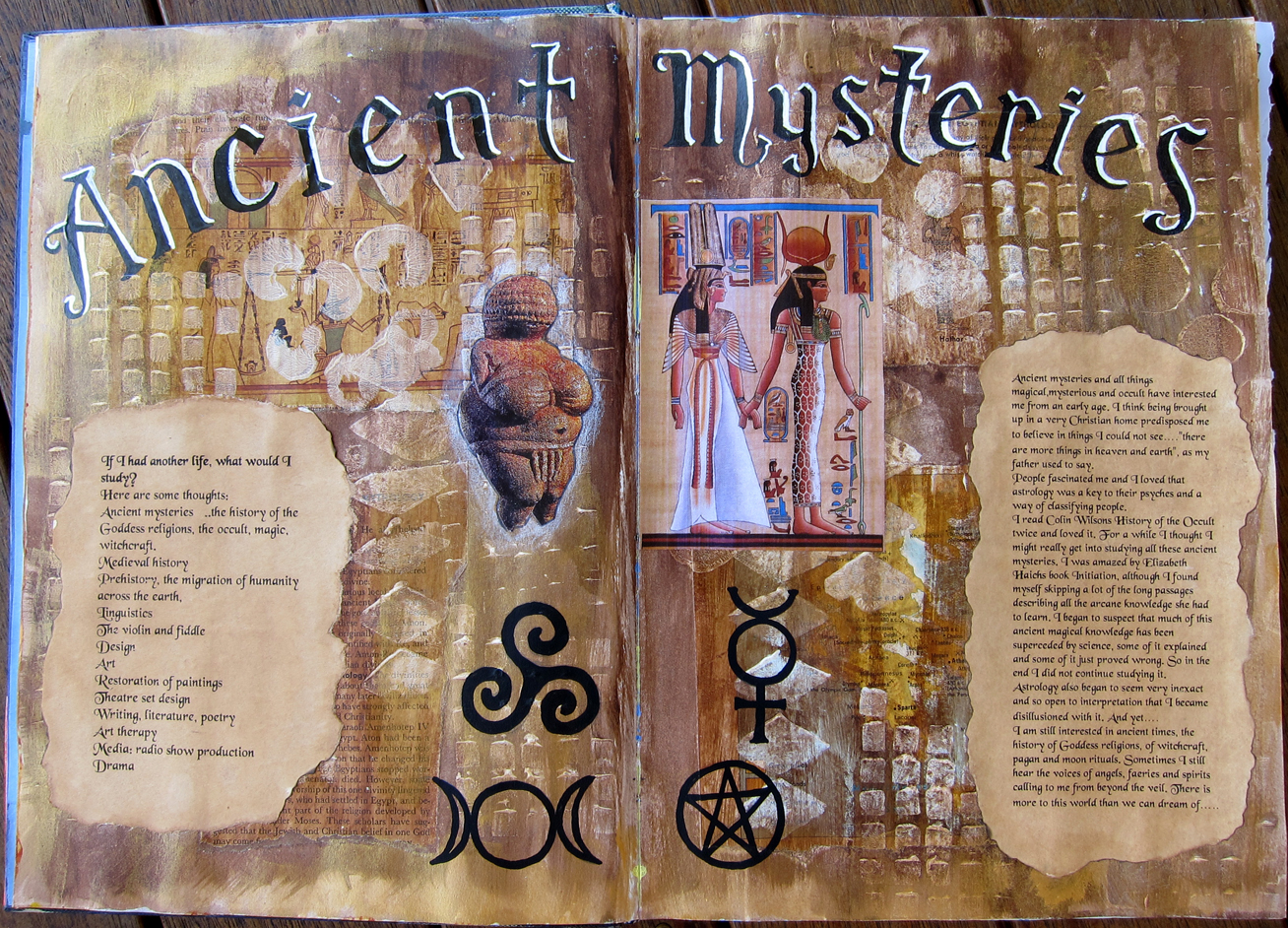
Another prompt that we were given was, if you had another lifetime what would you study? An interesting question, with of course, more than one answer! I made a whole list of things, but the one I chose to make a page about was “Ancient Mysteries”. Here it is:

The reason I chose this one was because I had already created this background, and it looked kind of ancient and seemed to fit. We made the background in the art journaling class in this way: 1. we ripped pages from old encyclopedias that had something to do with the prompt ie, what you would like to study, and stuck them down..

2. Then we stamped over them with gesso using some of Zom’s home made foam stamps.  3. We painted all over with one colour (I used burnt umber), and wiped some of it off so you could see the stamped patterns.  4. When dry, we painted a second colour over all and rubbed that back too. (I used gold)

I LOVED this background, but I thought it was so beautiful I’d never want to put anything over it! And what would show up on such a busy background anyway!?

After a couple of weeks I went ahead with the Ancient Mysteries theme and I liked how it turned out. I printed out some writing I did about the topic and made the paper look like old parchment by painting it with a wet tea bag and ripping/burning the edges. This was really lots of FUN. I had a feeling that black and white writing would stand out the best for the heading and I think that worked quite well.

Looking at both of these pages it is a little bit like they are school projects, with the big fancy headings and pictures and writing stuck down. I guess that’s Ok, I don’t really mind that. This journal is primarily for me, and I’m happy with these pages, I like the way they look and I got a lot out of the actual process of exploring these parts of me.

Songbirds

My vocal group The Songbirds performing at the writers festival in Byron Bay last August. This doesn’t have much to do with art journaling  but I wanted to test out the plugin for including youtube clips on my blog. Who knows maybe one day I’ll start making some youtube clips relevant to art journaling?  We are singing a 3 part arrangement I did of Leonard Cohen’s song “If it be your will”.

An internet prompt

Image


This was the second page I made, and it’s actually in the front of my journal. I was feeling a bit overwhelmed by my  lovely blank journal, not knowing what to do in it, so I used a prompt I found on the internet by Sarah Whitmire at  www.souljournaling.com

As I was so new to the process it was great to just be told exactly what to do. First I photocopied some dictionary pages, stuck them down and wrote over them in pencil about how I felt about starting a journal. Then I gessoed over them.  I found a black and white picture of a knight (Sarah gives a link to a site with the pictures) to represent the protector of my creativity. He is there in the front of my journal protecting me from criticism form others and especially from myself. I wrote some words on the knight indicating what qualities I would need to be creative in my journal.

On the facing page we were instructed just to write our own name in different ways, but I also decided to add some photos of myself at different ages, which I had first made a sepia colour using photoshop. Sarah had used Walnut ink on her knight picture and I loved the effect so I found some walnut ink at the art supply shop and  copied her idea, shading around the edges of the paper and of the knight. I love the aged effect it gives and it tones in nicely with the sepia photos.

I was happy with these pages and felt that I was off to a flying start with my art journal.