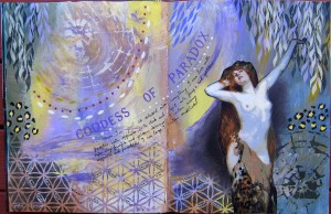
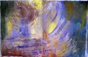
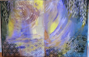
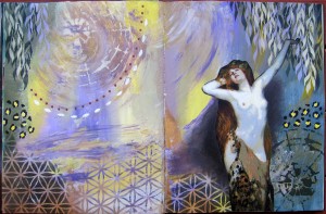
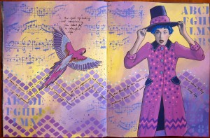
 My life and my mind have been very busy lately with arranging songs for choirs and organising several upcoming Heroine’s Journey classes. I didn’t realise that’s what this page would turn out to be about when I started it. I wanted to experiment a bit more with painting over magazine images, so i started with this image of the woman with hat…it was a black and white image and her coat appeared to be all black. First I swirled some yellow and purple together on the background, adding white to blend the colours together. Next I stuck down the woman and painted over her with clear gesso. I was wondering what colour to use for her clothes and was contemplating taking the purple and veering either towards blue or pink. I went with the pink/purple. I also had a few new stencils that I’d never used and wanted to try out. Once I’d used the stencils it started to become apparent that the page was about my business with all the creative projects I have going lately. Mostly I enjoy to have lots of creative things going, but occasionally it becomes a bit much, especially when I have deadlines (like with the choir arrangements) and a lot of organisation, as with the heroine’s journey classes, ordering art materials etc. The parrot joined the page and told me to stop squawking and complaining because I asked for a colourful life (I have a SoulCollage card called “Colourful life”)
It is fun painting over magazine images but its also easy to stuff up the face, so I’m always very careful there. Sometimes I just leave the face and don’t do much to it at all, but in this case since she was black and white, I wanted to colour her face, so I had to totally paint it. I’m quite pleased with how it tuned out, but I needed a REALLy fine brush!
I’m still wondering whether to write some larger words on the page, I’ve nearly always done that. But I notice increasingly people (on Facebook groups like “A Stand for Art Journaling”) don’t seem to be writing much on their pages, especially large words/headings. What do you think?

