Both Sides, January baby

I was born in January, my birthday is coming up in one week’s time and this art journal spread turned out to be about January and also the song ‘Both Sides Now”. both-sides-background

I had this image I wanted to use sometime of the woman looking thoughtful…it’s a 19th century  painting by Frederick Leighton called Solitude. I sort of chose colours for the background that I thought would tone in with the image, I didn’t want really bright colours as the painting is quite muted. I used a stencil I had cut a while back with a circle punch and tried to make it look like those lights or orbs that you sometimes get in photographs (some people I know think that they are actually photos of spirit beings but being a Capricorn I’m a bit skeptical!)

Anyway I duplicated the painting and flipped it on photoshop, because Janus, the ancient God for whom January is named, has 2 heads, looking in 2 directions. As I worked on the spread the words of Joni Mitchell’s famous song “Both Sides Now” came into my head, so I printed out the words in a script font, painted and cut them out to roughly look like clouds (“I’ve looked at clouds from both sides now…”) The significance for me of this page is that I have always felt that I am someone who is able to see both sides of a situation or argument. Sometimes this means that I don’t have very strong opinions and can be a bit of a fence sitter. On a more positive note though, it gives me the ability to empathise. I don’t know whether this has anything at all to do with being born in January, but you never know!

Happy birthday to me. Blessings to all of you art journalers out there, thanks for visiting.

both-sides-now

Complementary Messes

So it turns out that of all the 21 Secrets  “Make a Mess Magic” spreads that I did, I love the purple and yellow combination the most. Here is my finished spread, which I called “The Goddess of Paradox”. As with all my blog posts, click on the image to see a larger version. I’ve been scrolling the net lately for paintings which are out of copyright and it just so happens that I adore old paintings anyway,  especially 19th century paintings with women or goddesses paradoxin them! This one spoke to me about how relaxed she feels about living with Paradox (she does look relaxed doesn’t she!!?) and about how she contains multitudes and many opposing  contradictory characteristics, and she’s fine with that. And so am I.

I include here my process: first I made a mess using purple and yellow paint. Not only some interesting shades of brown but also some olive greens emerged, who knew?purple-and-yellow-mess

Then I did some stencilling in a dark olive green and a very light yellowy white. I started to love the page at this point.   I searched my images of paintings and found this wonderful woman who had some pale purple tones on her body and i knew she was perfect. I sponged a darker area underneath where I was going to stick her, so she would stand out and also tone in better to the background.

purple-and-yellow-stencilledFinally I dialogued with her to find out what she wanted to tell me, just as I do in SoulCollage, and with most of my art journal spreads.

She said she is the Goddess of paradox and she got me thinking about how I have many opposite characteristic as part of me, so i wrote some of these in tiny letters amongst the Flower of Life stencilling across the bottom of the page. I guess we all contain multitudes, I suspect you do too! Thanks for visiting my blog, here’s a bit of Walt Whitman to finish: “Do I contradict myself?
Very well then I contradict myself,
(I am large, I contain multitudes.)”

purple-and-yellow-collaged

Save

The Joy of the Sea

joy-of-the-seaA few minutes drive from where I live the Brunswick River joins the sea at Brunswick Heads, and throughout summer and autumn I like to swim everyday in the river, at high tide if possible. Sometimes in spring and early summer it’s cold getting in, so I have a little ritual that I do. As I dive in I ask for the “Joy of the Ocean” to be mine, and I imagine the joy that all the sea creatures, especially dolphins and fish must have as they glide and leap about in the sea, and that I am receiving all that joy into my body. Somehow this stops me feeling so cold. Slightly. I imagine that I am asking this of the Goddess of the Sea. Anyway, this spread turned out to be about that.

I’ve bought several 21 Secrets online art journaling courses now. As I think I’ve mentioned, some of the classes are inspiring and others not so much. I bought the Spring 2015 class largely because Roxanne Coble was one of the teachers. I made this page after I watched her videos. I know it’s not really very like her work, but well, my own thing started happening, so I just went with it. I decorated a separate page of watercolour paper with stencils and paint and gel pens, using the same colour scheme  as my spread, and cut this paper up to use as collage. Roxanne was working in an old altered book which had some black and white photos in it. As I was just working on a blank page in my Strathmore art journal and not an altered book,  I collaged down some old photos and other images before I started painting. I was loving my colour scheme, and even though i tried really hard to paint in some black areas , as Roxanne is fond of doing, I just couldn’t bring myself to do it in the end. That dark Prussian blue was the darkest i wanted to use. I sponged an area of Prussian blue on which to glue my focal image of the underwater ballet dancer, so that she would stand out against the background. Here is the collaged page before I started adding paint: thank you for visiting my blog.joy-of-the-sea-collage

Save

Make a Mess Magic

I’ve been doing the 21 secrets Color Color Color (or, as we say in this country, Colour, colour colour) online course. The class that has grabbed me the most is the one by Hali Karla called Make a mess magic. Hali invites you to make a mess, applying paint in different ways with no idea where it is going, and then invites you to make Magic from it somehow. She suggests using 2 complementary colours and exploring the different colours of brown/neutral/grey that is made by mixing them together. In her demo she used Blue and orange but suggested we could also use red and green or  purple and yellow. I decided to make 3 different pages so I could try all 3 combinations.

Here is my red and green attempt. Which I HATED because the red bits looked like blood and gore. I can see that red paint used straight can pretty much look like you’ve smeared blood across your page. Or perhaps I’m being a bit sensitive?

red-and-green-messAnyway, I stared at it for a long time, I even smeared some gold paint on it hoping to redeem it. Eventually I decided that most of the red had to go, so I used the fern and plant masks that I had cut earlier in the year and masked around them with 2 shades of green, a dark and a light. The red was only poking through in small quantities , which was a vast improvement!

red-and-green-maskedIt made for quite a colourful busy background though and so I thought it needed something in black and white to stand out. Black and white, hmmm…? I know, magpies! If you don’t live in Australia you may not be familiar with magpies, but they are everywhere here. Everytime I go out for a walk I see lots of them, usually staring intently at me, sometimes swooping down to scare you away if they have babies in the trees (in springtime). They are very cheeky birds who will swoop in to steal your food if they can. My mother loved them and used to go out everyday holding out food and calling “maggie, maggie, maggie”.

red-and-green-finishedThey showed up quite well on this background, but I did have to paint a little bit of watered down white paint behind them to tone down the background. After I outlined them with some white and black pens, I asked them what they wanted to tell me. I thought it might be something timeless and enlightening, since they are quite magical birds, a bit similar to ravens, and they have an intelligent look in their eyes. But they started singing an old silly song from 1981 by Joe Dolce, “Shaddap a Your Face”. In case you don’t remember the song,  I include the lyrics of the chorus here for your edification, it was sung with an italian accent. :

 Mama used to say all-a time.What’s-a matter you? Hey! Gotta no respect.
What-a you t’ink you do? Why you look-a so sad?
It’s-a not so bad, it’s-a nice-a place.Ah, shaddap-a you face! I’ll include the Youtube clip below.

So my birds said to me: “what’s a matter you?  Why you look so sad? it’s a not so bad! it’s a nice place!”  Fortunately they didn’t go so far as to say “Shaddup a you face” but I could tell they were thinking it!

It seems a bit silly, but actually, this is quite a deep and timeless message for me. I have been feeling a bit …well, not exactly sad, but a bit FLAT and lacking in joy at times, which considering my life is actually wonderful and I live in the best and most beautiful place IN THE WORLD (and I’ve travelled a lot in the last 6 years which has only confirmed this opinion!) with a husband who is wonderful and supportive, my flatness is inexplicable and disappointing. So I need to hear the magpies’ message! What IS the matter with me? Why do I look so sad?? it’s a not so bad! It’s a nice-a place! So I’ll just Shaddap-a my face now. Thanks for visiting my blog!

Save

Save

Queen Archetype and a new colour combination

I thought I’d try out a new combination of colours. I recently bought a colour called green grey, so I wanted to try it out. I also just received a parcel I had ordered containing  new art journal , the Dylusions Mixed media journal, and a new stencil, one with small dots. Excited I leapt into a page straightaway, with no idea what it would be about. The only colours I used for this spread were:  Green Grey, Red Oxide, Yellow Ochre and Titanium White. The background turned out like this: then I used the new stencil with the small dots basically all over the page, using only those same paint colours mixed into different combinations.

queen-backgroundqueen-stencilledI had an image from a magazine of a woman holding a funny orange fluffy thing on her head, so I collaged it down and painted over it, turning the fluffy thing into a crown and changing the colour of her outfit so it toned into the background better. She is crowning herself so I decided perhaps the page was about the Queen Archetype. As often happens whenever I make a SoulCollage (or in this case art journal page) about an archetype it means I am becoming more aware of its presence in my life. I have had a Princess card in my SoulCollage deck for a long time…I think it was the second card I ever made, back in 2007. But now I feel I have graduated from Princess  to Queen, in the sense of feeling more in control perhaps, definitely older and more mature,  or at least more having sovereignty over my own life, and also having more to give to others, because i am happy and stable in my own life.

queen-collagedThe image of the 16th century Queen appeared next and then for some reason I really wanted a nautilus shell. Not sure why, I just love them. That Italian patterned paper I bought in Italy last year came in handy as well. Then it was time for a bit of embellishment with a cream Posca and a white gel pen

So there you have it, my Queen Archetype page.queen-finished I decided that even though I have a queen archetype, it’s not a haughty queen, but more of a democratic and friendly queen. I know I am a leader but I also like to be democratic and encourage others to have input and to find their own inner queens.

Catch up post: Third journal pages

Here are some more pages from my third journal, which is basically finished except for a couple of pages that still need something more. These pages are mostly more than a year old now and I can see that my “style” (if I even have one..?) is changing over time.  I’m well into my 4th journal now, and also my 5th journal, which is the Heroine’s Journey journal is half full now. But I’ll post some of those another time.

Kathryn page finishedGerrit new ZealandBack in Brunswick smDecadesImagination

Save

Evolution of a Page

Face it 1I began this page with no idea of what i wanted it to be about. I randomly glued down some black and white undercollage, just things that appealed to me, left over from the heroine’s journey classes. Oh yes, and the eye. Then I gessoed over the whole thing  and wiped it back a bit so you could still see some of the undercollage. And the eye.

I painted a few areas with yellow ochre and some with turquoise and attempted a bit of a blend between those two colours.I used my handcut spiral stencil when the turquoise paint was still wet and sprayed water through it, then put a paper towel over it to lift some of the paint where the water was to reveal the spirals. This worked Ok but was not brilliant, so then I just didFace it 2 some stencilling with paint on a sponge wedge.I still had no clue what the page might turn out to be about. I grabbed a few images I had lying about that seemed to go with the colour scheme…..I love the image of the naked woman staring at the skull…I found her when I was looking for images of the goddess  Inanna. The background was too full on,  and overwhelmed the images so I toned it down with some gesso tinted with yellow ochre. After I glued down the images I cut a few stamps with the ellipse pattern, not sure why, I think I watched an art journaling  youtube clip with similar stamps.

Face it finishedI thought the page might be about the Goddess, then i thought maybe it’s about time passing and accepting that. So I glued the clock face on the right. i stamped the ellipse stamp with a white stamp pad. They didn’t turn out very well, so in the end I went over them with a white posca paint pen. Then they were too white, aargh! So I toned them down by painting over them with some nickel azo gold paint (very watered down).

The next day as i was meditating in sanctuary, the words “face it” popped into my head and I realised that was the theme of the page..whatever it is, just face it. Whether it is the fear of time passing, of growing old, the fear of death, just face it, look it in the eye. there’s nothing else to be done.  I love this page now, I think it’s one of my favourites.


Heroine’s Art Journaler interview number one: Christina

As many of you know, for the last 18 months I have been teaching a course I have developed for women called The Heroine’s Journey. In this 7 part course we reflect on our lives through the lens of the stages of the Hero’s Journey (as identified by Joseph Campbell), using myths and fairy tales, writing, ritual, drama and art journaling. So far I have run the course 3 times, with another starting on 9th August. I have also already run a Part 2 Heroine’s Journey course, as many of the participants wanted to continue on with the process.

I thought it would be interesting to do a series of posts on some of the Heroine’s Journey participants and feature some of their work….so without further ado, may I present Heroine’s Journey art journaler Christina Christina black copy. Christina had not done much art journaling before doing the heroine’s course, but she has a natural eye for colour, harmony and beauty.

I interviewed Christina about her experience of the heroine’s journey, and art journaling.

Alison: What have you liked most about doing the Heroine’s Journey?

Christina: I don’t think I’ve ever given myself the luxury of time to do some creative work, like art work. I like all the new techniques I’ve been learning and I’ve been really surprised by how beautiful some of my pages are, so that’s been…startling and amazing really! And I really love some of my pages and feel happy to show them to people whereas in the past I would have found it very challenging to show my art to anyone.

I’ve also loved the camaraderie of the women in the group and I’ve had a feeling of safety within the group, where we’ve really exposed ourselves, both with our art work and with our feelings. There have been some very poignant moments and a few tears, both mine and other people’s. Holding that space for others…it’s been very beautiful.

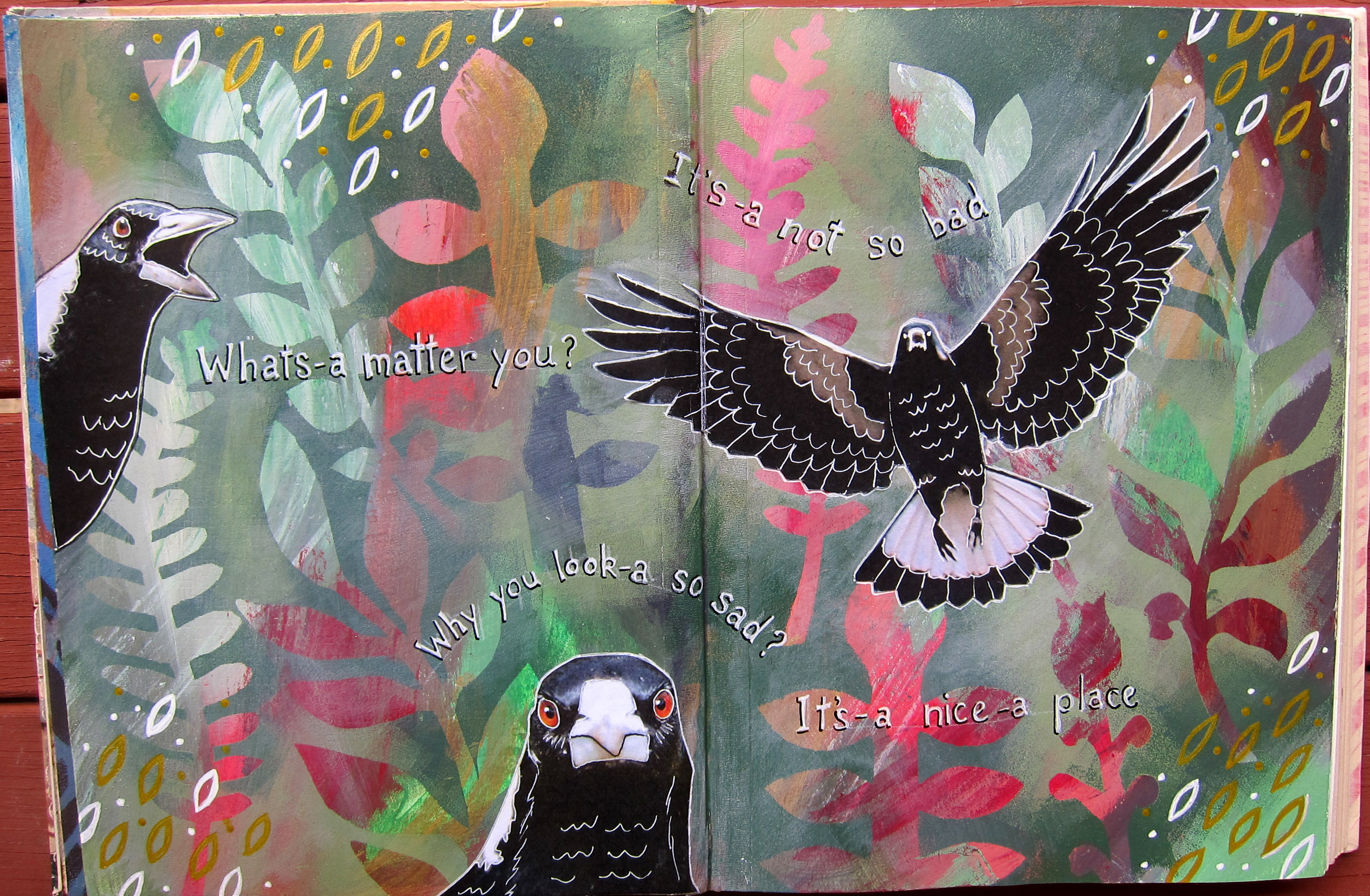
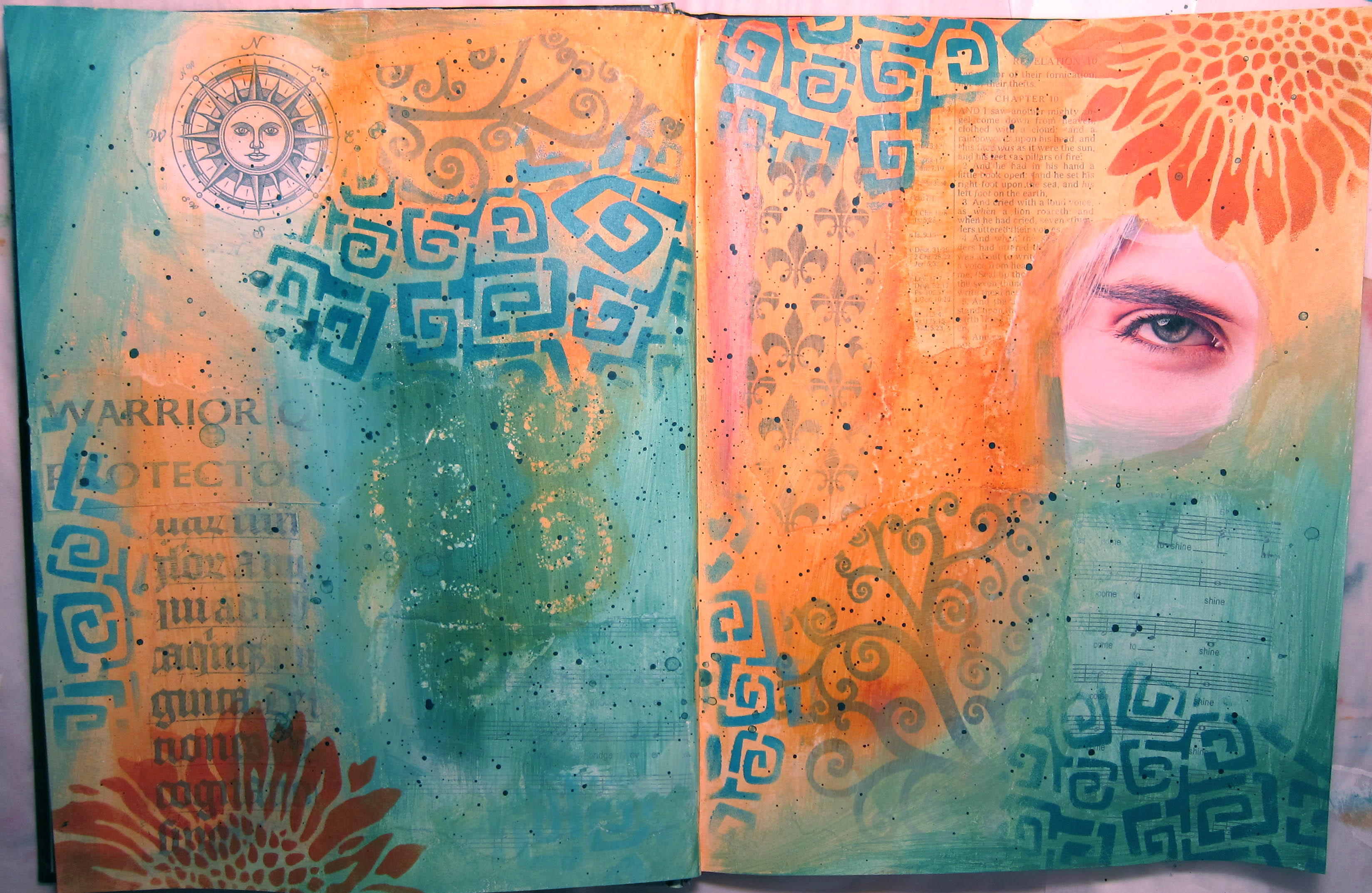
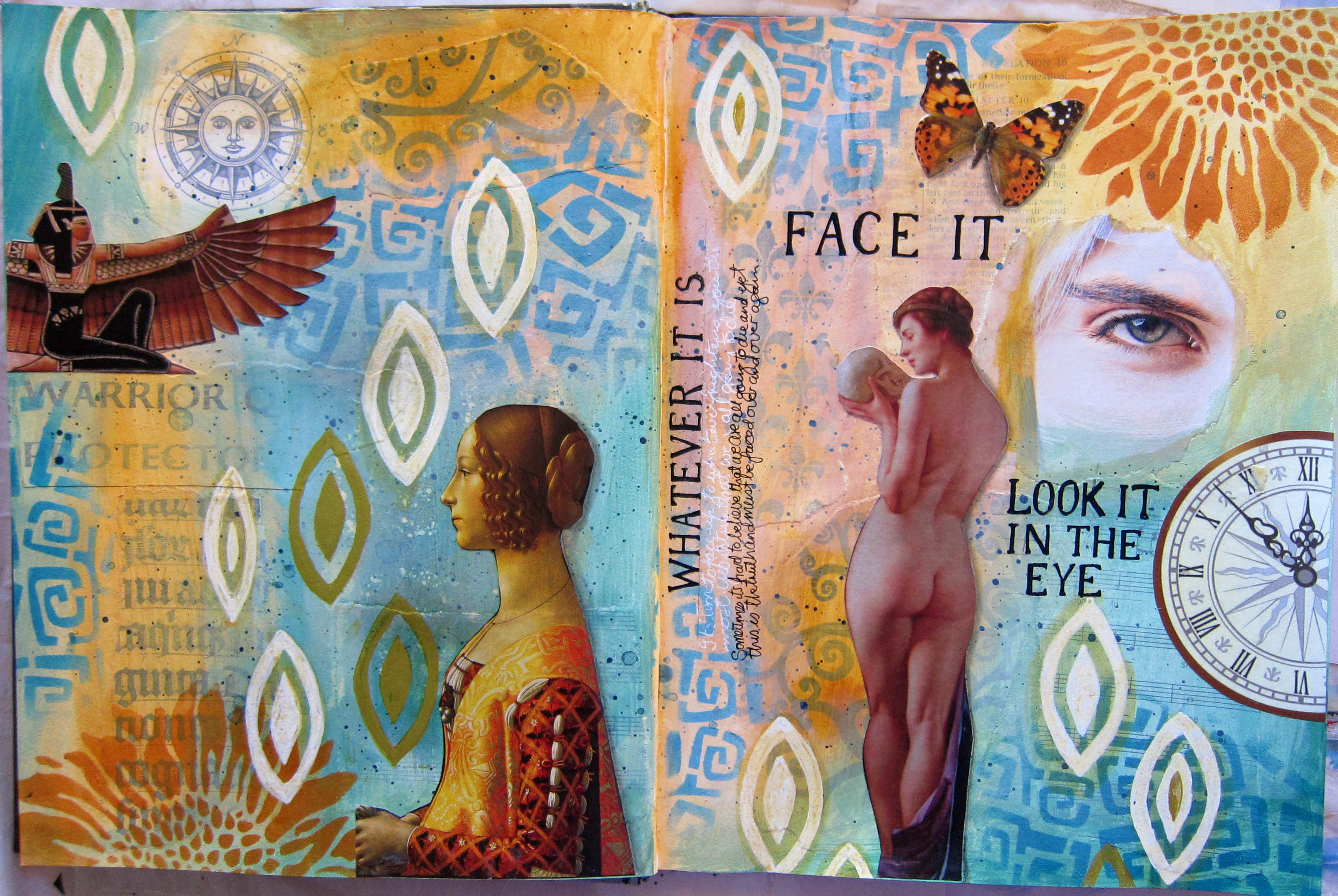
A: Tell me about some of your pages…..this Warrior page for example?


C:  Well it was interesting how I ended up having this 15 year old warrior, standing next to my grown up warrior. I really saw what a warrior my teenager self was, way back then, she had to be. And also seeing her innocence. And then my mature inner warrior, how capable she is, how resilient. I enjoyed using the animal totems on this page too, animals that I felt an affinity with. They are my companions. The wolf is there behind me, he’s got my back, and the eagle flies over and is a scout, they’re both my scouts and my muses in some way too.

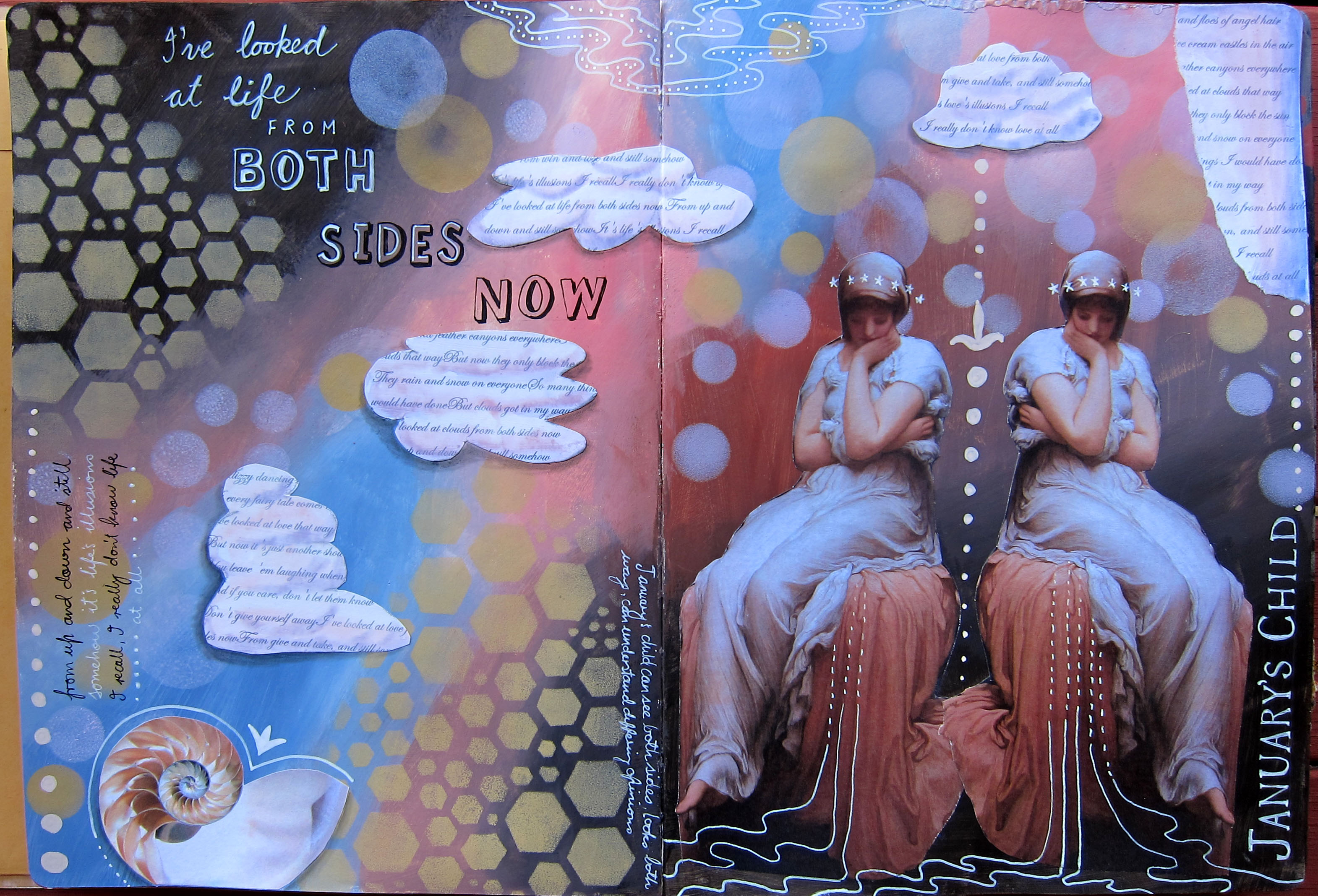
A: And the ancestors page?  Motherline Christina

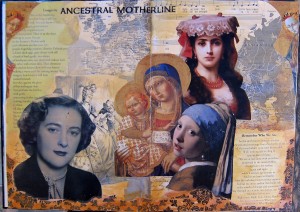
C: Well I was really close to my Mum, and she died a long time ago and I really miss her, so I loved to put her photo here, when she was in her prime. And the Girl with the Pearl earring I included because my Grandmother was Dutch…and I loved the book, and the painting. She represents my European heritage. And I also used some maps of Europe in the background too. And then I included the perennial mother, mother Mary. That felt really significant to me too, to include the nurturing, overarching mother. And I’ve included the french thing in there, I’ve always loved everything French, I love the language, I used to own a french perfumerie.

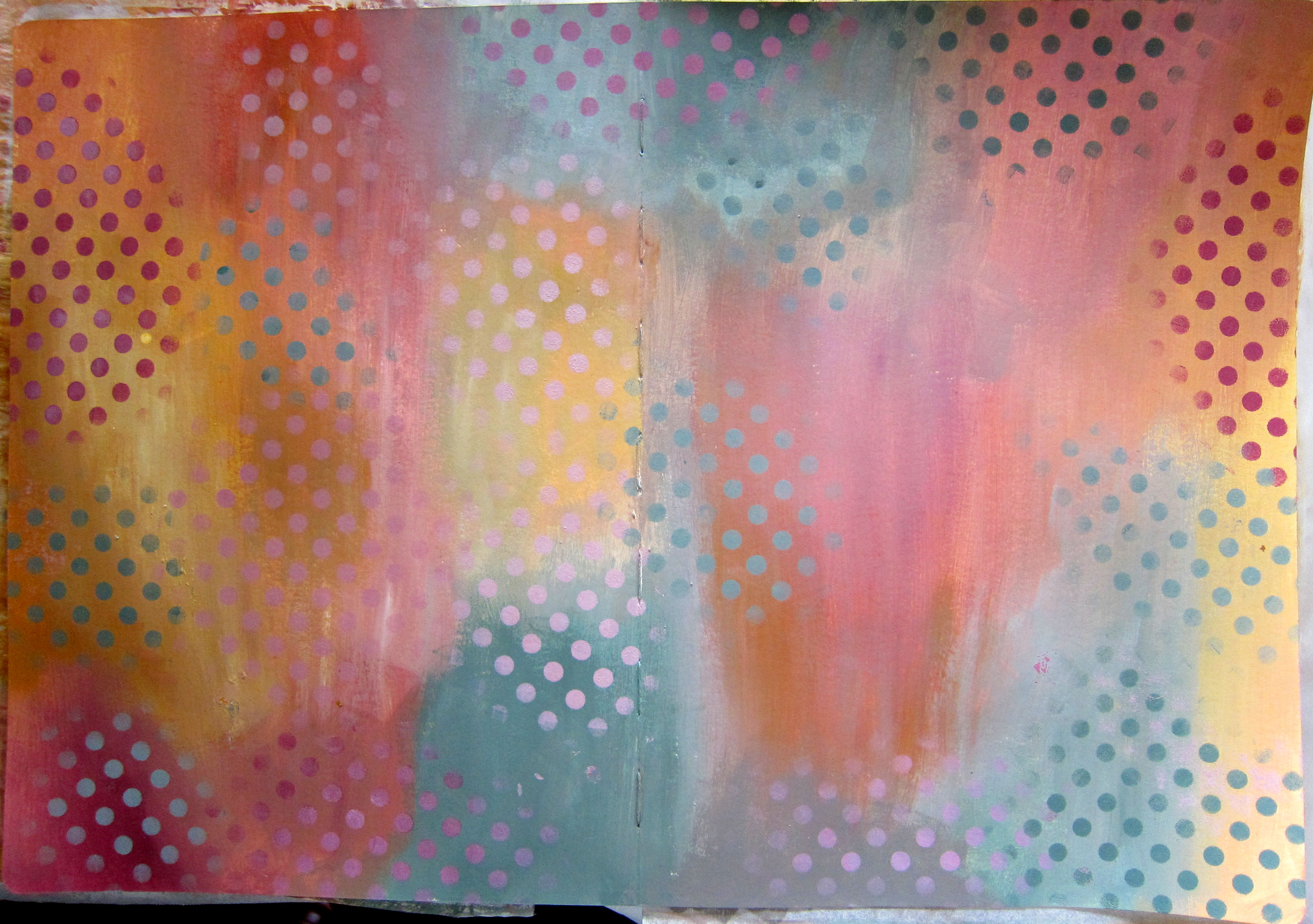
A:  I like the muted colours you’ve used in the background, it almost looks like you’ve stained it with tea or coffee or something.

C:  Yes I wanted an aged look. I had some other ancestor photos I could have used but they were more 1960’s photos and didn’t go so well with this old “Ancient Mother” look.

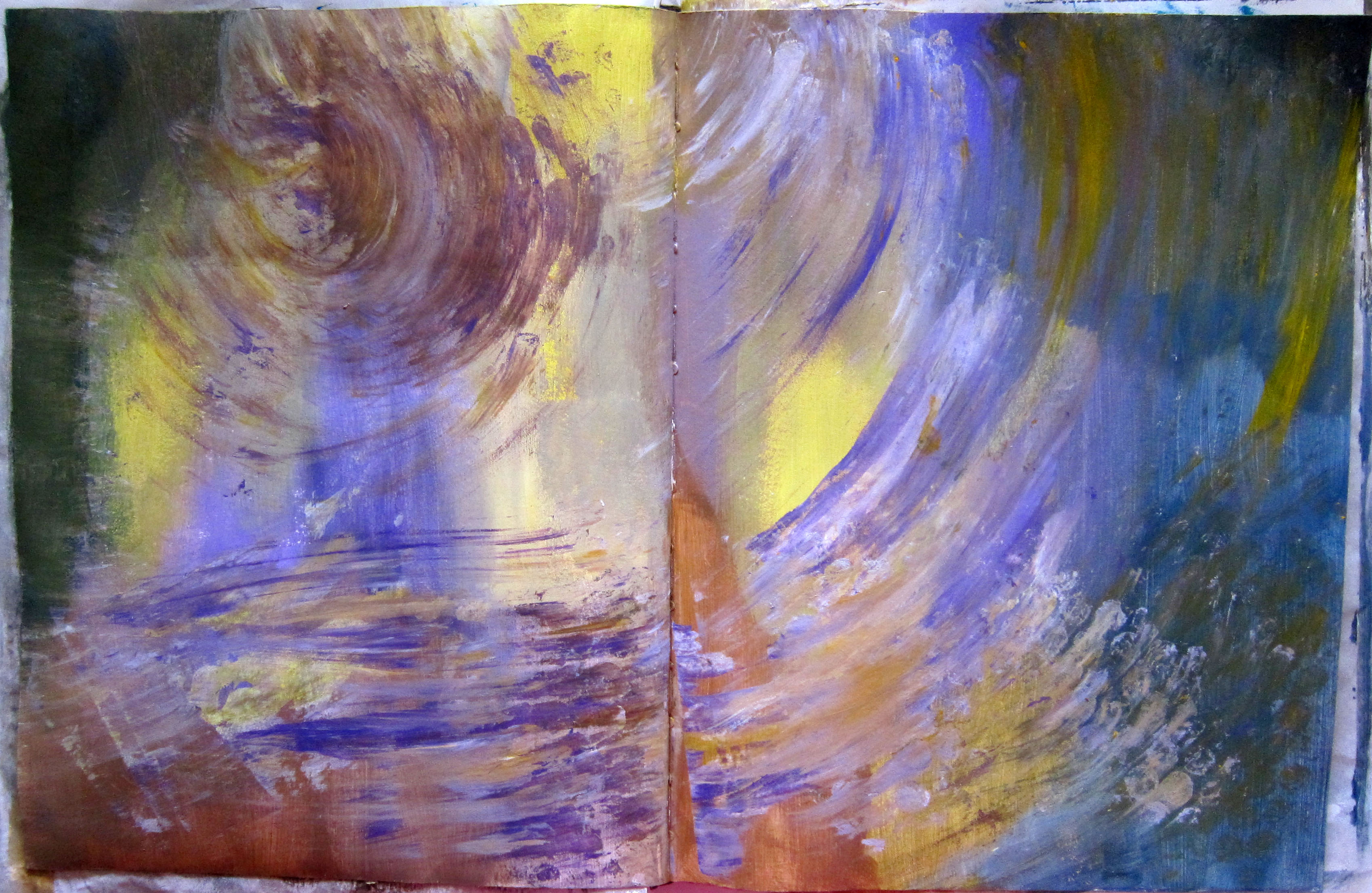
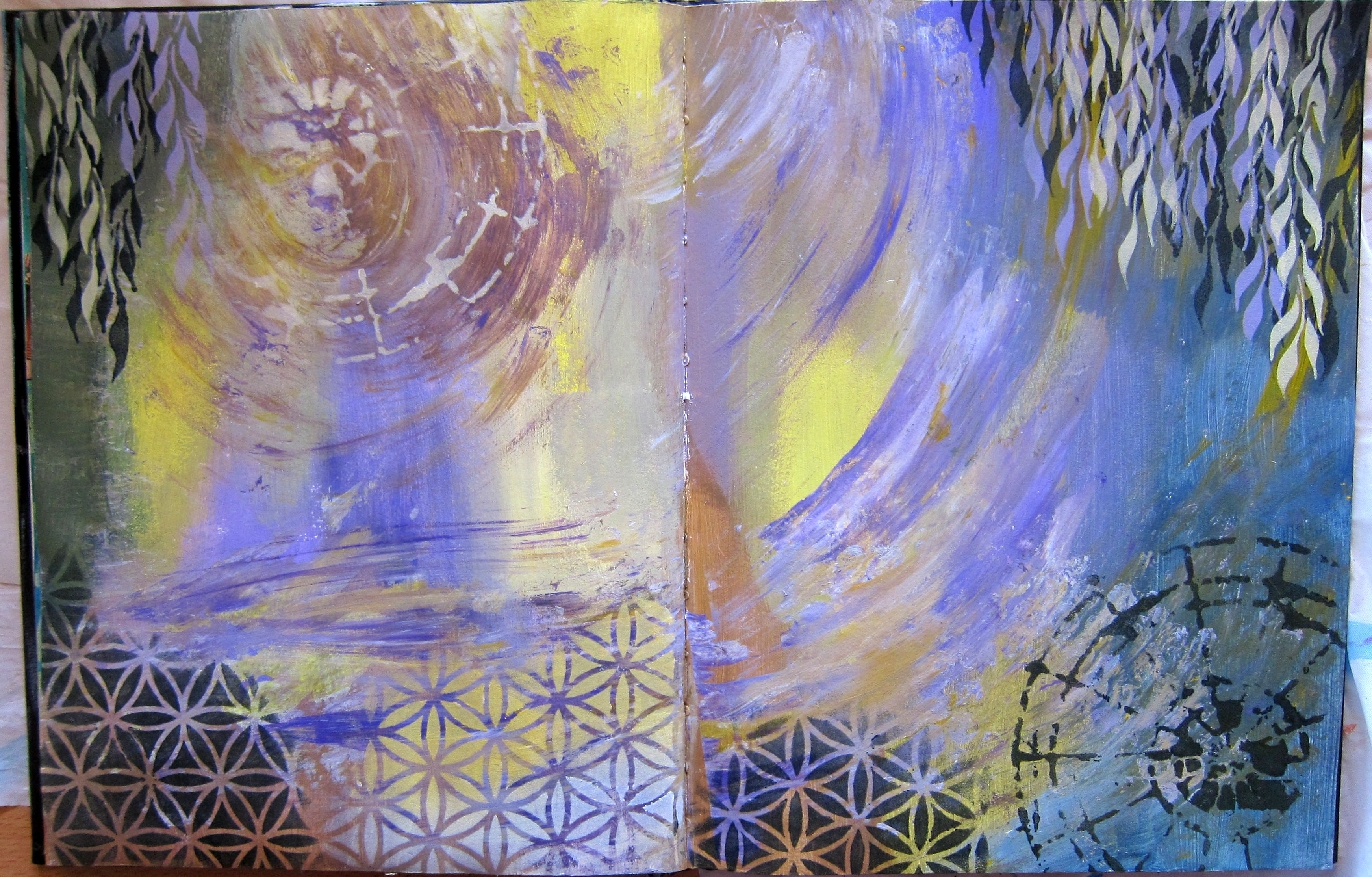
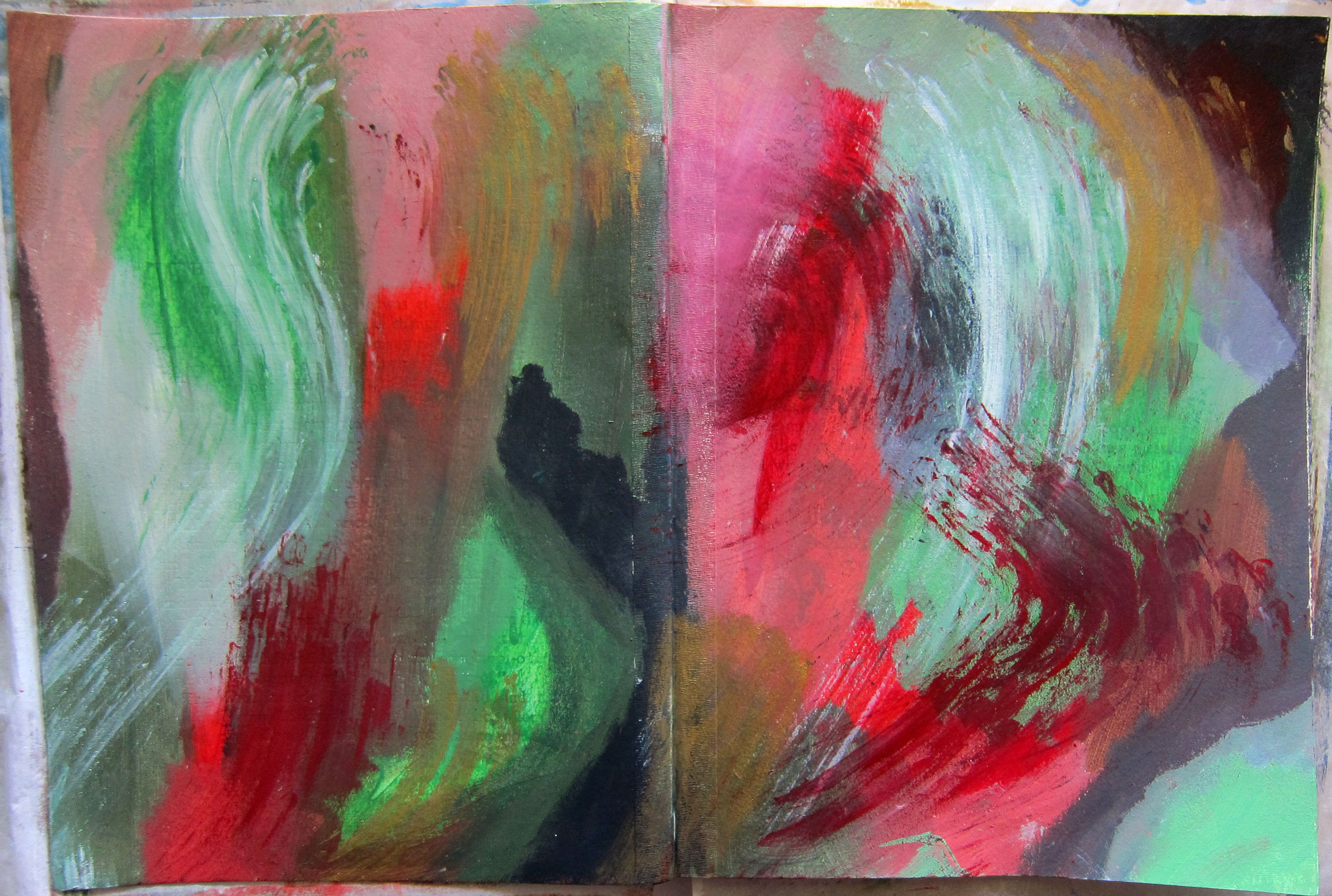
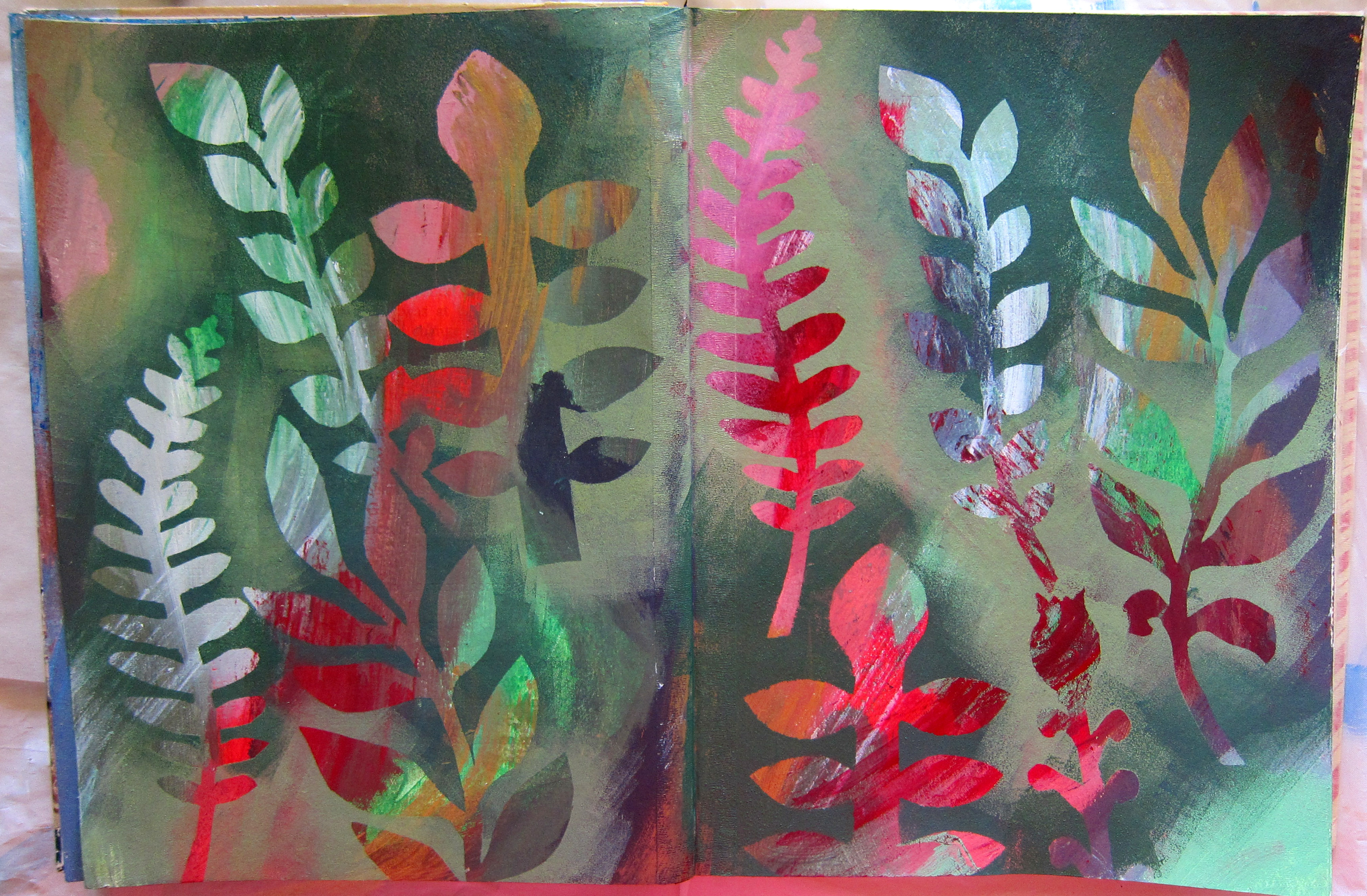
The above 2 pages were made by Christina during  Part one of the Heroine’s Journey which she completed last year. She has also completed Part 2, and the next pages are from that course.

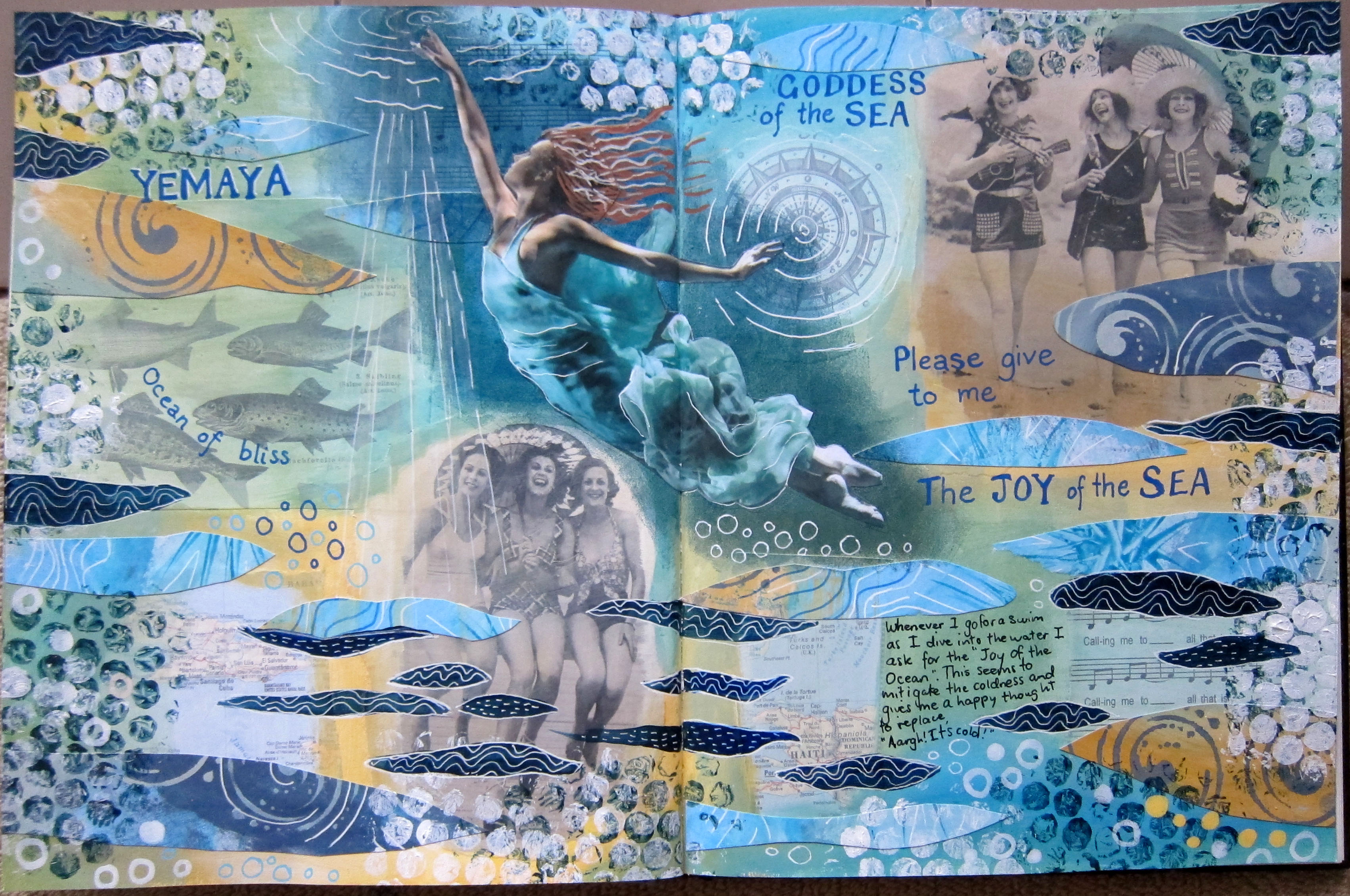
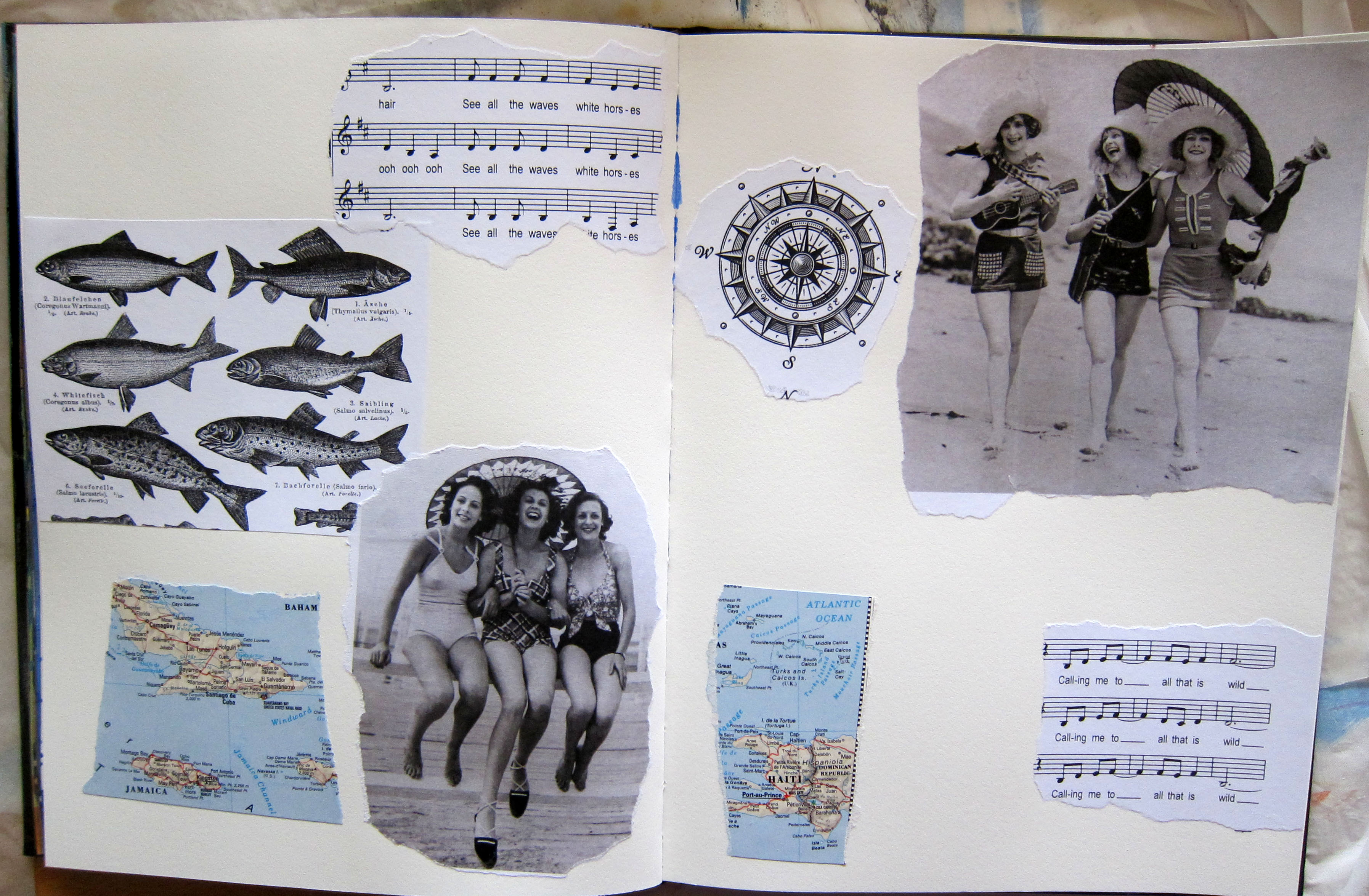
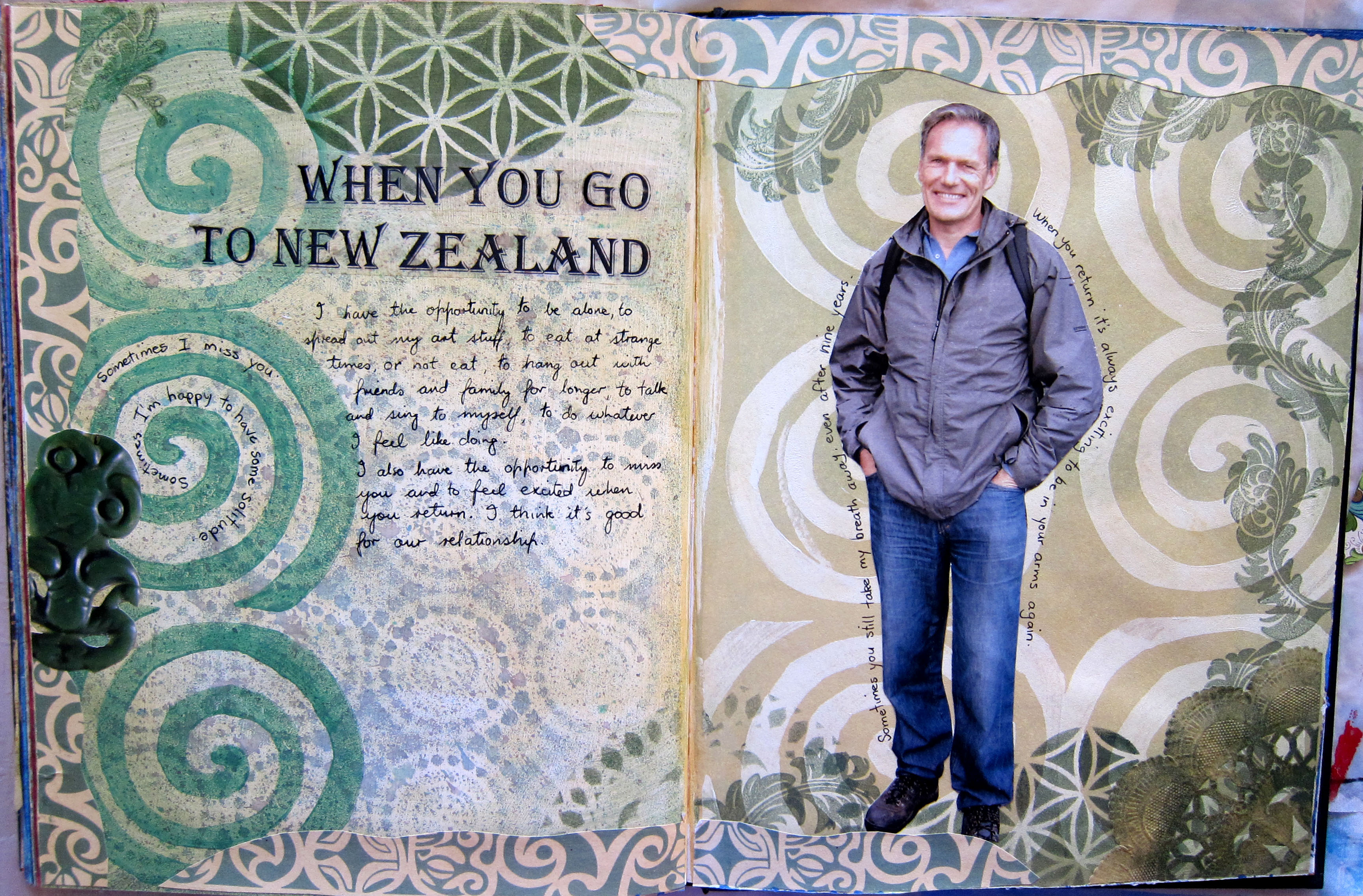
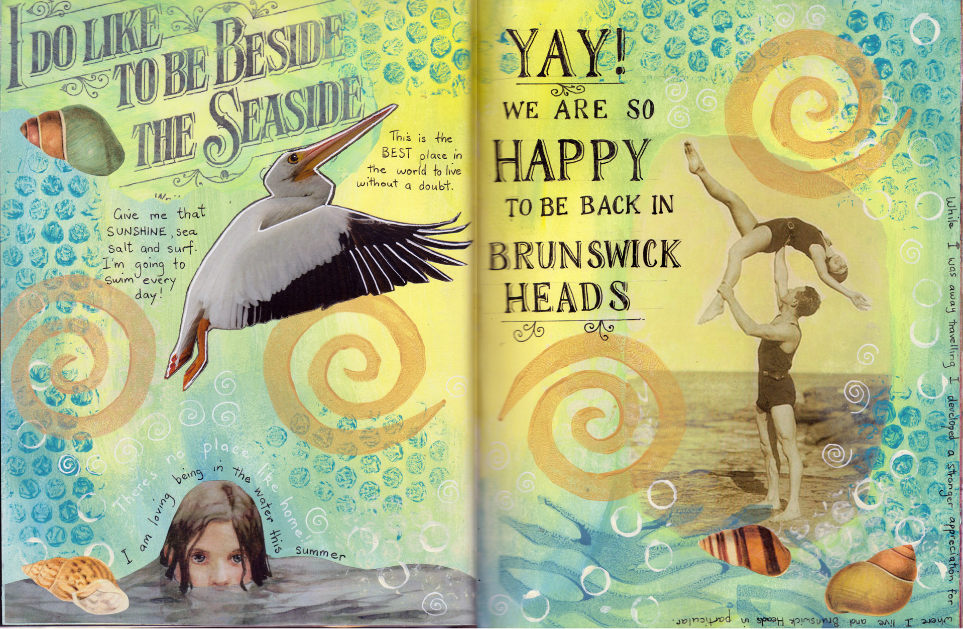
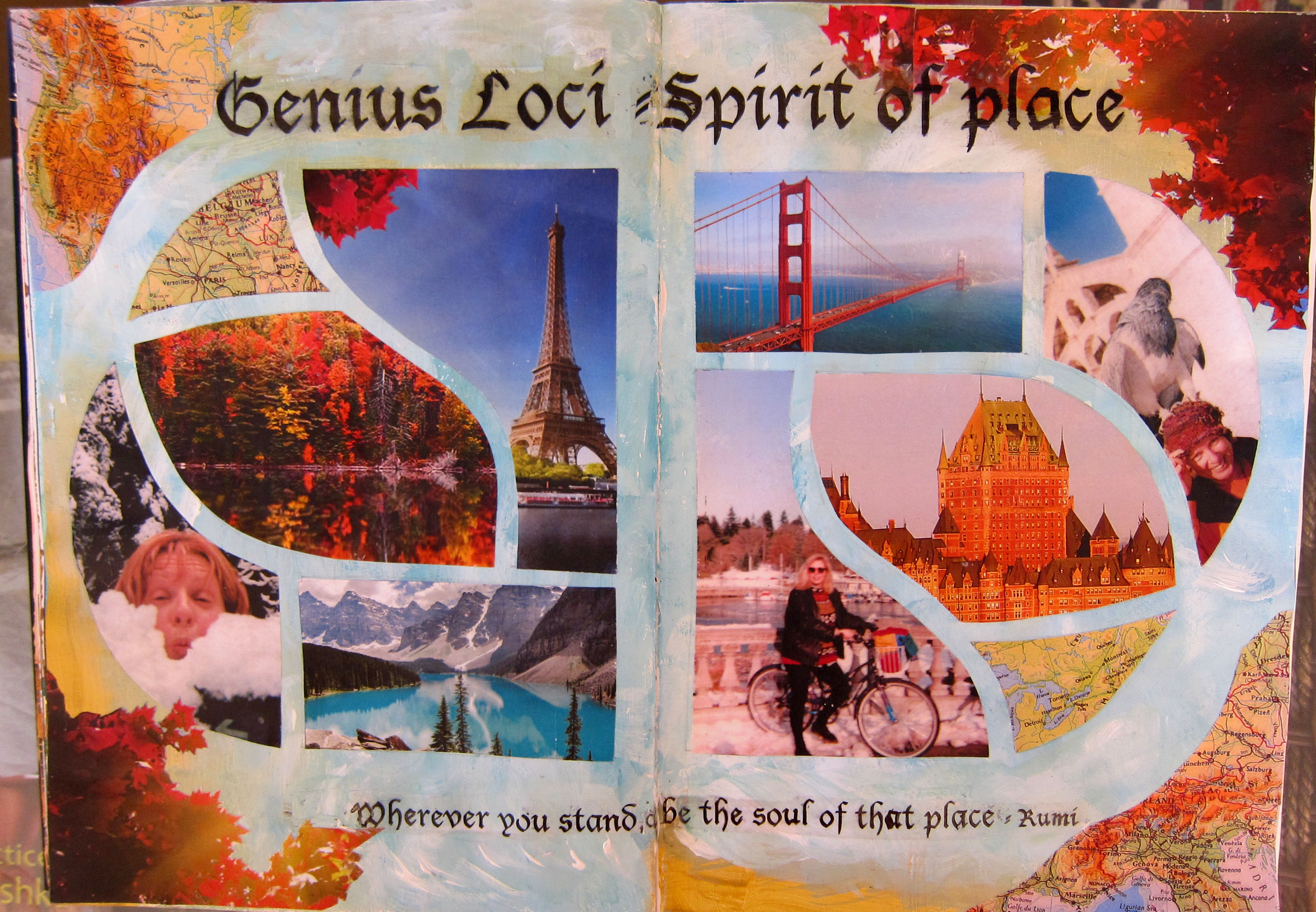
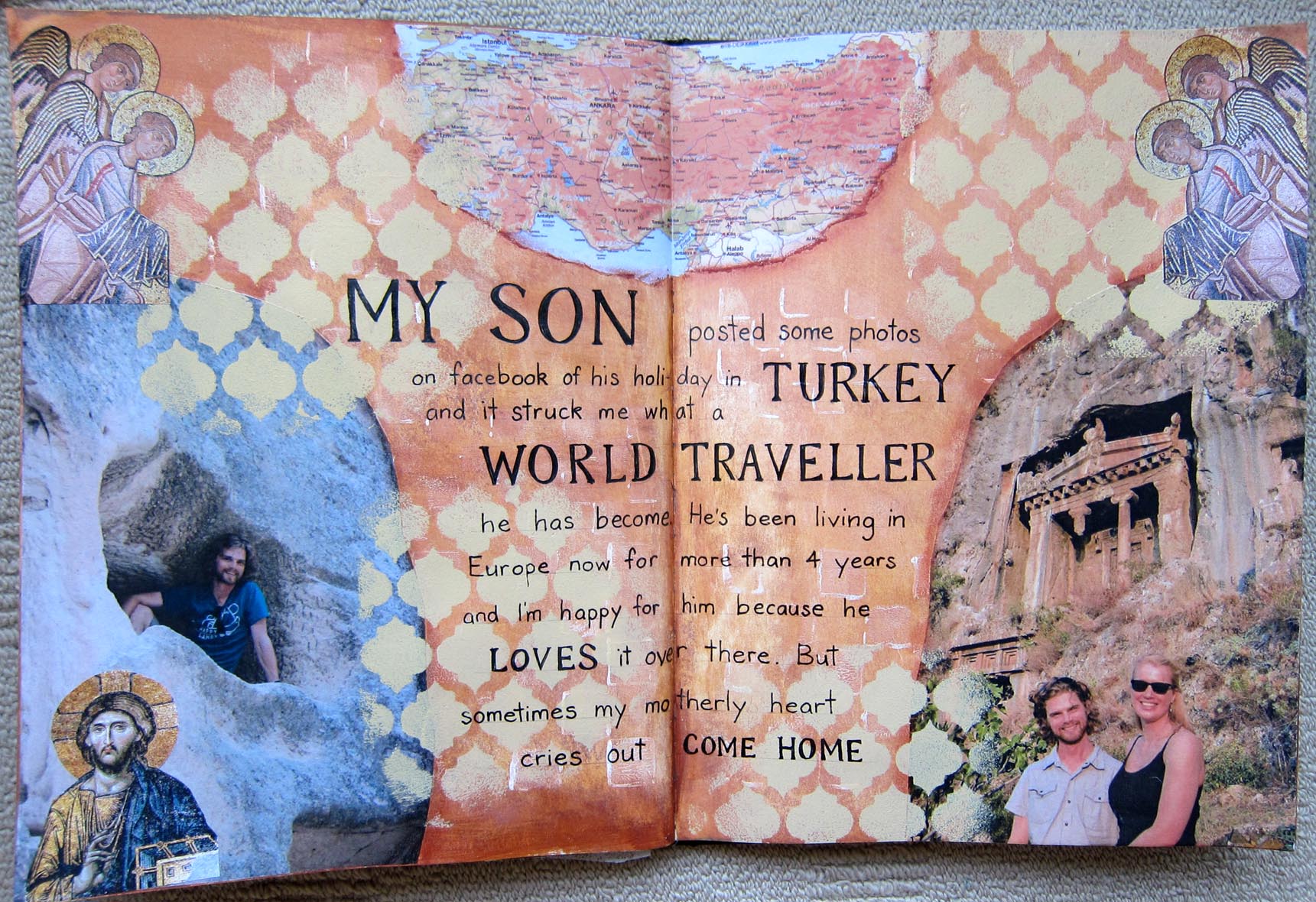
Christina has travelled quite a lot, and has spent some years living in Canada, which she loves. She told me she really enjoyed making this Special Places page, sifting through her travel phtographs and remembering special places.Place Christina


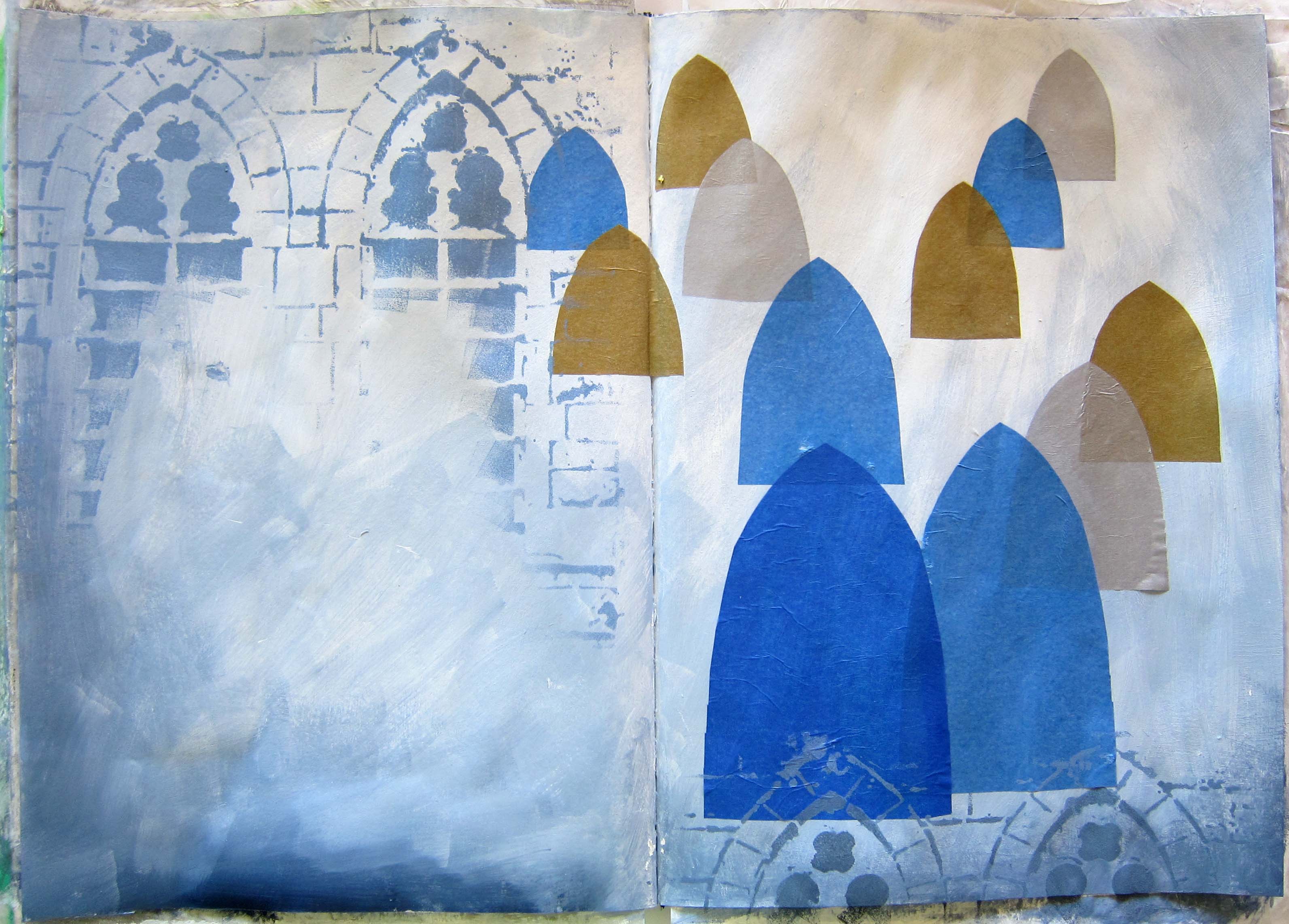
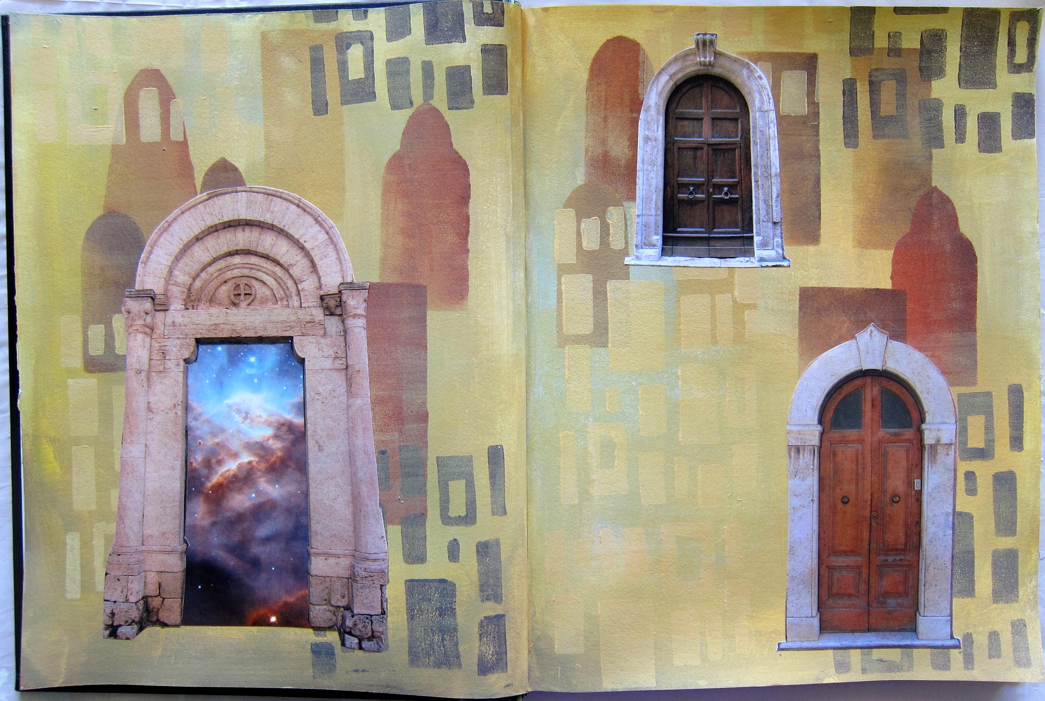
Joseph Campbell said “The cave you fear to enter holds the treasure you seek”

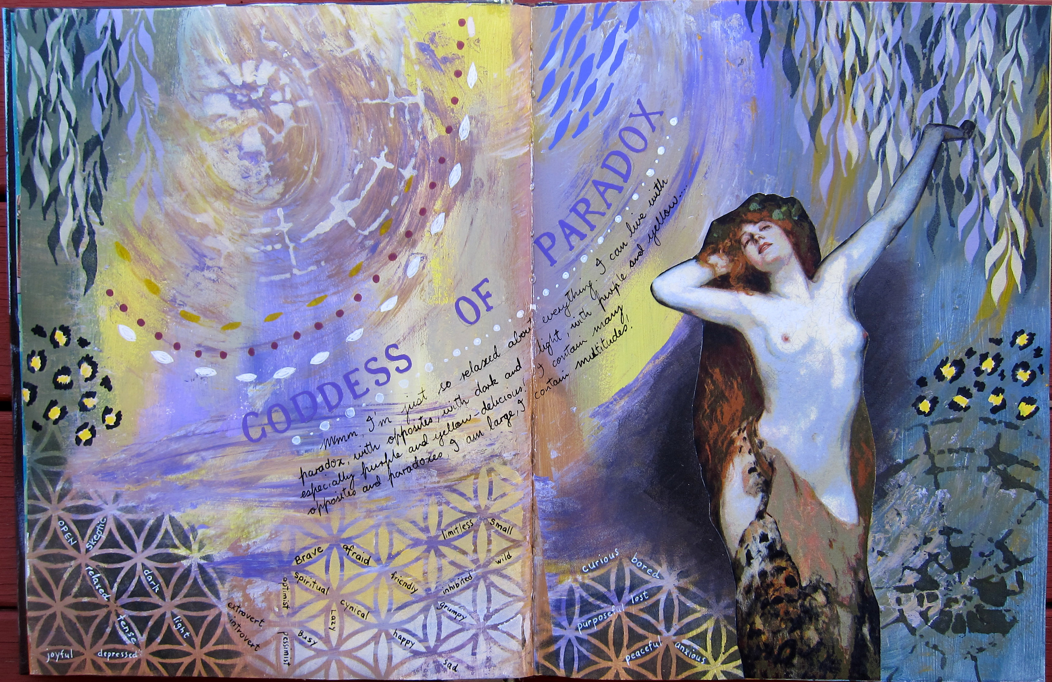
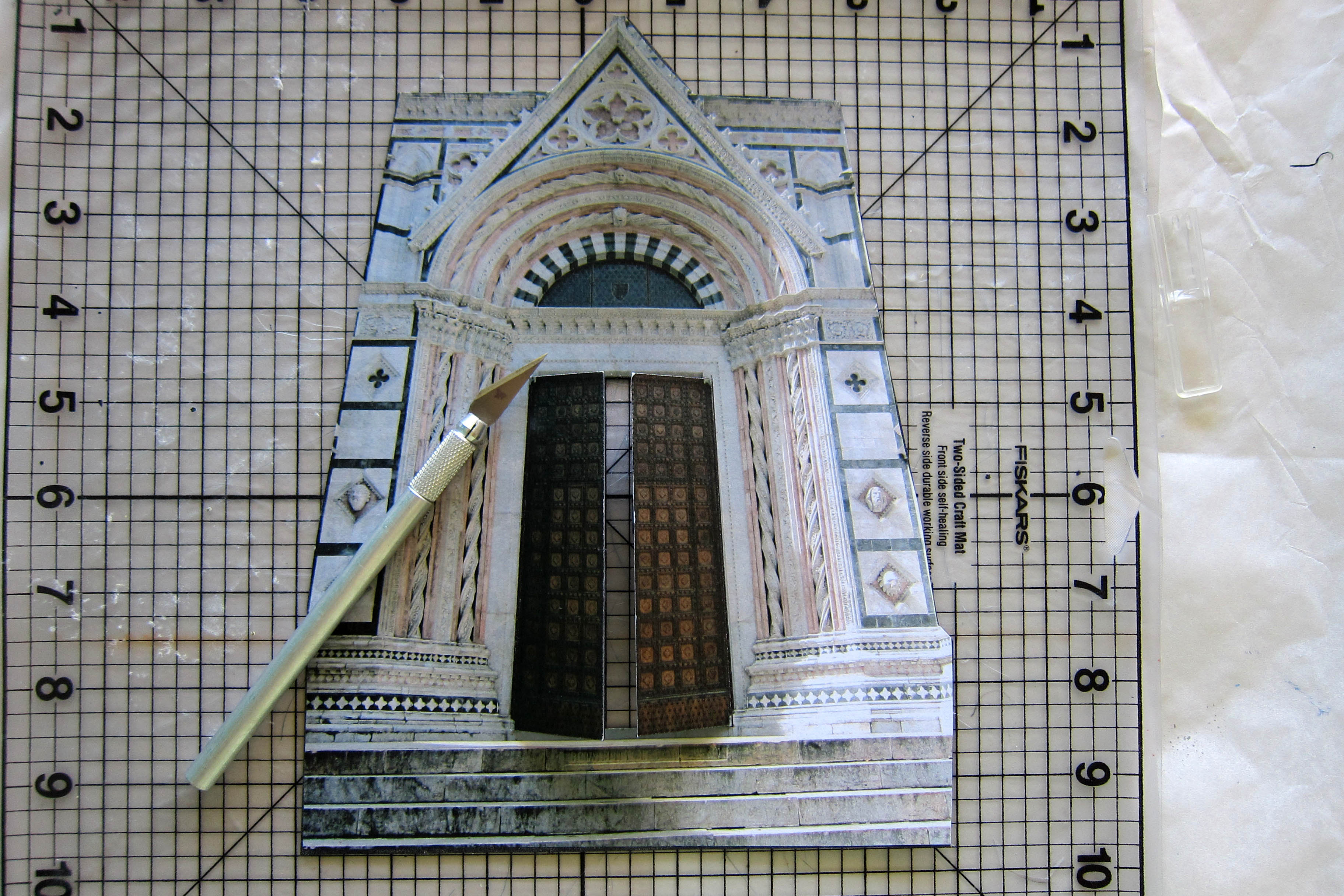
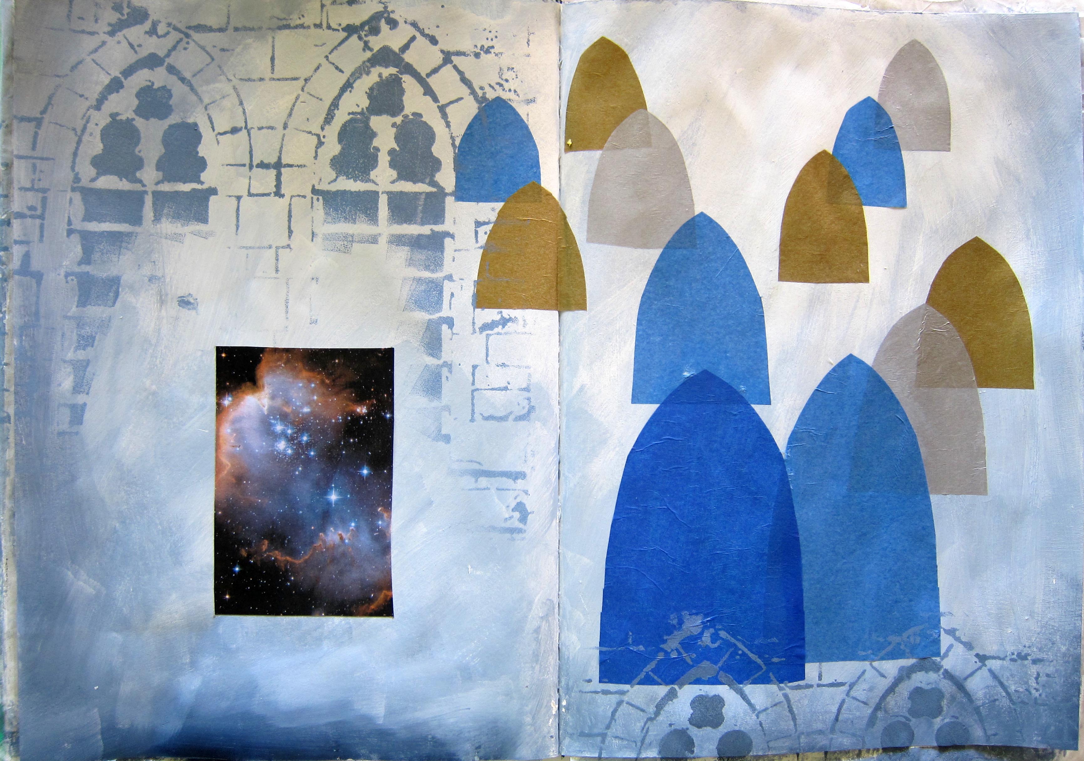
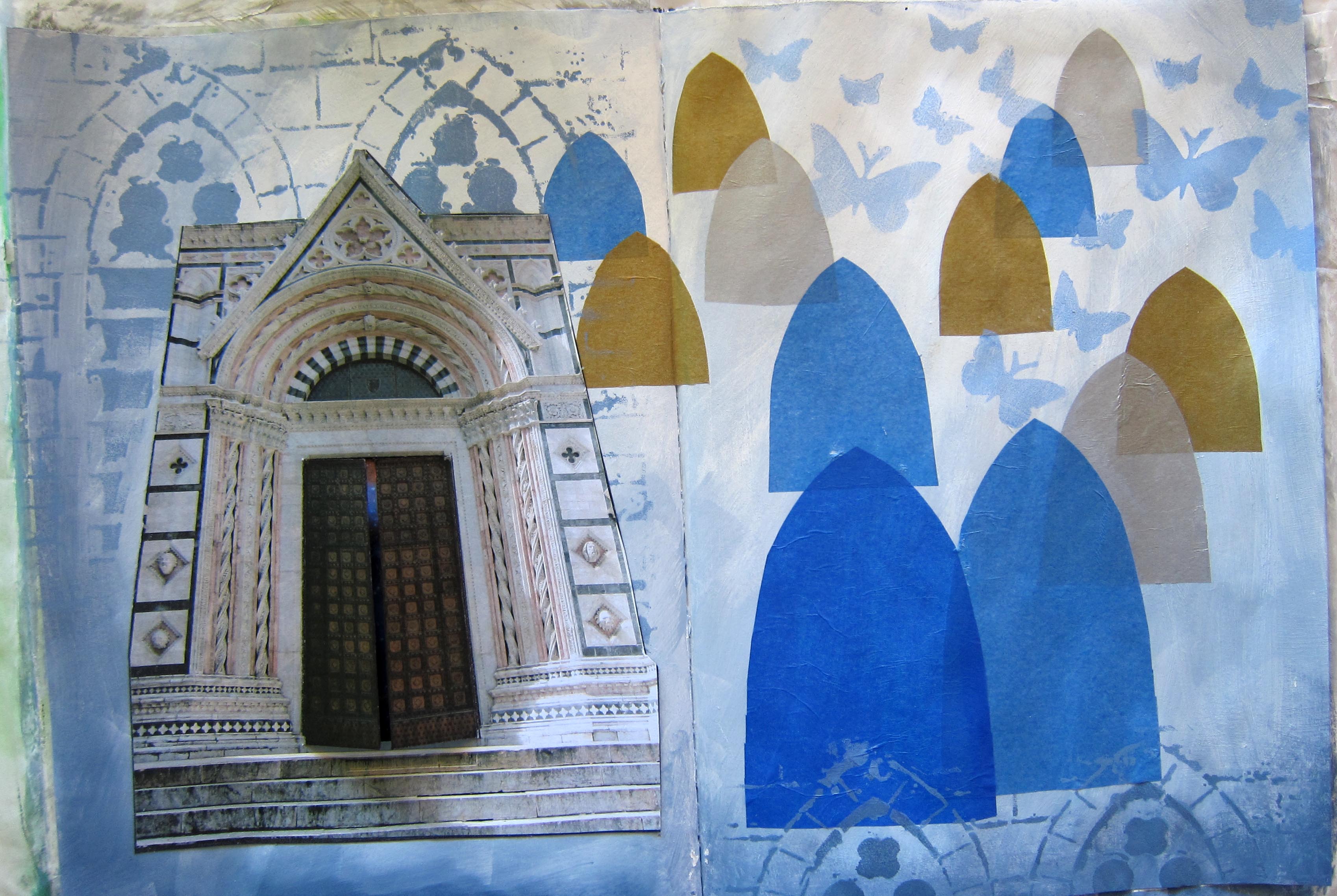
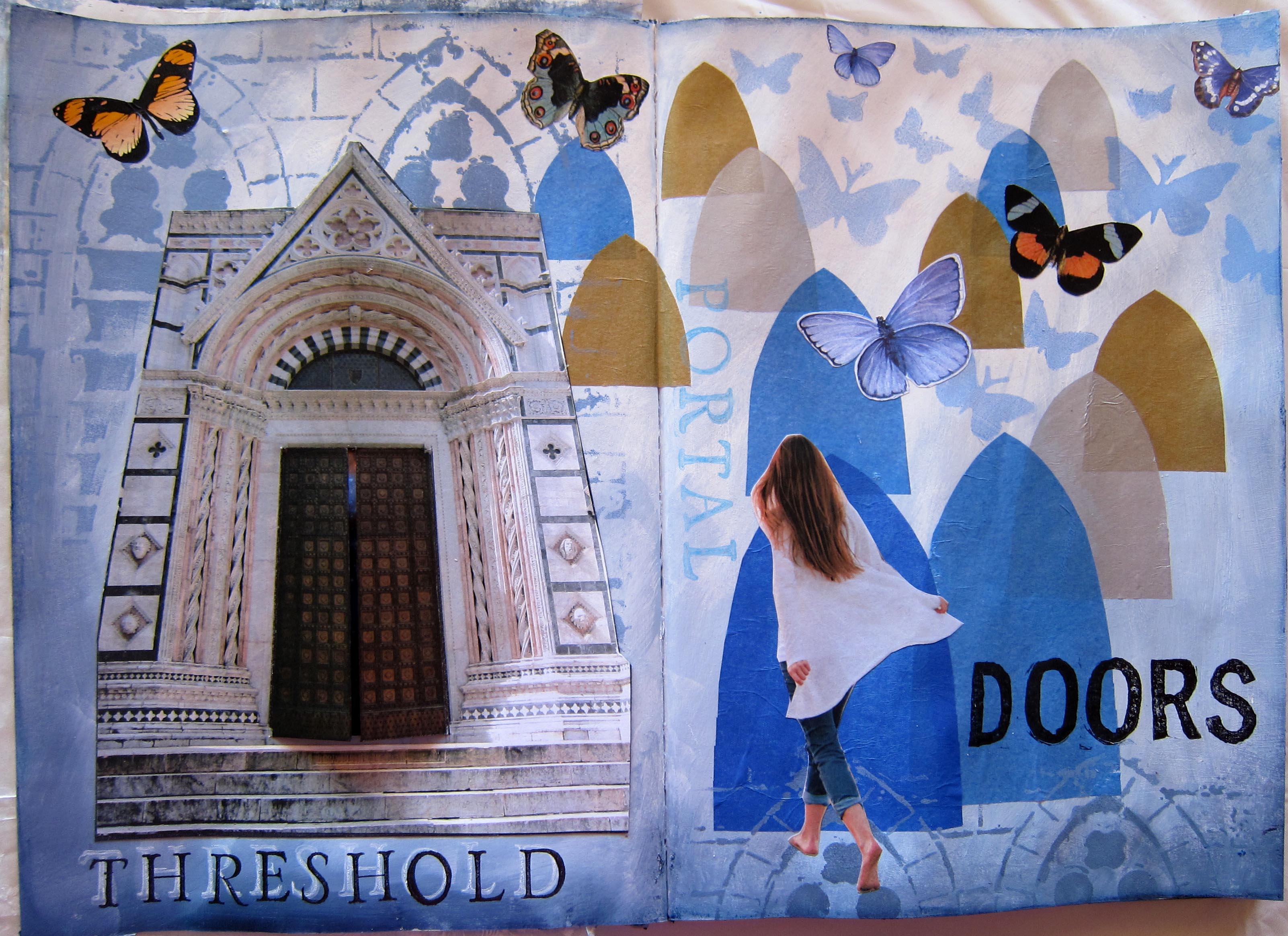
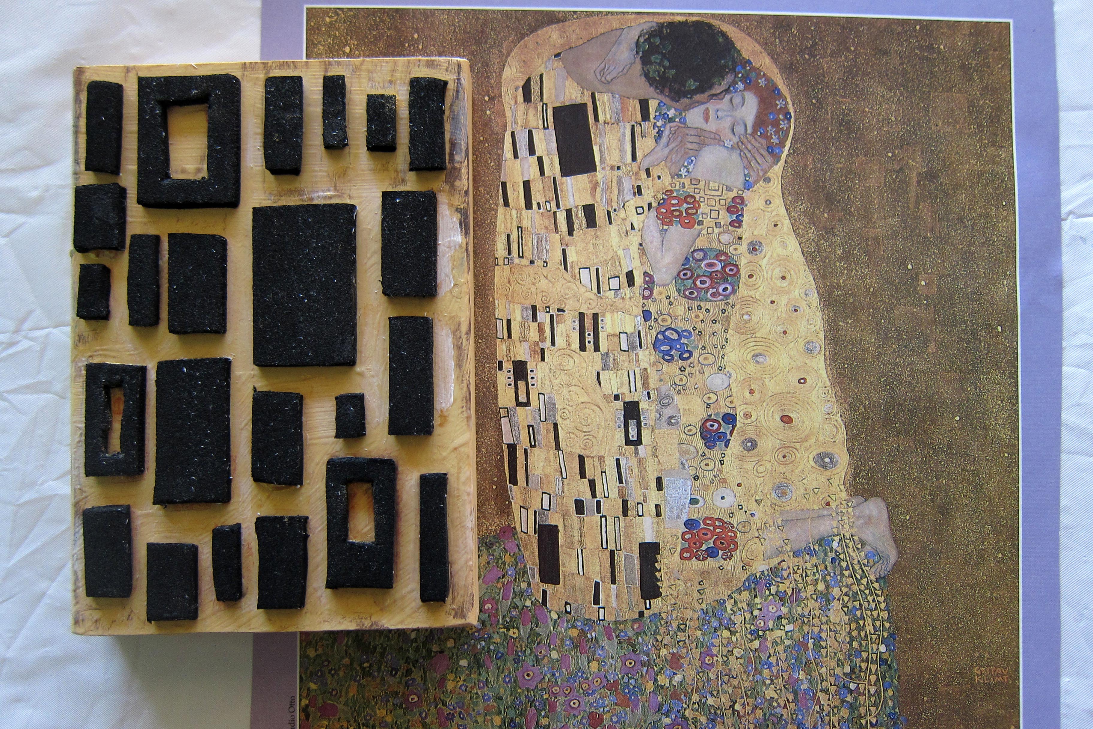
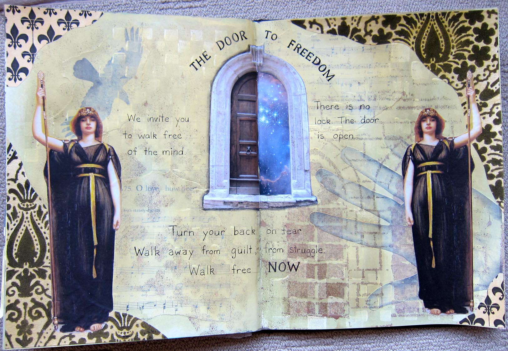
During the Part 2 course we made a page about entering the cave and finding the “treasure”, whatever that may be, perhaps some new knowledge, some new strength or self confidence. The journalers could choose  from a series of different images to represent their treasure. Christina chose a Holy grail image, which is hidden behind an opening door in the cave.. I asked her about this page.

A. Why did you choose the Grail image for your treasure, instead of the treasure chest or stars?

C. I’ve always had a thing for the Grail. A few years ago I did a workshop where we made a goblet to represent the Grail. I think the Grail is more mystical than a treasure chest. My red haired warrior is going on a quest, a mystical quest to get the Holy grail.

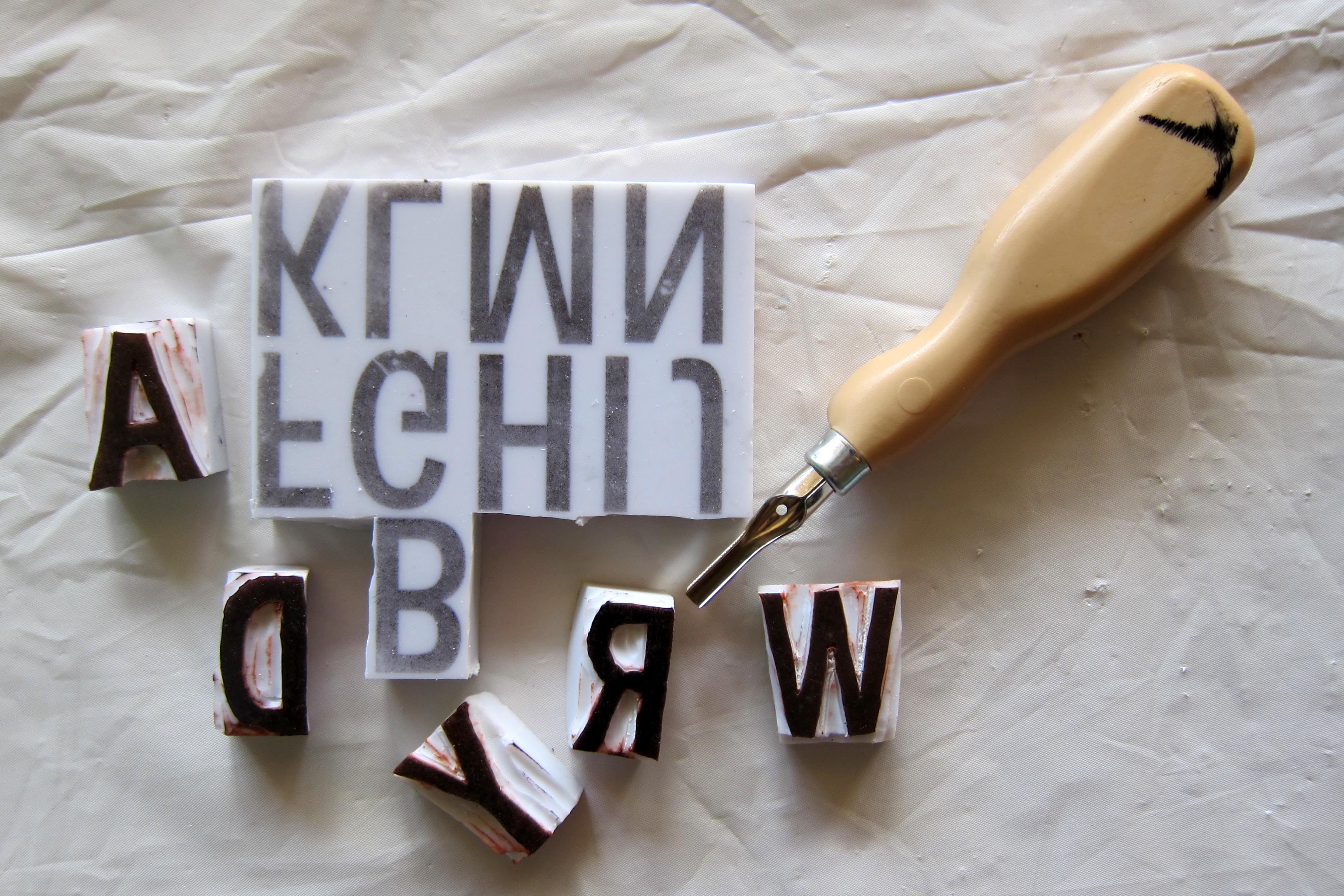
A. (On this page I introduced a new technique of scrunching and glueing down tissue paper to create a textured cave roof, which we then painted black or dark brown, When it was dry we rubbed  Inka Gold paint lightly on it, which was picked up by the higher ridges.  A.  I know you enjoyed the new process I introduced, of working with tissue paper to add texture. Can you say more about this?

C.Well I loved to create texture, I enjoy tactile 3 Dimensional art, and I also love gold, so I really loved rubbing the Inka Gold onto the tissue. I also tried rolling some tissue paper, as well as scrunching it,  to make stalactites hanging down.

A. yes everyone in the class was impressed with this innovation of yours.

C. i also put gold leaf around the image of the grail…you can only see this when you open the doors.

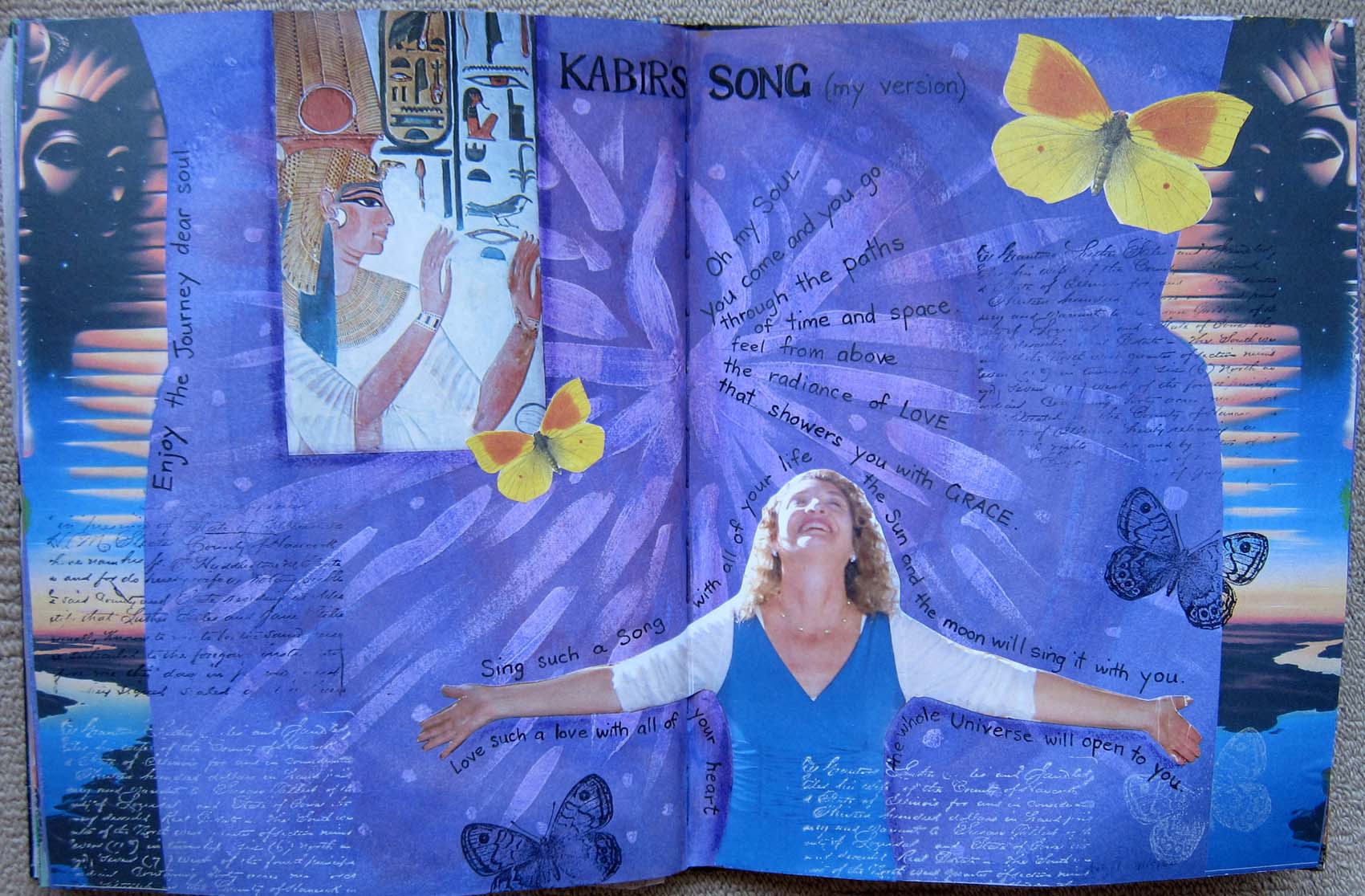
A. So finally I thought I would include your butterfly and flower head page. You have used a photo of yourself in your thirties I think. What was this page about for you in the end?

Butterfly head Christina
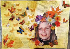
C. Well as you had suggested I used some of the positive comments that the other Journeyers had written about me, as undercollage, along with a couple of my favourite poems that we had as our readings. I included a couple of tulips amongst the flowers to represent my Dutch heritage. But ultimately I think the page is about freedom…the butterflies represent freedom. I’m thinking of writing “Fly free” somewhere on the page.

A. I was impressed with the way you have made your butterflies 3 dimensional, in that you have only glued them down the middle and the wings are sticking out from the page.

C. Well, again, it’s that 3D thing that I really like. It was really interesting to see the things that the others wrote about me and to think, “so that’s how you see me!”

It was great to have Christina in the Heroine’s Journey group, and I really hope she continues art journaling, now that the course is over.

Save

Save

Doorways and Thresholds

This is a “how to do” post aimed at my Heroine’s Journey (Part 2) students…and of course anyone else interested in art journaling! We have been studying the Stages of the hero’s Journey (Joseph Campbell) in relation to our own lives and making an art journal to celebrate our lives and our journeys. Today we looked specifically at crossing the thresholds/doors/portals.

Here is the evolution of this first page on doors: First I painted a light background, mostly white mixed with Paynes Grey and Ultramarine blue…a bit like this page here:Grey background

then I cut out different sized arched door shapes from coloured tissue paper and glued them in, taking care to only put the Matt medium on the page and not directly on the tissue paper. Then I used a stencil girl stencil with arched doorways to jazz it up a bit.

Blue doorsI  wanted to add a doorway with doors you can actually open so I enlarged and printed out a photo I had taken in Tuscany of a door in Siena which I then backed with black cardboard (I used spray adhesive for this as I find it works better than Matt medium for large gluing projects, spray both of the surfaces!) It’s necessary to back the picture with cardboard so the doors will be strong enough when you cut them.

Blue doors cuttingYou’ll have to use a scalpel knife to cut the around the doors,  cut the centre line and the tops and bottoms but do not cut the edges which would be hinged!

Blue doors hand


I cut a rectangle of a starry sky, slightly bigger than the door opening and stuck it on the left hand page, and then stuck the door over the top, being careful to line it up so you can see the stars through the opening doors.


Blue doors 3

Blue doors 4


I stencilled a few butterflies in a pale blue, on the right hand page.Blue doors 5 I tend to use butterflies a lot in my journals to symbolise the soul or spirit, so on this page they represent the soul calling me through the doorways, into the adventure, whatever it may be.

Finally I collaged a woman walking towards the doors and some butterflies .Blue doors 6 I used some alphabet stamps to write the word “Threshold”, stamping it first in white, but it was too hard to read so I stamped over it (and slightly to the right and down a fraction) in black. I quite like the effect. The word “Doors” I stamped in black using some alphabet stamps that I have been carving myself from ezy carve rubber (bought at the art shop..but you can also use ordinary erasers).Alphabet stamps You have to have special carving equipment for this  but the Speedball lino cut set is not very expensive. Carving my own alphabet stamps is kind of satisfying but it’s difficult, easy to make one slip and ruin the stamp, and time consuming so I wouldn’t necessarily recommend it for everyone!

Doorways page number Two. For this page I first painted a double spread with a few colours, mixed on the page…Raw Siena mostly with some Yellow ochre, white and a couple of patches of Paynes grey mixed with white. Then I cut some door shaped stencils from some spare glossy photo paper (excellent for stencils).Brown stencils I just folded the paper in half, cut half a door shape , then opened it out and voila! symmetrical door shapes.


I used a sponge spouncer (love that word!) to stencil different shades of brown paint through the door shapes. Then I made myself a new foam stamp, one I had been intending to make for a while, based on the rectangular shapes in Klimt’s painting, “The kiss” Brown stamp I love this stamp!


So then I stamped it with dark brown paint, and when that was dry, with a light gold colour paint.

Brown 1


I was quite pleased although there was a bit too much tonal contrast, I knew it would detract from the photos of doors that I wanted to collage over it, so I toned the background down a bit. To do this I mixed a watery mix of gesso and raw siena  and painted it in a wash over the whole page, rubbing it off a bit with a paper towel as I did it.

Brown 2


I like the way it looks not just like doors but like a whole city of buildings, doors and windows. Then I printed out some more of my Tuscan doors. I cut the actual doors out of the largest one and replaced them with a starry sky. To me the stars represent the mystery…of what might be beyond the threshold, the unknowable, the great BEYOND!

Brown 3Using the “Rule of three” to balance the composition I added 2 smaller doors. There was a beautfiful blue colour in the starry sky which I wanted to bring into other places on the page for balance so I stencilled 3 patches of blue. Then I used my handcut alphabet stamps again to stamp the word “Doorways”  vertically. I was a bit disappointed and wished I had just written it instead, the brown stamp pad I used was very mottled and uneven. BUT I try to let go of my perfectionism in my art journal, so it’s ALL GOOD.

Brown 4Finally I wrote something about one particular threshold crossing in my life, when I left Sydney and moved to the North Coast. I wrote really small, with a fine gel pen, which smudged a few times (that’s what happens to left handers, I’m used to it!)

I hope this has been helpful. Let me know if you make a Doorway or Threshold page.

My third journal

I’ve decided to get back to my blog, now it’s 2016! Here are a few pages from my third journal which is almost finished. Church in the Pines World Traveller Son Gerrit in NZ Guilt into Gold Kabir's Song Mandala page Autumn Tree poem Door to FreedomI mostly love my pages actually. This is what I use: Acrylic paints, stencils (home made and bought, including a plastic lace tablecloth), collage, scrapbook patterned papers, home made foam background stamps, gesso resist, occasionally a spray ink. And of course black and white pens, mostly uniball gel.

Save