My Brilliant Career

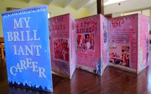
I bought a children’s board book a while ago with the intention of altering it and turning it into a journal. It opens out like a concertina. I gessoed both sides of it, mostly covering over the  pictures and text underneath. I decided to make it into a kind of retrospective of my (school) teaching career, as I stopped teaching in school a year ago now, so it seemed a good time to think back over those years.
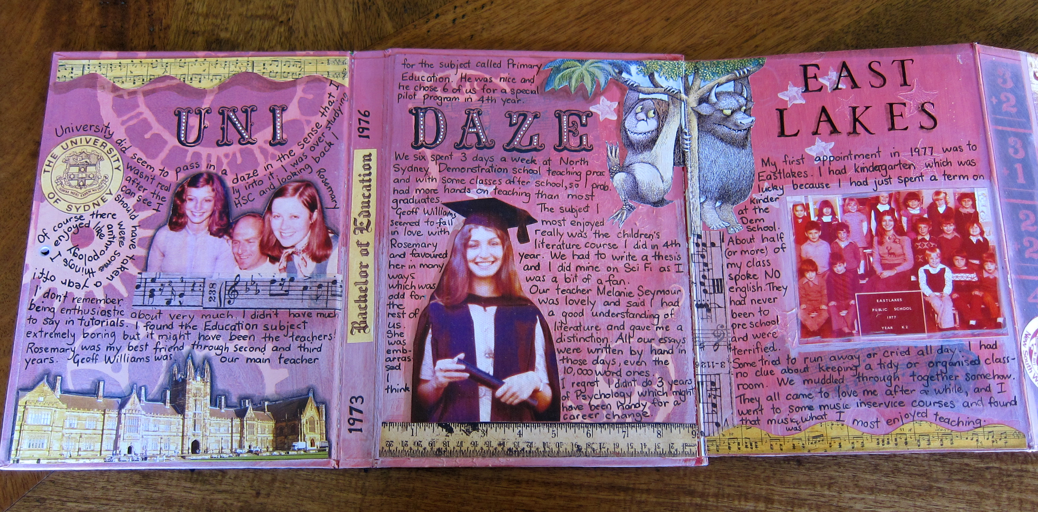
so far I’ve completed one side of the book in which I’ve written some memories of my university days and of my first few years of teaching in Sydney. I used old photographs and some pictures from “Where the wild things are” (a popular children’s book at the time) and some decorations from a set of scrapbook papers called “school days”.
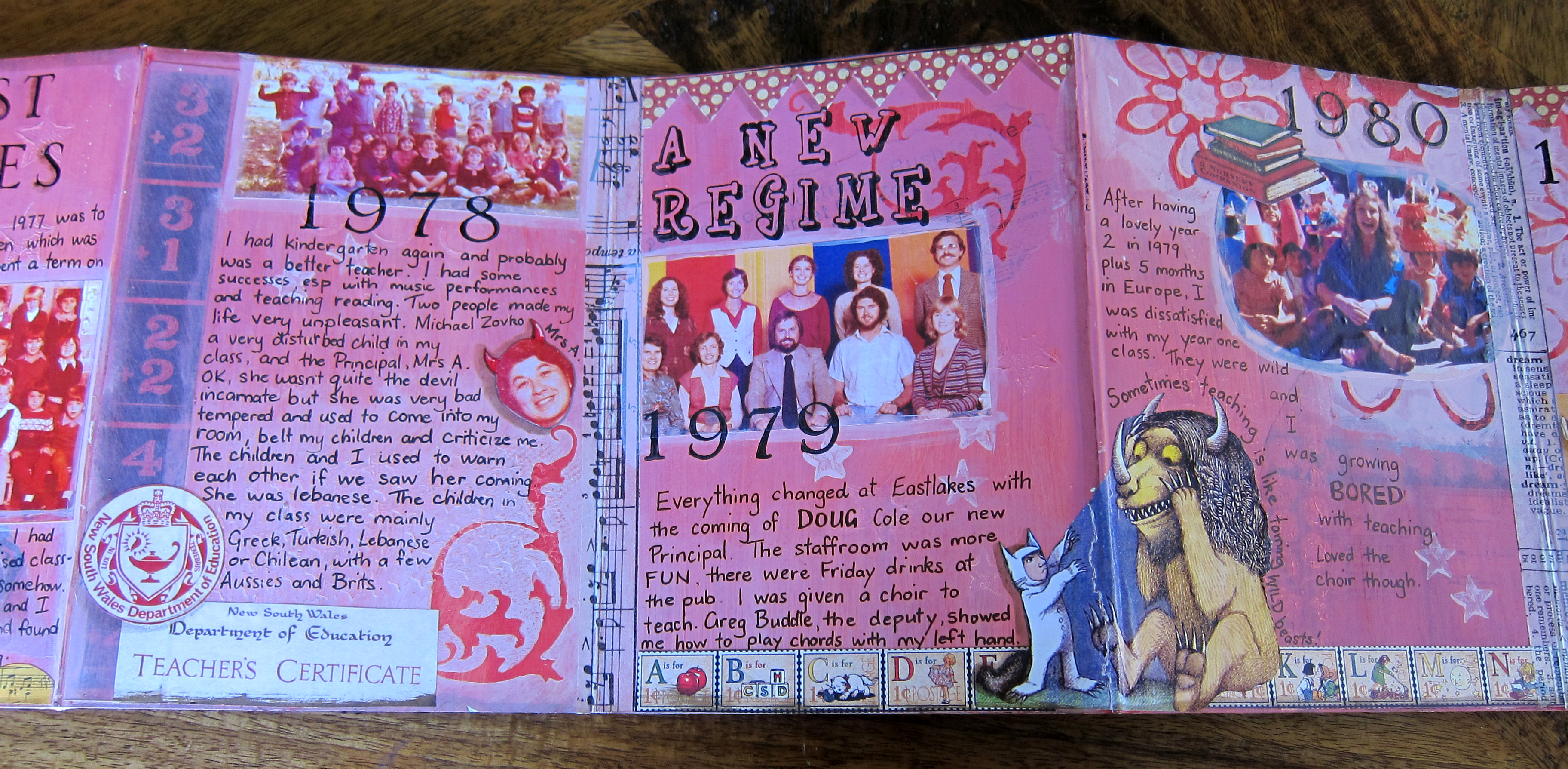
This was a very therapeutic process for me, to relive old memories both good and bad, and to reflect on my strengths and weaknesses as a teacher!
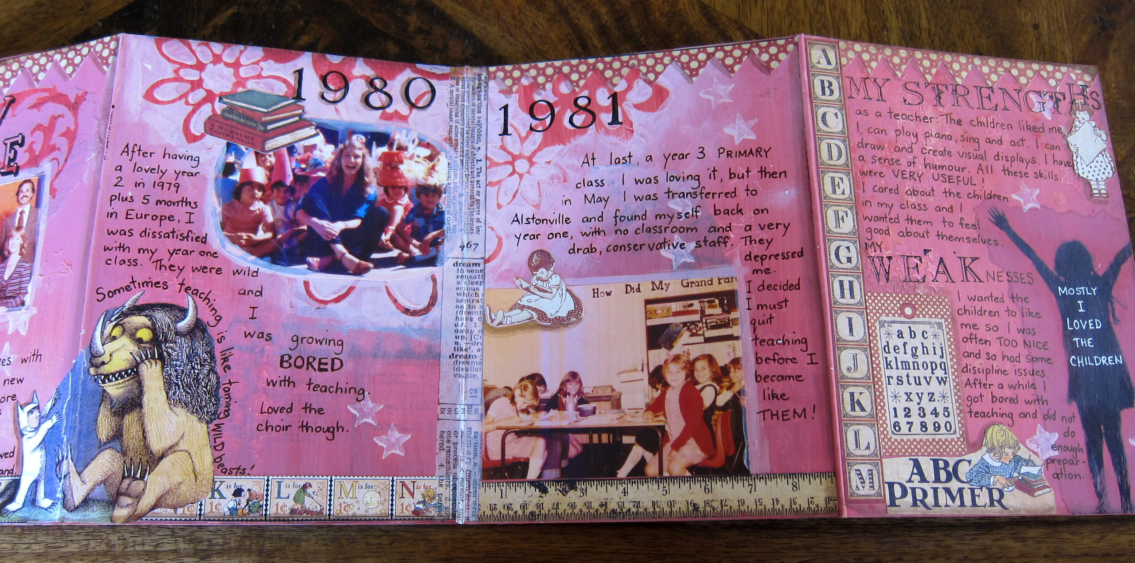
It was great to look through old photos also, although a bit disappointing to find I didn’t really have many photos of myself at work.

I used some chipboard letters to make the title of the book, the first time I have ever used them and I really like the effect. I tend not to use anything vaguely 3 dimensional inside my journal because I imagine it won’t close properly. But the cover is a different matter!

I have painted some backgrounds on the other side of this journal ready for some photos and writing about the later years of my career up here on the North coast as a music and drama specialist teacher and will get around to finishing it sometime this year! Right now I’m all caught up with the 21 secrets online art journaling course!

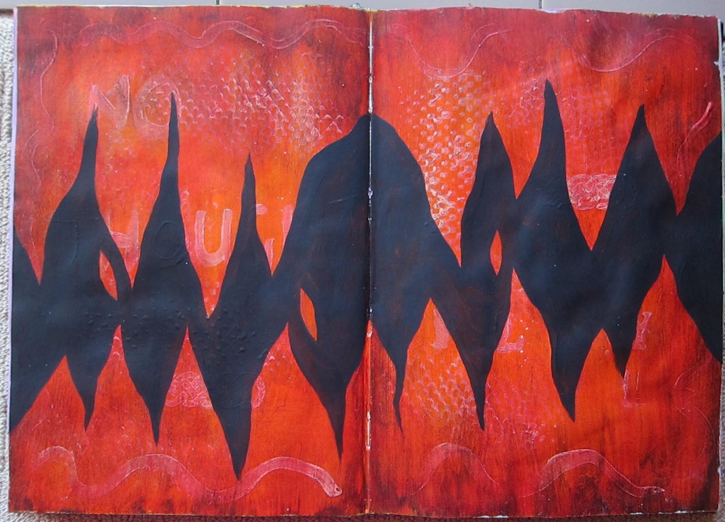
Two backgrounds

Here are two backgrounds waiting for me to do something with them. This first one is a bit textured: I used some kind of plastic mat to stamp some gesso, painted over it with orange acrylic and rubbed it back so you could see the gesso underneath. I had also painted a few gesso words, I think “no thought” and “play”. When the orange was dry I painted burnt umber over all and rubbed it back too. The page sat like that for a few weeks waiting for some attention and everytime I looked at it it seemed to say “Fire”. Then one week in my art journaling class with Zom we were asked to create some black gesso areas on one of our backgrounds so I chose this one and painted black across the centre creating the flames. This is quite a strong background now, I don’t quite know how to approach adding something to it. It would be likely that the background would overpower anything I might stick on top of it! Will keep you posted.

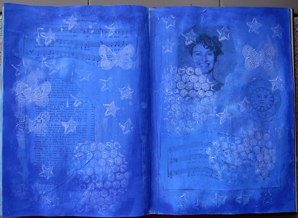
Here is another background awaiting a “foreground”. It was created in a similar way to the previous one only in this one I collaged down some pieces first…some music, a black and white photocopy of a photo of me in younger days, a page from the dictionary with definitions of love.Then I stamped some gesso using bought stamps and bubble wrap, and when that was dry painted 2 different shades of blue. Obviously I don’t know many different techniques yet for creating backgrounds! This was actually really fun to do because I was showing my friend Ruth (who has recently acquired the art journaling bug!) a couple of background techniques and we were working together at my dining room table, and having a lovely relaxed creating time. Anyway, I do like this blue background and I trust that one day it will become clear to me what I must put over it!

Self portraits

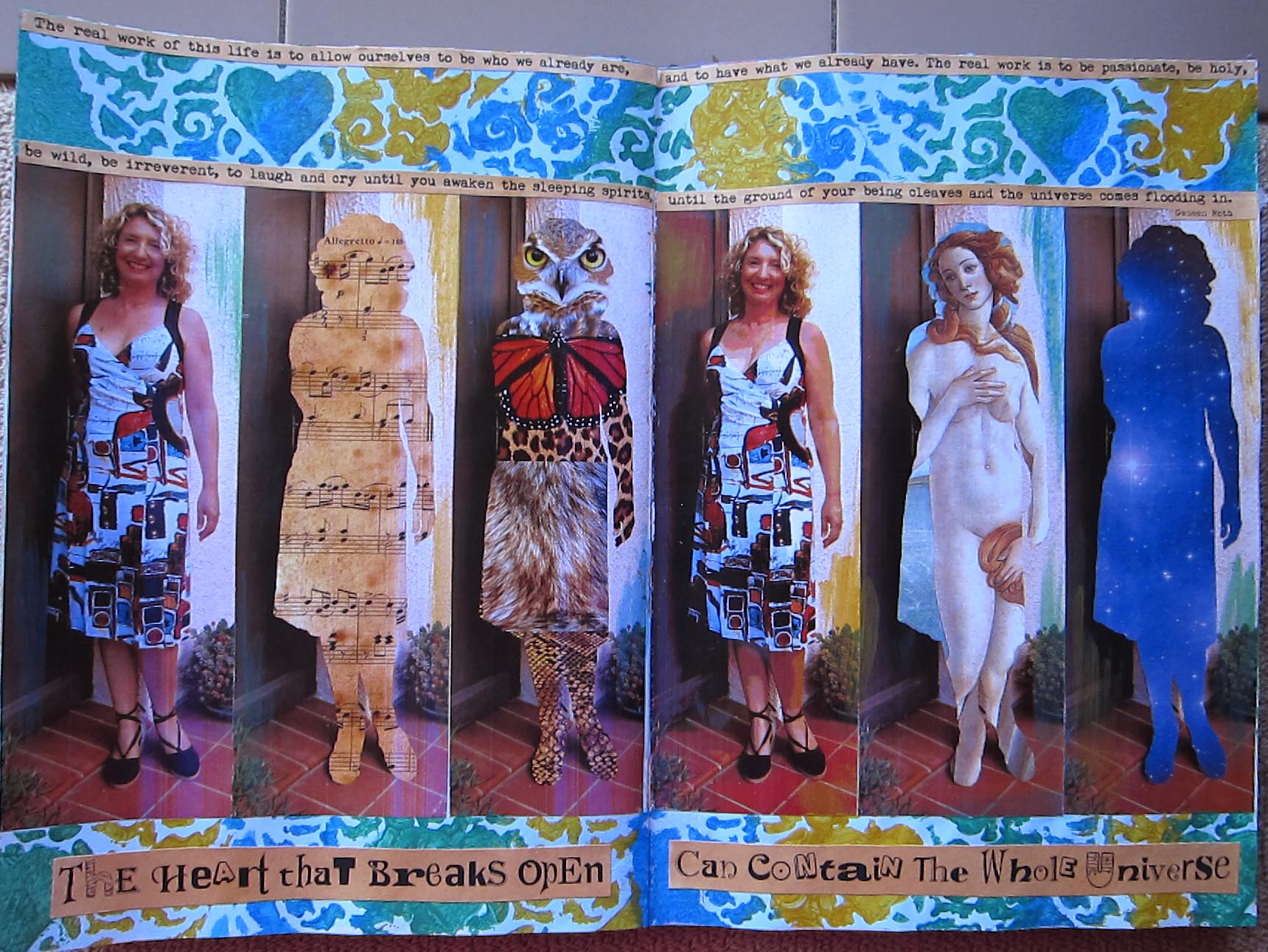
“The real work of this life is to allow ourselves to be who we already are, and to have what we already have.  The real work is to be passionate, be holy, be wild, be irreverent, to laugh and cry until you awaken the sleeping spirits,until the ground of your being cleaves and the universe comes flooding in.” Geneen Roth

“The Heart that breaks open can contain the whole universe” Joanna Macy

A series of self portraits, perhaps inspired by those two quotes. I believe that in some unfathomable way, we each contain the whole universe. We are stardust, we are light particles. The other portraits acknowledge some of my animal totems, and also my animal nature, my musical nature, and one of my most significant archetypes, Aphrodite.

I’m thinking of making a larger version of this page, perhaps on canvas…a scarey step for me! I’d like to add a couple more, maybe one with a map! I also already have some interest from friends in a portrait of them done in this way, representing some of their many “faces” or aspects. So I might be taking commissions!!

Beloved


Here is my latest page, just finished a few days ago. It’s really a celebration of my relationship with my husband . There are some romantic pictures from old 1950’s magazines in the background, which are peeping through in places. I wanted to use the picture I had of Gustav Klimt’s “The Kiss” (a painting much loved by romantics like myself!) and I ended up printing out some extra strips from the painting to make a border. I love sunflowers, they remind me of optimism and joy, and also of our fabulous trip last year through France, where we saw many beautiful fields of them. The photo of us was taken at our Christmas party last December. My skin is not actually that brown colour, something odd happened when I photographed this page. Because my journal is A4 size I can only scan one side of each double page at a time so I’ve been photographing the pages instead of scanning them for this blog. I think its mostly working out Ok, what do you think?

This page looks really happy, positive and sunny to me, and I guess that’s because I am in a happy phase of my life, and my beloved has a lot to do with that!

What gives me wings

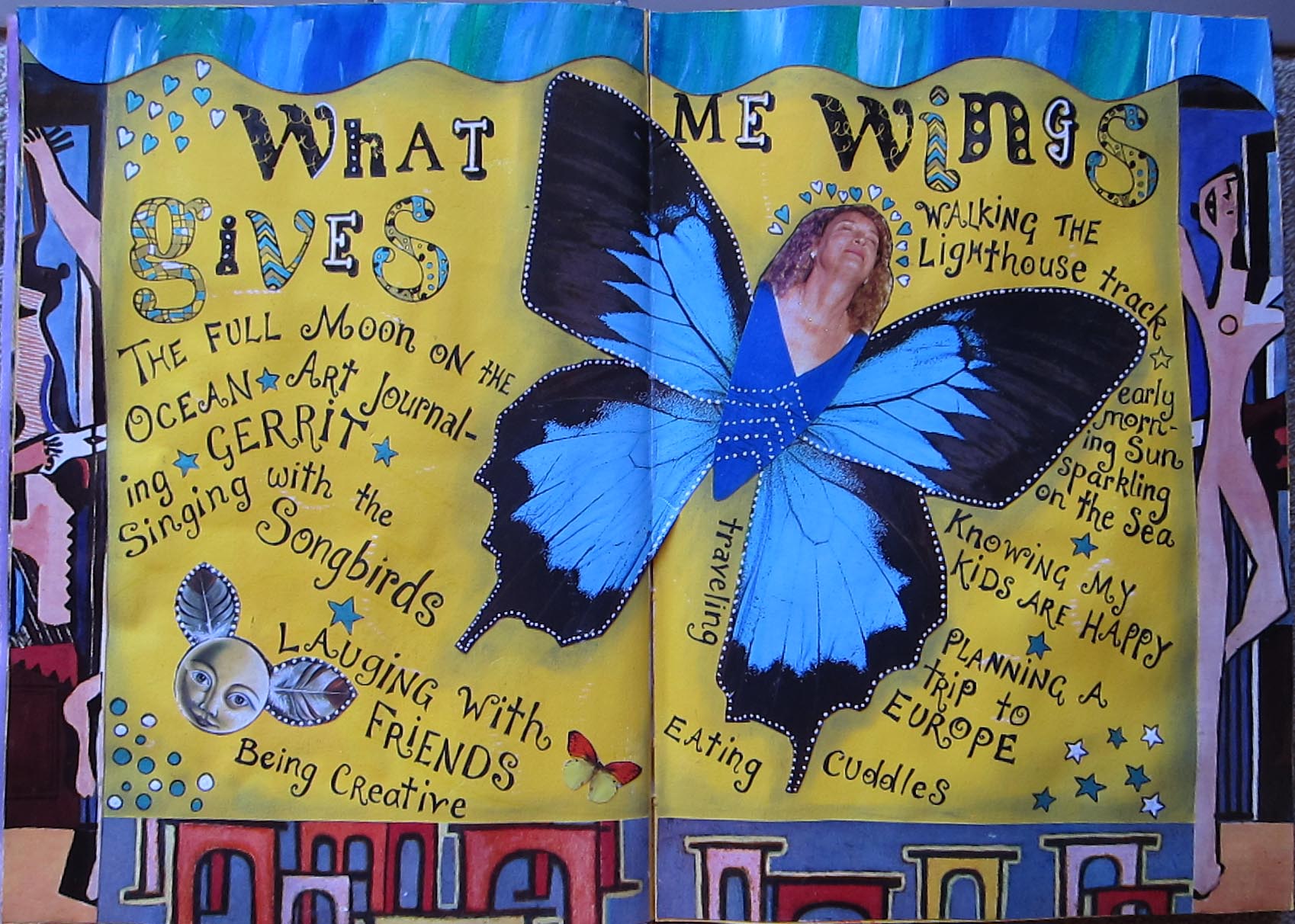
Like many beginning art journalers I have come across the work of Teesha Moore, greatly admired it and thought that one day I would try to do something a little bit similar. I have watched her videos on youtube which are really excellent for new art journalers, well for anyone really. If you haven’t seen them HERE is a link to one.

So in what way is this similar to her work in those videos? Well there is a plain brightly coloured background, a border made of colourful strips, some kind of central collaged image made up of different images and some curly lettering. Oh and I used a pan pastel to do some shading around the edges. My initial intention was to make a central image which was more like hers, a bit zany, with weird parts of people and animals, maybe huge eyes and stripey legs etc, but I somehow couldn’t do it. I was really stalled on this page once I had made the borders. Eventually I realised that I didn’t want to copy Teesha THAT closely, I need it to be meaningful to me. Then I came across this large butterfly pic which I loved, and this pic of me being ecstatic in the temple at the Mana retreat centre in New Zealand just seemed to go so easily with the wings. Writing down some of the things that “give me wings” was really fun too.