Medieval page

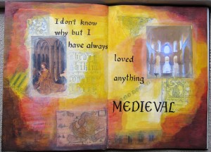
A while ago I bought a book for my sister called “Creative Paint workshop for Mixed Media Artists” by Ann Baldwin. It’s very inspiring so I’ve borrowed it and don’t look like giving it back anytime soon (mwah ha ha!) Oops, my sister has subscribed to this blog and now knows my evil plan. Anyway, this page was inspired by that book. I tried to use layers of acrylic glazes but I don’t really know what I’m doing with acrylic paints and it didn’t turn out the way I expected (or anything like Ann Baldwin’s) It’s OK though. I’ve included a photo I took last July in the Tower of London chapel as I loved the way the light was streaming in. There are several layers of collage, black and white medieval designs and buildings, and some coloured collage on the top layer. I bought a calligraphy felt pen and enjoyed using that on this page.

It is true that I have always loved medieval things (and also renaissance) I love the buildings, the churches, the clothes, the art, the music, the OLDNESS. In Australia we don’t have buildings older than 200 years so when we arrived in Europe last year, I was running around Utrecht (where my son is living) exclaiming over the OLDNESS of things. The canals there date from the 11th century! I’m not sure why I find oldness so interesting, I just do! Does anyone else feel that way?

Pages with Doors

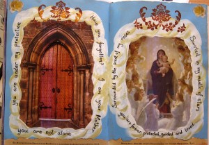
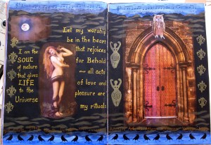
A while ago  in our art journaling class with Zom we made some pages with either a door or a window opening through to the next page….or at least, like most pages I’ve done, we started them in class and finished them at home. Here are my pages, first with the door closed, then with it open so you can see through it to the page behind.

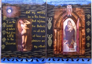
This was the first page I had done with a black gesso background, but it won’t be the last. I love the way the pictures seem to arise out of the darkness. The words are from the “Charge of the Goddess”. I printed out 2 copies of the medieval door and stuck one directly on the other side of this one, so the door opens from both sides of the page.

When the door is open you can see the gorgeous painting of the “Virgin with Angels” by Bouguereau which I think is my favourite painting of Mary. I cut the Goddess stamp from an eraser.

I didn’t really think too much about my choices of images here, just followed my instinct but I suppose I’m showing two different faces of the Goddess here. Here is the next page:

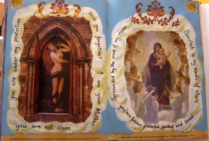
As you can see I was going for a lighter, more “heavenly” look here with sky blue and white clouds. Actually I didn’t really like the circle of clouds once I had done them, partly because I mixed the paint with a Flow medium by Jo Sonja’s which turned out to be gloss. Yuck, I hate gloss in my journal…if anyone wants my Jo Sonja’s flow medium you can have it, I won’t be using it again.

What I do love is when you open the door and see the dark goddess with the snake, again, two faces of the Goddess. The writing on the left is the message of the Virgin of Guadaloupe as cited in Clarissa Pinkola Estes new book “Untie the Strong Woman”. Being brought up as a protestant (Methodist) minister’s daughter I never had much of a relationship to Mary, we thought that was a weird Catholic obsession, but I found this message strangely moving, “Have you forgotten, I am your mother, you are not alone….” Since I have become more into the sacred feminine in recent years I can feel a closer connection to Mary now than I ever have before. Though I have always loved some of the beautiful musical versions of Ave Maria. Especially the version by Franz Biebl…check it out on youtube sung by Chanticleer…I saw these guys sing this in Brisbane in 1997 and I’ve never been the same since!

Inspired by Traci Bunkers

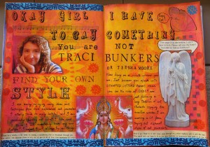
I’m enrolled in the 21 secrets online art journaling course and one of the teachers is Traci Bunkers. I like her work and I own a copy of her book “The Art Journal Workshop”, which is a useful book for someone new to art journaling as she gives step by step instructions and photos of exactly how she produces her pages. Not surprisingly, when people are following her instructions in 21 Secrets they end up producing pages which are quite similar to hers (the same is true for most of the other teachers also).

I decided to (gently) send myself up a bit for copying her style. I hope you can read the text when you click on the page above. I was thrilled to find this statue of an angel who is covering her eyes, and she’s saying “This page is so derivative, I can’t bear to look. Please tell me she hasn’t included an Indian Goddess!!”   Which of course, I have! Traci often seems to have an Indian deity, and also she often has a photo of herself, and she frequently is addressing herself in large stamped letters, like I have done on this page. Unfortunately I didn’t have any of Traci’s alphabet stamps ; she has produced her own sets which you can buy here:

Anyway, I admire Traci and am not meaning to make fun of her at all, only of myself, as she is not the only art journaler I have tried to copy (see my Teesha Moore inspired page here) However, once I had addressed myself sternly in stamped letters I began to argue with myself, because actually I think it’s fine to be copying the style of others when you are starting out in something, as I say on this page, I’m just following the ancient tradition of art students copying the masters in order to learn new skills. What do you think?


Art Journaler

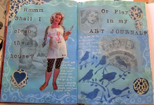
The prompt we were given in our art journaling class was to write about what might happen if we gave more time to our creativity. Since I already devote quite a lot of time, thought and energy to my art journal (my husband thinks I’m obsessed!) I ended up writing about whether or not it is Ok to do this. I have a couple of 1950’s New Zealand women’s weekly mags from which I collaged down a few housewifely ads and painted over them thinly. I recently bought this songbirds stencil which has seven birds in a tree. I had to buy it because I sing in a group called the Songbirds and there are seven of us!

I was working on this page alongside my friend Christine, and suddenly had the idea to get her to take a pic of me looking like a 1950’s housewife. I have a dustpan in one hand and a paintbrush in the other, and I’m contemplating my daily dilemma…shall I clean the house or play in my art journal? I must admit that the house cleaning hardly ever wins!

I have included a quote which is from Howard Thurman “Don’t ask what the world needs. Ask what makes you come alive, and go do it. Because what the world needs is people who have come alive.” Art journaling makes me come alive, as I say on this page, “At this time in my life, this is my bliss and I am following it”.


Souls on the Shore

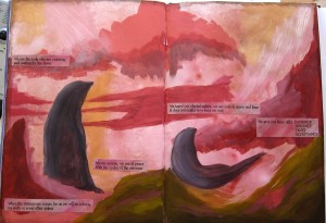
I’ve signed up for 21 secrets , an online art journaling course this year. Some of the classes are great, while others haven’t really grabbed me, but I have tried painting in a way which is very different from anything I’ve done before. This was inspired by Connie Hozvicka’s class in which we were encouraged to just paint intuitively, not knowing where we were going with it. This is what I came up with. It looked like two seals watching sunrise on another planet. I just let it stay like this for a week or so, then I did a enquiring process similar to what we do in SoulCollage ie I asked the two “beings” who they were and wrote down what they seemed to be saying to me. This is what they said: We are the souls who are watching and waiting for the dawn We are serene, we are at peace  with the cycles of the universe.  When the shining one comes for us we will be reborn, on earth or some other galaxy.  We know our eternal nature, we are outside space and time  It does not matter how long we wait.  We give you these gifts:  PATIENCE, SERENITY, TRUST, ACCEPTANCE.

So it turned out they were SOULS not SEALS! Interesting how the subconscious works! Yes I know, it’s pretty cosmic, but hey, this is Byron Bay, spiritual heart of the east coast.

So anyway, I printed out what they said and stuck it on the page, darkened the edges of the page slightly with walnut ink, and there it is, finished.

I will definitely be trying this painting process again, it reminds me of the intuitive process of making a SoulCollage card. I love the idea that my intuition and or subconscious is leading me to create something significant and I don’t know what it is while I’m doing it. How cool is that!?

Honouring my daughter

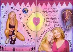
My daughter is living in London, has been there one year and will be there at least one more year. My son is living in Holland for at least 4 years, so of course I am missing both of them, although I know they are doing what they want to do and are happy, so that makes me happy! Anyway, I had created this background a while ago just using Portfolio watersoluble oil pastels and painting over them with gesso. This is one of my favourite background creating techniques, so quick, easy and satisfying!

My daughter works as a personal trainer in London and is being very successful. She has a strong Artemis/Diana archetype thing happening I think….ie she’s very focused (aims her arrow and off she goes), very outdoorsy and fit, and very independent, being quite happy with her own company and not really needing a relationship. I am very admiring of this (having always been much more of a codependent-must-be-in-relationship-or-I’m-nothing type of gal!) Sometimes I just look at her in wonder and think, “where have you come from, amazingly wonderful woman??”

For the top border I just painted some newspaper to tone in with my dress and cut it in a zig zag pattern, and I really like the effect. It gives a more energetic and focused edge to the page which was otherwise quite soft and floaty looking. Used my new alphabet stamp set that I bought in the Blue Mountains a few weeks ago, it’s a typewriter font.

I always thought focused had 2 s’s but my spell check keeps telling me no, so there you go, I was wrong!

I’ve discovered I need to add these pictures as medium, not full size as they take too long to load and you, gentle reader, might get impatient! But I gather that if you click on the picture you can see it full size, so that’s all good then!


The Gods Themselves

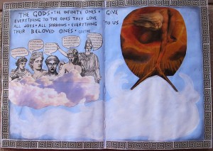
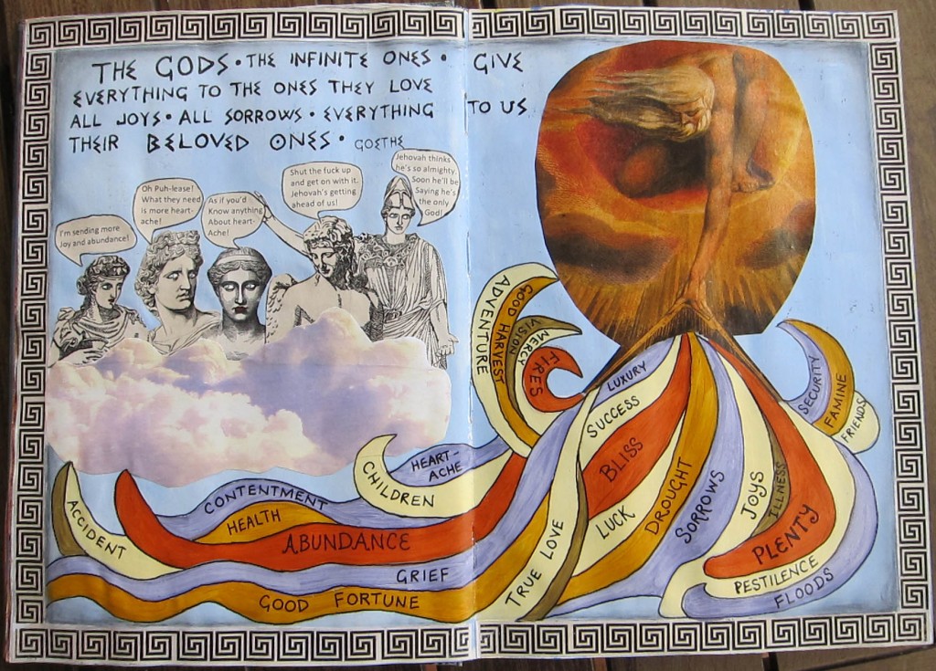
“The Gods, the infinite ones, give everything to the ones they love, all joys, all sorrows, EVERYTHING to us, their beloved ones.” Goethe

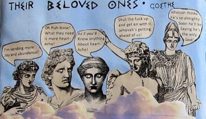
This quote from Goethe, along with the William Blake painting  “God creating the universe” was the inspiration for this journal page. It remained in this unfinished state (above) for many weeks. My original intention was to have many streams of bright colours coming down from God’s hand representing all the many life experiences, good and bad. Since the quote was “the Gods” plural, I decided to put some Greek and Roman gods in on the act, which was all going well until they all started bickering amongst themselves , as you can see below: (warning, swearing is involved) You’ll probably need to click on it to make it big enough to read anyway.

At this stage I realised that a bunch of really bright colours across the bottom was going to unbalance the whole colour composition so I just didn’t finish it for ages. Finally I had the idea to take some of the colours from the William Blake painting, and also from the purplish clouds, and use those colours for the coloured streams, and this is how it turned out:

I rather like the way it turned out now and I’m glad I finished it. For the border I think I just googled “Greek borders” and printed one out several times.

I’m not sure whether I find this quote comforting or not. I know the first time I heard it I was struck by it. I suppose in a way I celebrate the rich tapestry of life, I appreciate the many different experiences we are given, I understand that difficult experiences help us to grow, and naturally, at the same time I  wish for only good things to come my way!

My Brilliant Career

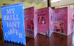
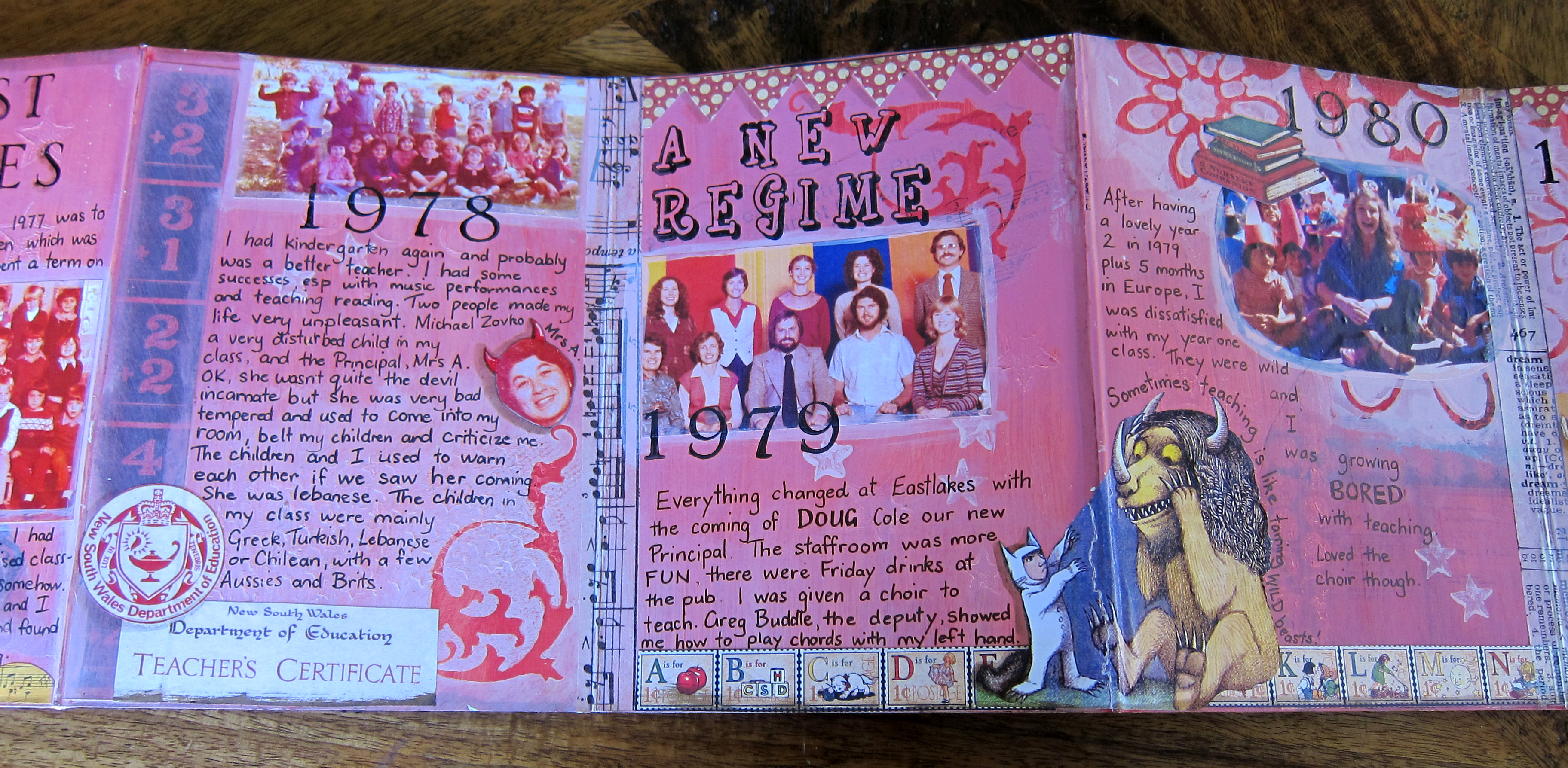
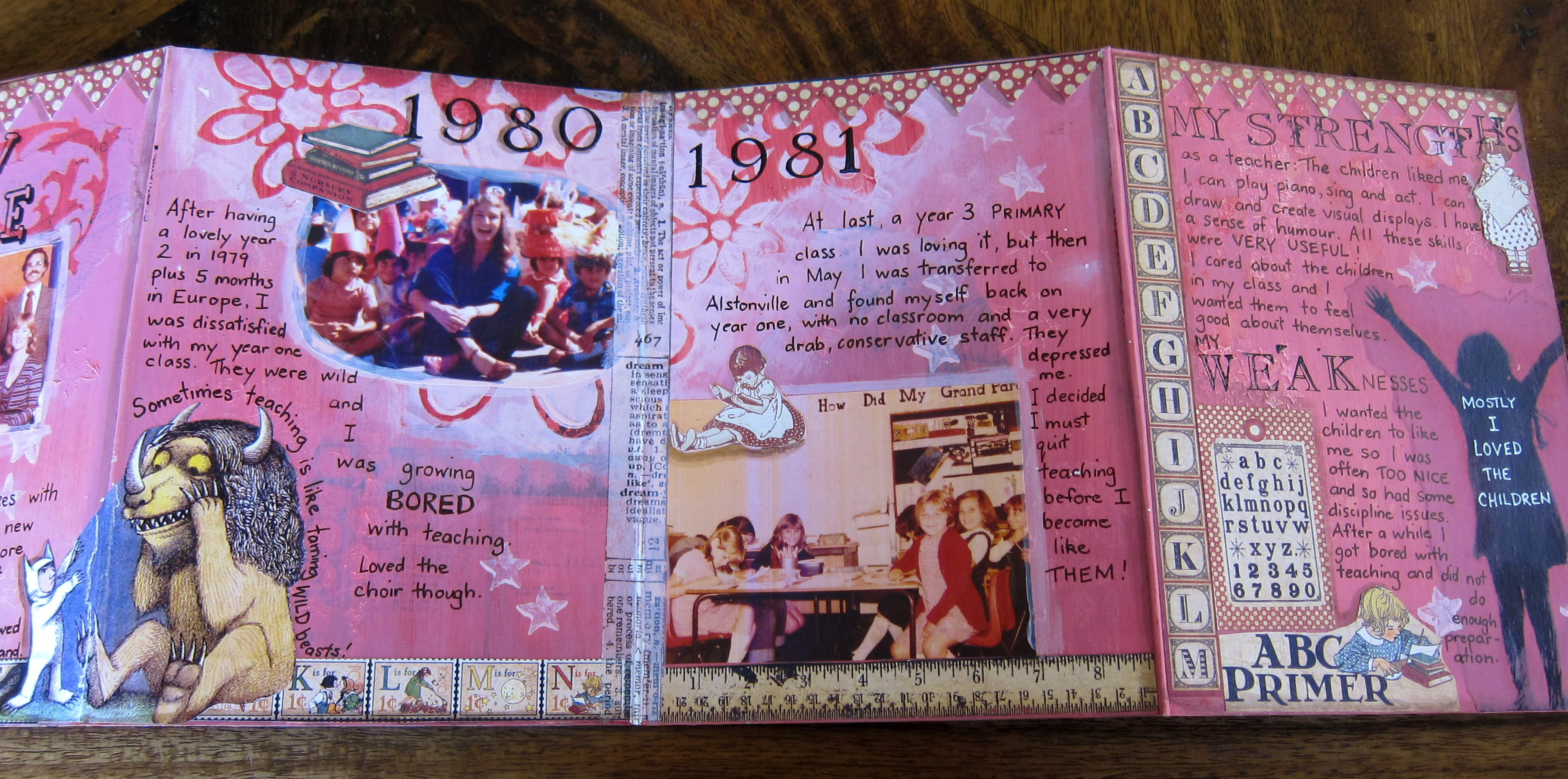
I bought a children’s board book a while ago with the intention of altering it and turning it into a journal. It opens out like a concertina. I gessoed both sides of it, mostly covering over the  pictures and text underneath. I decided to make it into a kind of retrospective of my (school) teaching career, as I stopped teaching in school a year ago now, so it seemed a good time to think back over those years.

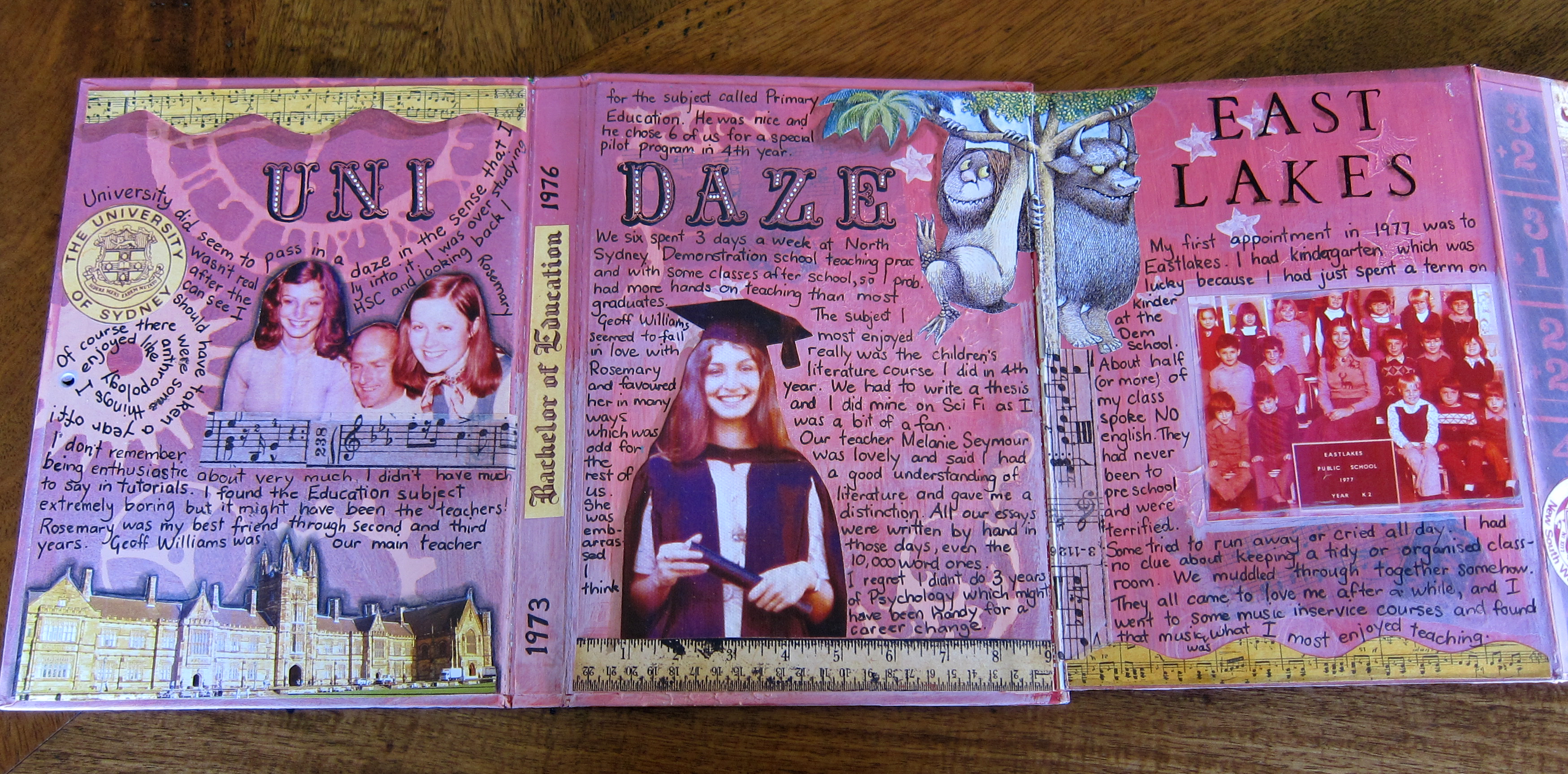
so far I’ve completed one side of the book in which I’ve written some memories of my university days and of my first few years of teaching in Sydney. I used old photographs and some pictures from “Where the wild things are” (a popular children’s book at the time) and some decorations from a set of scrapbook papers called “school days”.

This was a very therapeutic process for me, to relive old memories both good and bad, and to reflect on my strengths and weaknesses as a teacher!

It was great to look through old photos also, although a bit disappointing to find I didn’t really have many photos of myself at work.

I used some chipboard letters to make the title of the book, the first time I have ever used them and I really like the effect. I tend not to use anything vaguely 3 dimensional inside my journal because I imagine it won’t close properly. But the cover is a different matter!

I have painted some backgrounds on the other side of this journal ready for some photos and writing about the later years of my career up here on the North coast as a music and drama specialist teacher and will get around to finishing it sometime this year! Right now I’m all caught up with the 21 secrets online art journaling course!

Two backgrounds

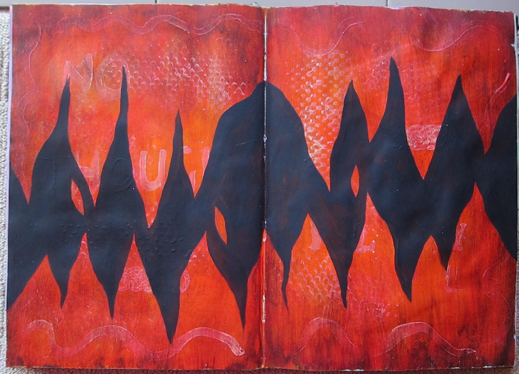
Here are two backgrounds waiting for me to do something with them. This first one is a bit textured: I used some kind of plastic mat to stamp some gesso, painted over it with orange acrylic and rubbed it back so you could see the gesso underneath. I had also painted a few gesso words, I think “no thought” and “play”. When the orange was dry I painted burnt umber over all and rubbed it back too. The page sat like that for a few weeks waiting for some attention and everytime I looked at it it seemed to say “Fire”. Then one week in my art journaling class with Zom we were asked to create some black gesso areas on one of our backgrounds so I chose this one and painted black across the centre creating the flames. This is quite a strong background now, I don’t quite know how to approach adding something to it. It would be likely that the background would overpower anything I might stick on top of it! Will keep you posted.

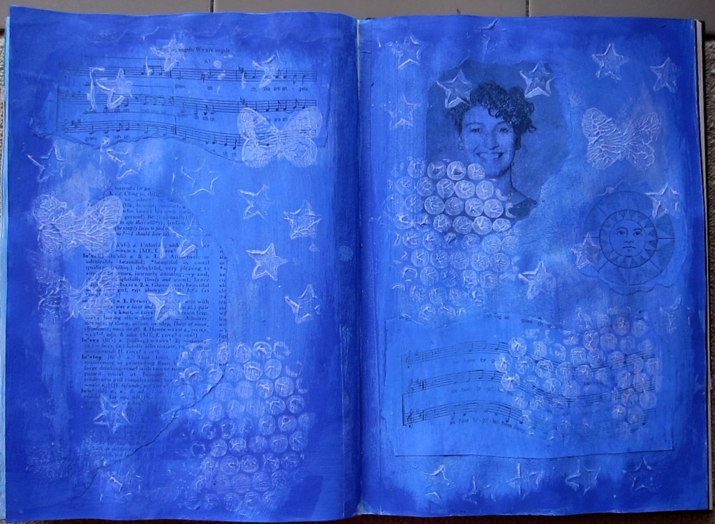
Here is another background awaiting a “foreground”. It was created in a similar way to the previous one only in this one I collaged down some pieces first…some music, a black and white photocopy of a photo of me in younger days, a page from the dictionary with definitions of love.Then I stamped some gesso using bought stamps and bubble wrap, and when that was dry painted 2 different shades of blue. Obviously I don’t know many different techniques yet for creating backgrounds! This was actually really fun to do because I was showing my friend Ruth (who has recently acquired the art journaling bug!) a couple of background techniques and we were working together at my dining room table, and having a lovely relaxed creating time. Anyway, I do like this blue background and I trust that one day it will become clear to me what I must put over it!

Self portraits

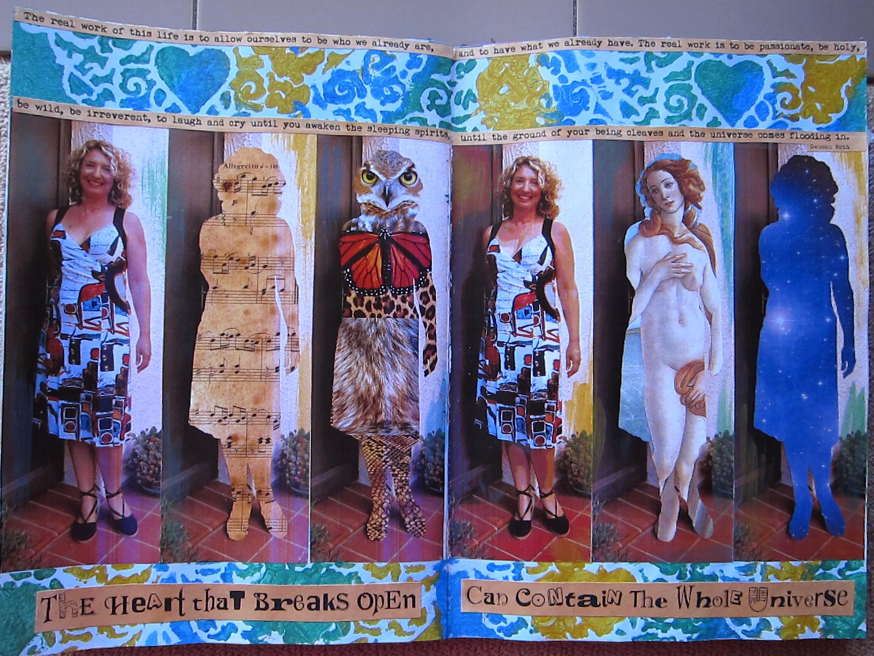
“The real work of this life is to allow ourselves to be who we already are, and to have what we already have.  The real work is to be passionate, be holy, be wild, be irreverent, to laugh and cry until you awaken the sleeping spirits,until the ground of your being cleaves and the universe comes flooding in.” Geneen Roth

“The Heart that breaks open can contain the whole universe” Joanna Macy

A series of self portraits, perhaps inspired by those two quotes. I believe that in some unfathomable way, we each contain the whole universe. We are stardust, we are light particles. The other portraits acknowledge some of my animal totems, and also my animal nature, my musical nature, and one of my most significant archetypes, Aphrodite.

I’m thinking of making a larger version of this page, perhaps on canvas…a scarey step for me! I’d like to add a couple more, maybe one with a map! I also already have some interest from friends in a portrait of them done in this way, representing some of their many “faces” or aspects. So I might be taking commissions!!