The Joy of the Sea

joy-of-the-sea
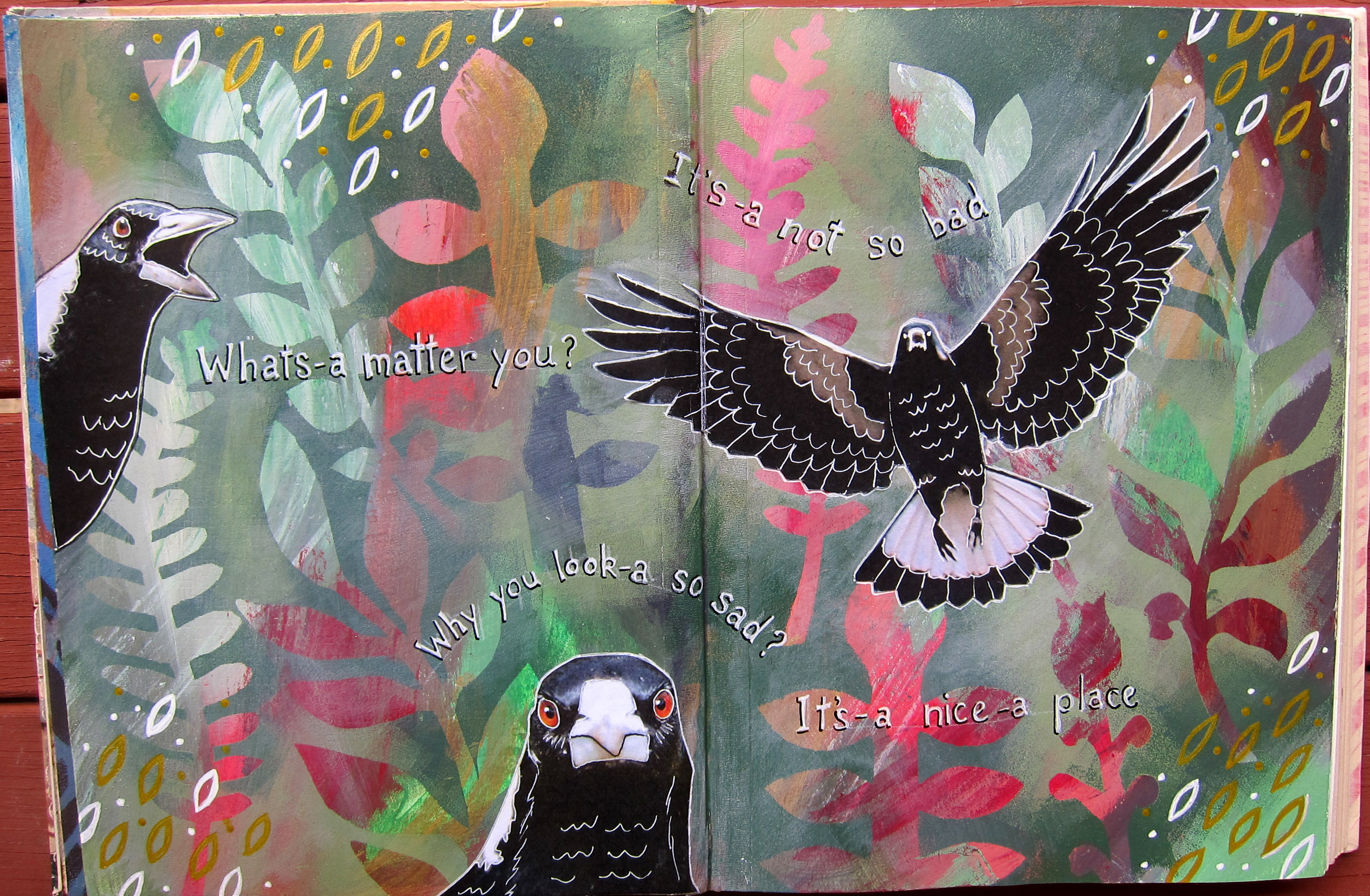
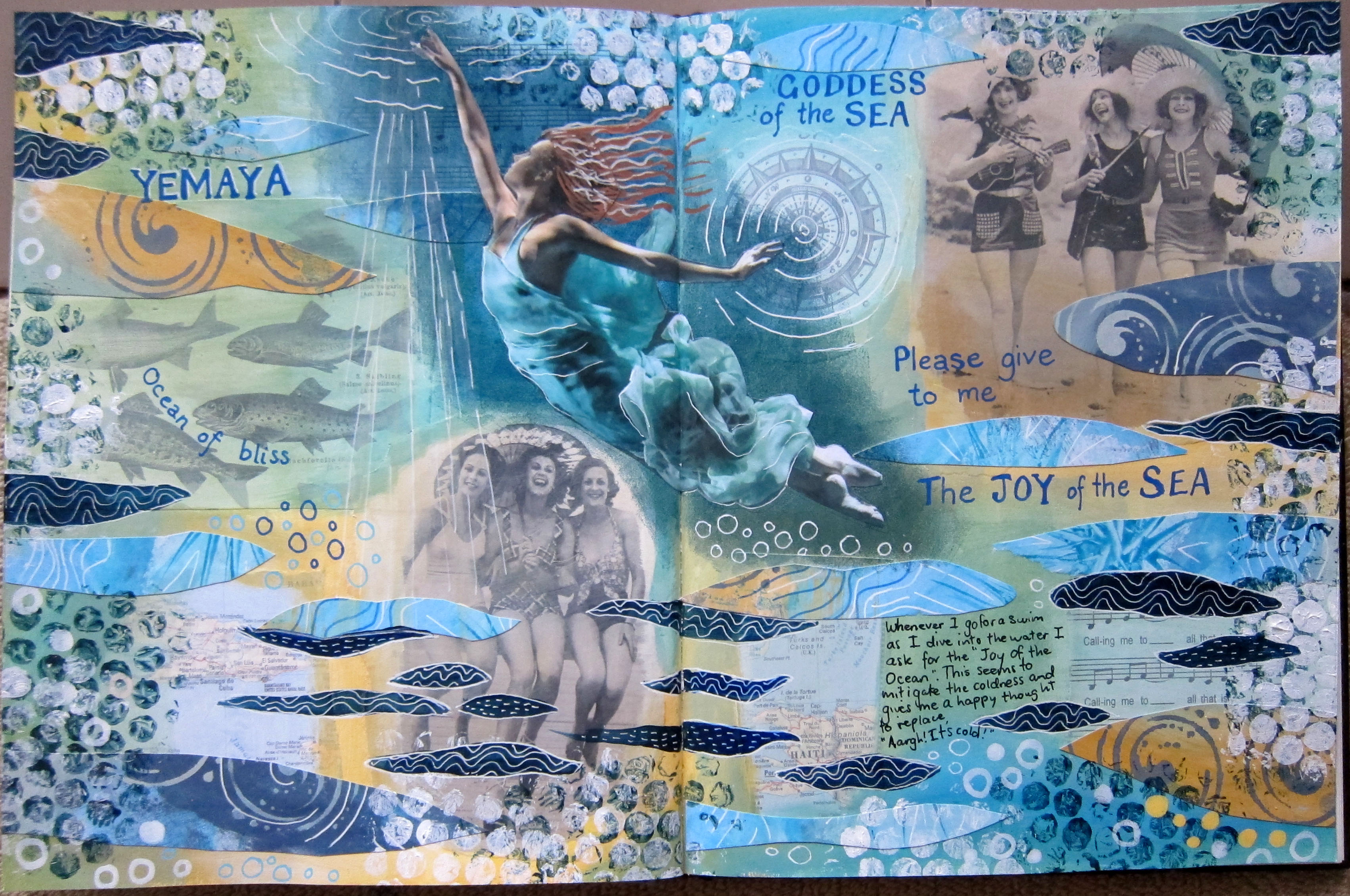
A few minutes drive from where I live the Brunswick River joins the sea at Brunswick Heads, and throughout summer and autumn I like to swim everyday in the river, at high tide if possible. Sometimes in spring and early summer it’s cold getting in, so I have a little ritual that I do. As I dive in I ask for the “Joy of the Ocean” to be mine, and I imagine the joy that all the sea creatures, especially dolphins and fish must have as they glide and leap about in the sea, and that I am receiving all that joy into my body. Somehow this stops me feeling so cold. Slightly. I imagine that I am asking this of the Goddess of the Sea. Anyway, this spread turned out to be about that.

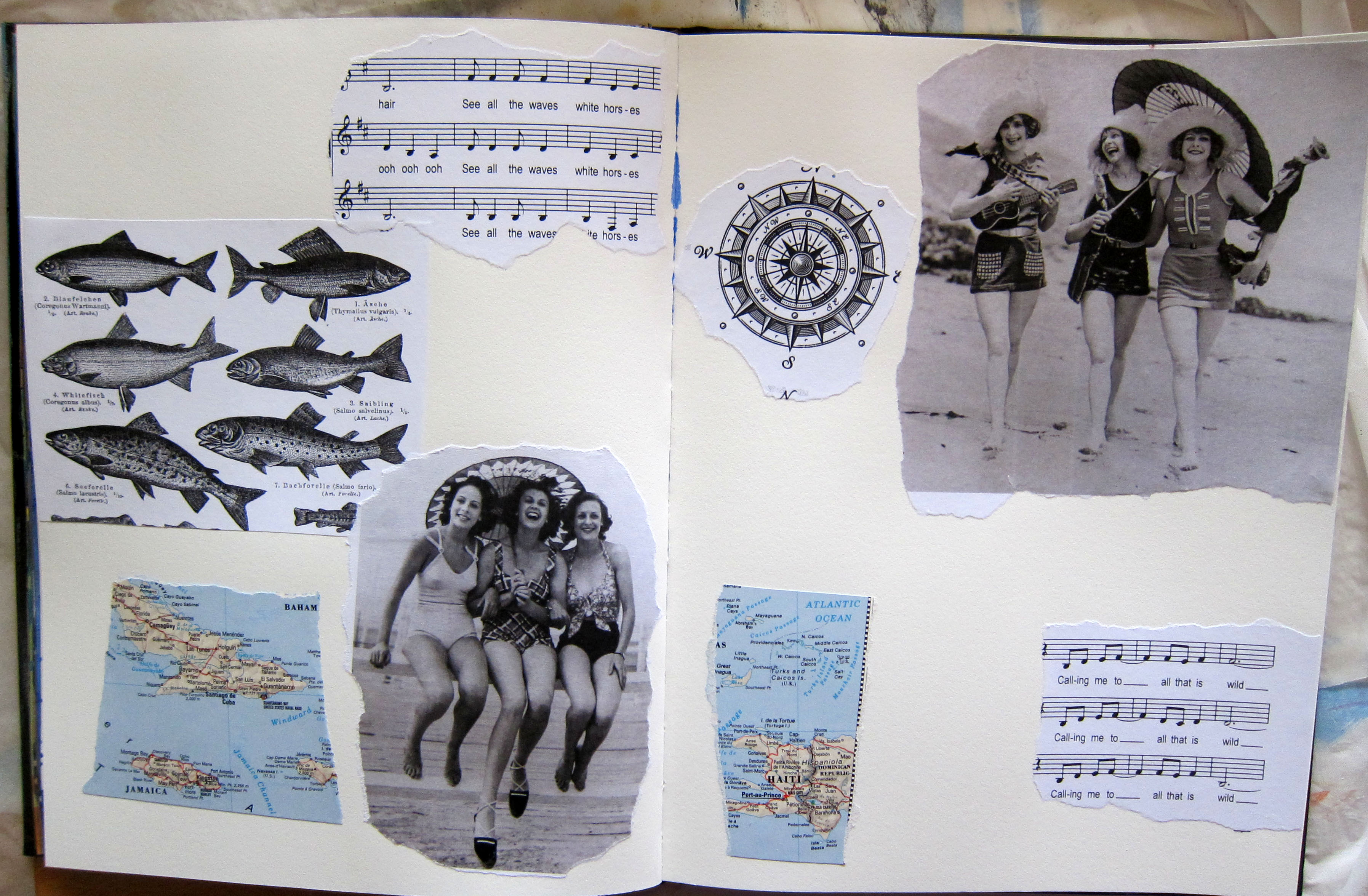
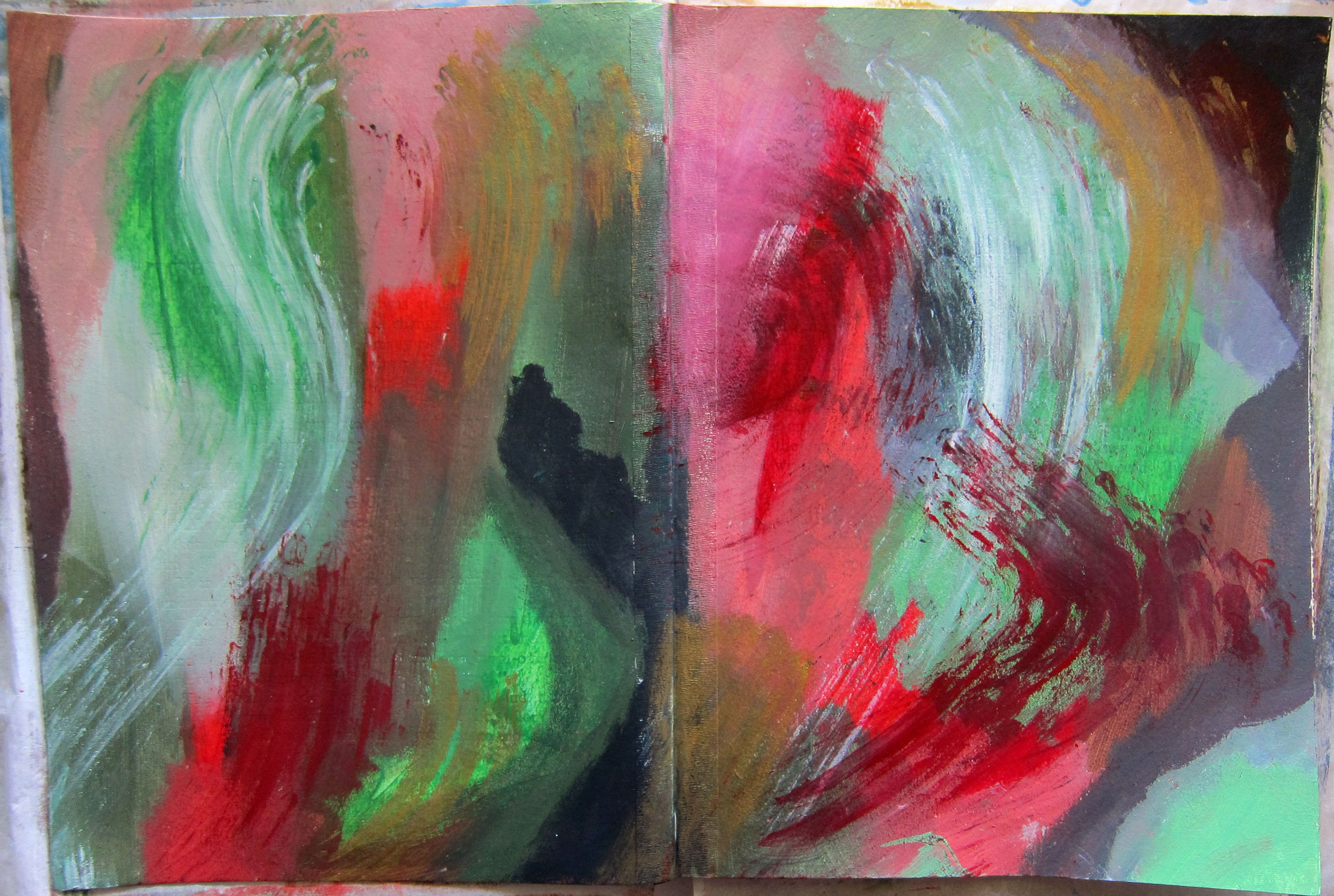
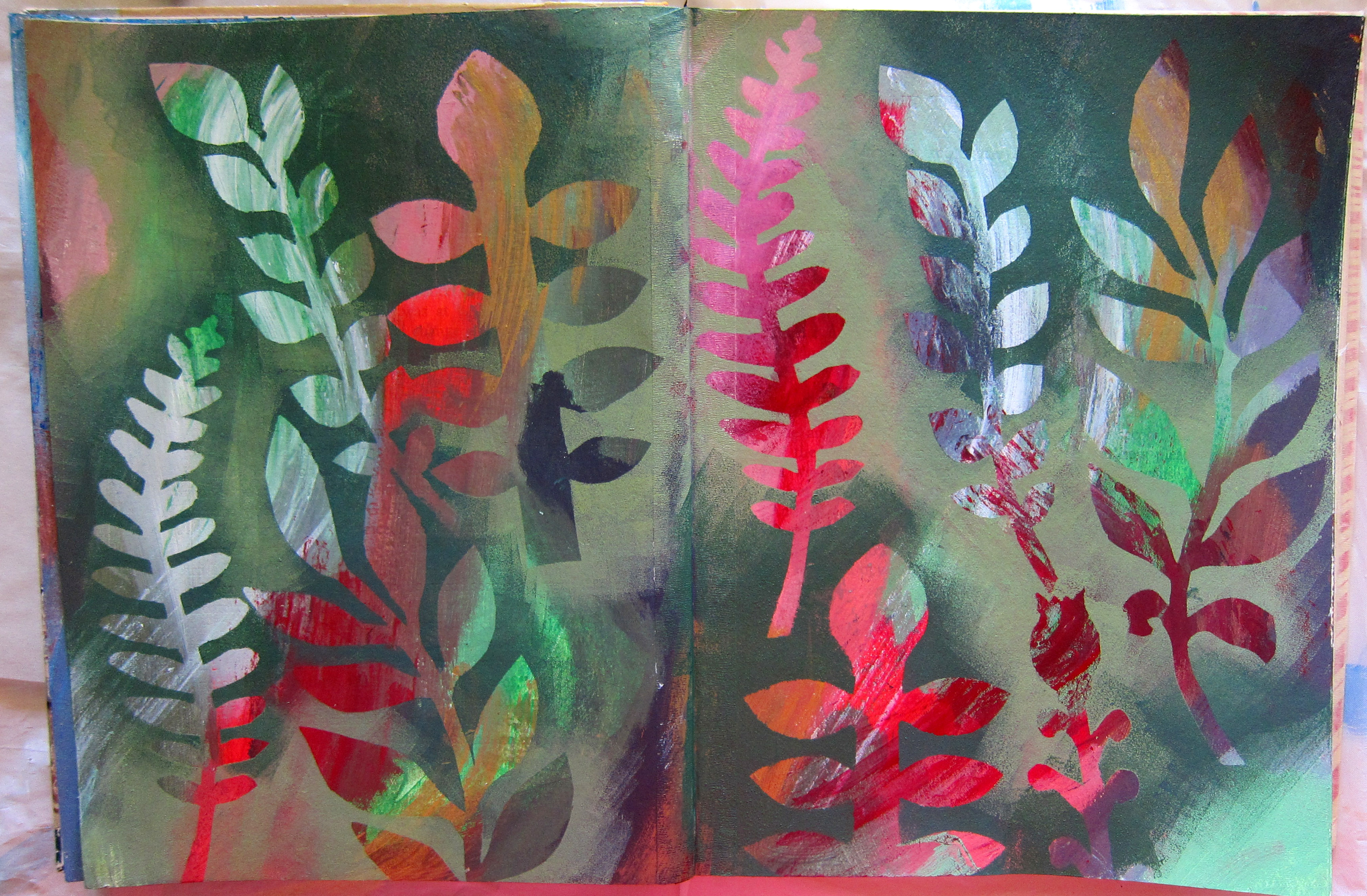
I’ve bought several 21 Secrets online art journaling courses now. As I think I’ve mentioned, some of the classes are inspiring and others not so much. I bought the Spring 2015 class largely because Roxanne Coble was one of the teachers. I made this page after I watched her videos. I know it’s not really very like her work, but well, my own thing started happening, so I just went with it. I decorated a separate page of watercolour paper with stencils and paint and gel pens, using the same colour scheme  as my spread, and cut this paper up to use as collage. Roxanne was working in an old altered book which had some black and white photos in it. As I was just working on a blank page in my Strathmore art journal and not an altered book,  I collaged down some old photos and other images before I started painting. I was loving my colour scheme, and even though i tried really hard to paint in some black areas , as Roxanne is fond of doing, I just couldn’t bring myself to do it in the end. That dark Prussian blue was the darkest i wanted to use. I sponged an area of Prussian blue on which to glue my focal image of the underwater ballet dancer, so that she would stand out against the background. Here is the collaged page before I started adding paint: thank you for visiting my blog.joy-of-the-sea-collage

Save

Make a Mess Magic

I’ve been doing the 21 secrets Color Color Color (or, as we say in this country, Colour, colour colour) online course. The class that has grabbed me the most is the one by Hali Karla called Make a mess magic. Hali invites you to make a mess, applying paint in different ways with no idea where it is going, and then invites you to make Magic from it somehow. She suggests using 2 complementary colours and exploring the different colours of brown/neutral/grey that is made by mixing them together. In her demo she used Blue and orange but suggested we could also use red and green or  purple and yellow. I decided to make 3 different pages so I could try all 3 combinations.

Here is my red and green attempt. Which I HATED because the red bits looked like blood and gore. I can see that red paint used straight can pretty much look like you’ve smeared blood across your page. Or perhaps I’m being a bit sensitive?

red-and-green-messAnyway, I stared at it for a long time, I even smeared some gold paint on it hoping to redeem it. Eventually I decided that most of the red had to go, so I used the fern and plant masks that I had cut earlier in the year and masked around them with 2 shades of green, a dark and a light. The red was only poking through in small quantities , which was a vast improvement!

red-and-green-maskedIt made for quite a colourful busy background though and so I thought it needed something in black and white to stand out. Black and white, hmmm…? I know, magpies! If you don’t live in Australia you may not be familiar with magpies, but they are everywhere here. Everytime I go out for a walk I see lots of them, usually staring intently at me, sometimes swooping down to scare you away if they have babies in the trees (in springtime). They are very cheeky birds who will swoop in to steal your food if they can. My mother loved them and used to go out everyday holding out food and calling “maggie, maggie, maggie”.

red-and-green-finishedThey showed up quite well on this background, but I did have to paint a little bit of watered down white paint behind them to tone down the background. After I outlined them with some white and black pens, I asked them what they wanted to tell me. I thought it might be something timeless and enlightening, since they are quite magical birds, a bit similar to ravens, and they have an intelligent look in their eyes. But they started singing an old silly song from 1981 by Joe Dolce, “Shaddap a Your Face”. In case you don’t remember the song,  I include the lyrics of the chorus here for your edification, it was sung with an italian accent. :

 Mama used to say all-a time.What’s-a matter you? Hey! Gotta no respect.
What-a you t’ink you do? Why you look-a so sad?
It’s-a not so bad, it’s-a nice-a place.Ah, shaddap-a you face! I’ll include the Youtube clip below.

So my birds said to me: “what’s a matter you?  Why you look so sad? it’s a not so bad! it’s a nice place!”  Fortunately they didn’t go so far as to say “Shaddup a you face” but I could tell they were thinking it!

It seems a bit silly, but actually, this is quite a deep and timeless message for me. I have been feeling a bit …well, not exactly sad, but a bit FLAT and lacking in joy at times, which considering my life is actually wonderful and I live in the best and most beautiful place IN THE WORLD (and I’ve travelled a lot in the last 6 years which has only confirmed this opinion!) with a husband who is wonderful and supportive, my flatness is inexplicable and disappointing. So I need to hear the magpies’ message! What IS the matter with me? Why do I look so sad?? it’s a not so bad! It’s a nice-a place! So I’ll just Shaddap-a my face now. Thanks for visiting my blog!

Save

Save

Inspired by Traci Bunkers

I’m enrolled in the 21 secrets online art journaling course and one of the teachers is Traci Bunkers. I like her work and I own a copy of her book “The Art Journal Workshop”, which is a useful book for someone new to art journaling as she gives step by step instructions and photos of exactly how she produces her pages. Not surprisingly, when people are following her instructions in 21 Secrets they end up producing pages which are quite similar to hers (the same is true for most of the other teachers also).

I decided to (gently) send myself up a bit for copying her style. I hope you can read the text when you click on the page above. I was thrilled to find this statue of an angel who is covering her eyes, and she’s saying “This page is so derivative, I can’t bear to look. Please tell me she hasn’t included an Indian Goddess!!”   Which of course, I have! Traci often seems to have an Indian deity, and also she often has a photo of herself, and she frequently is addressing herself in large stamped letters, like I have done on this page. Unfortunately I didn’t have any of Traci’s alphabet stamps ; she has produced her own sets which you can buy here:

Anyway, I admire Traci and am not meaning to make fun of her at all, only of myself, as she is not the only art journaler I have tried to copy (see my Teesha Moore inspired page here) However, once I had addressed myself sternly in stamped letters I began to argue with myself, because actually I think it’s fine to be copying the style of others when you are starting out in something, as I say on this page, I’m just following the ancient tradition of art students copying the masters in order to learn new skills. What do you think?


Souls on the Shore

I’ve signed up for 21 secrets , an online art journaling course this year. Some of the classes are great, while others haven’t really grabbed me, but I have tried painting in a way which is very different from anything I’ve done before. This was inspired by Connie Hozvicka’s class in which we were encouraged to just paint intuitively, not knowing where we were going with it. This is what I came up with. It looked like two seals watching sunrise on another planet. I just let it stay like this for a week or so, then I did a enquiring process similar to what we do in SoulCollage ie I asked the two “beings” who they were and wrote down what they seemed to be saying to me. This is what they said: We are the souls who are watching and waiting for the dawn We are serene, we are at peace  with the cycles of the universe.  When the shining one comes for us we will be reborn, on earth or some other galaxy.  We know our eternal nature, we are outside space and time  It does not matter how long we wait.  We give you these gifts:  PATIENCE, SERENITY, TRUST, ACCEPTANCE.

So it turned out they were SOULS not SEALS! Interesting how the subconscious works! Yes I know, it’s pretty cosmic, but hey, this is Byron Bay, spiritual heart of the east coast.

So anyway, I printed out what they said and stuck it on the page, darkened the edges of the page slightly with walnut ink, and there it is, finished.

I will definitely be trying this painting process again, it reminds me of the intuitive process of making a SoulCollage card. I love the idea that my intuition and or subconscious is leading me to create something significant and I don’t know what it is while I’m doing it. How cool is that!?